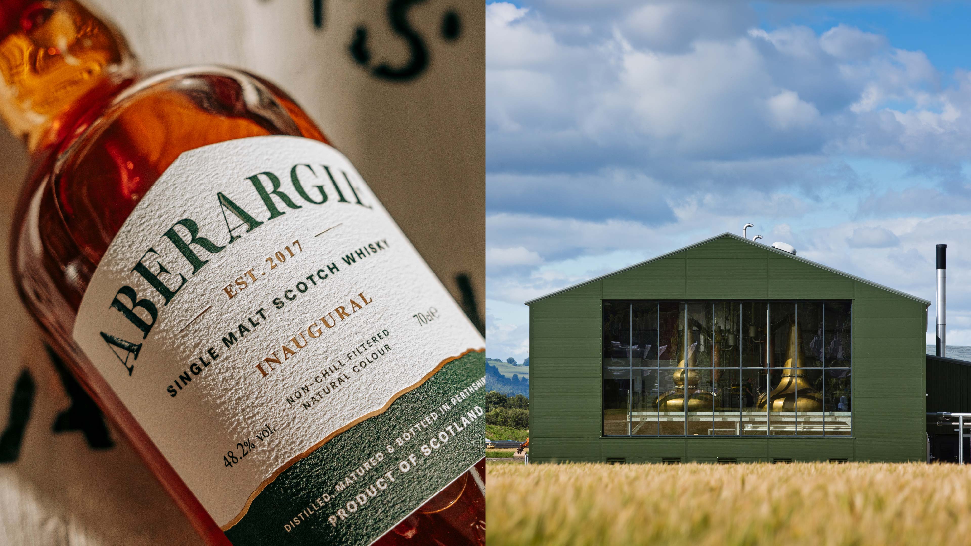
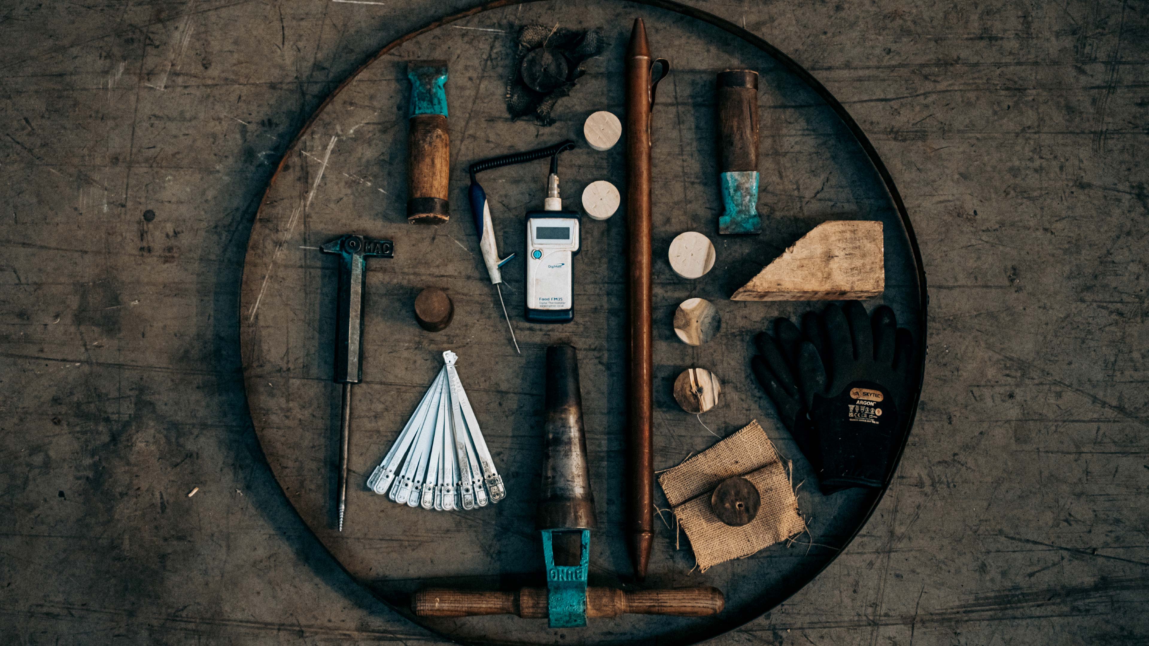
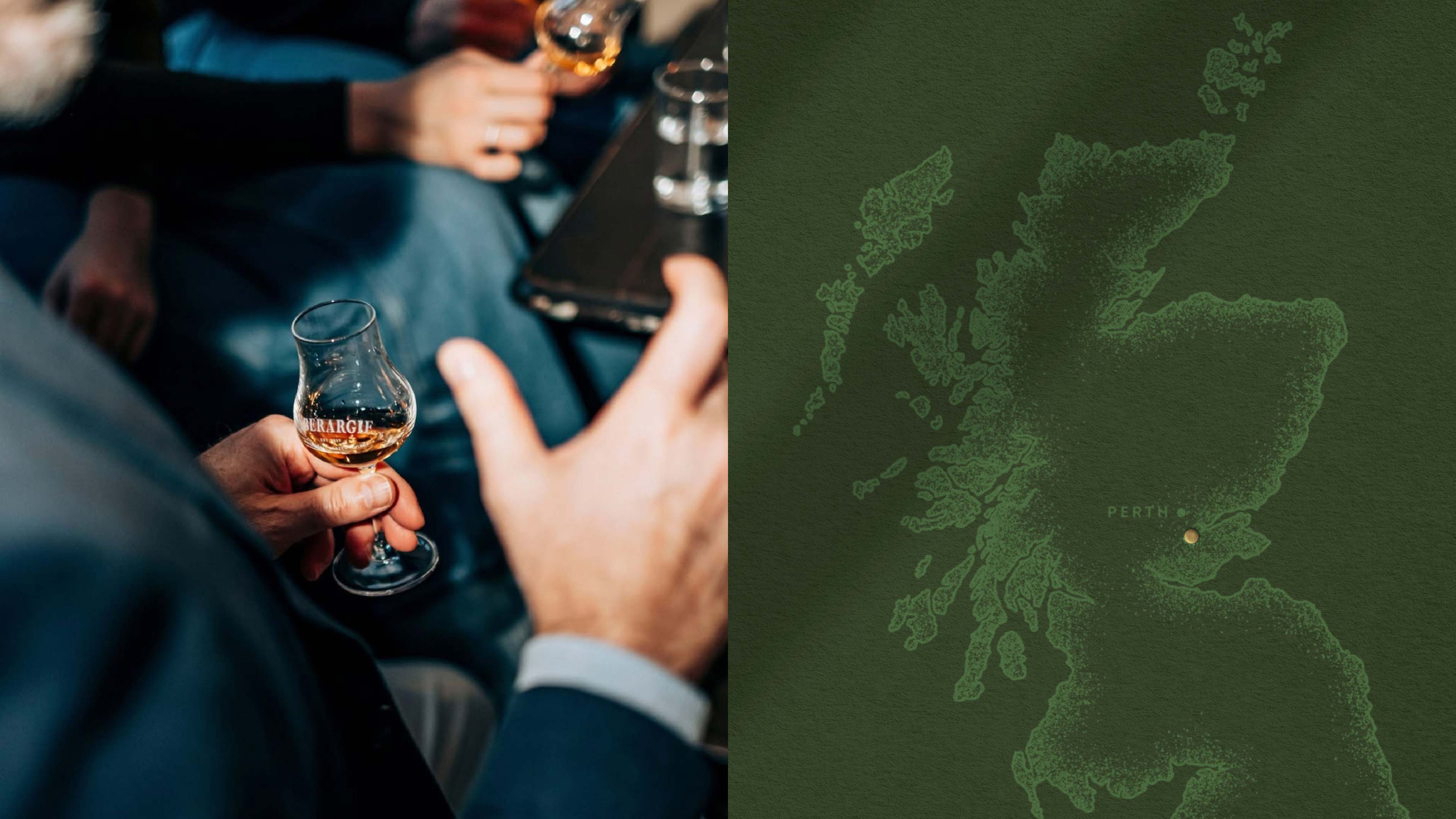
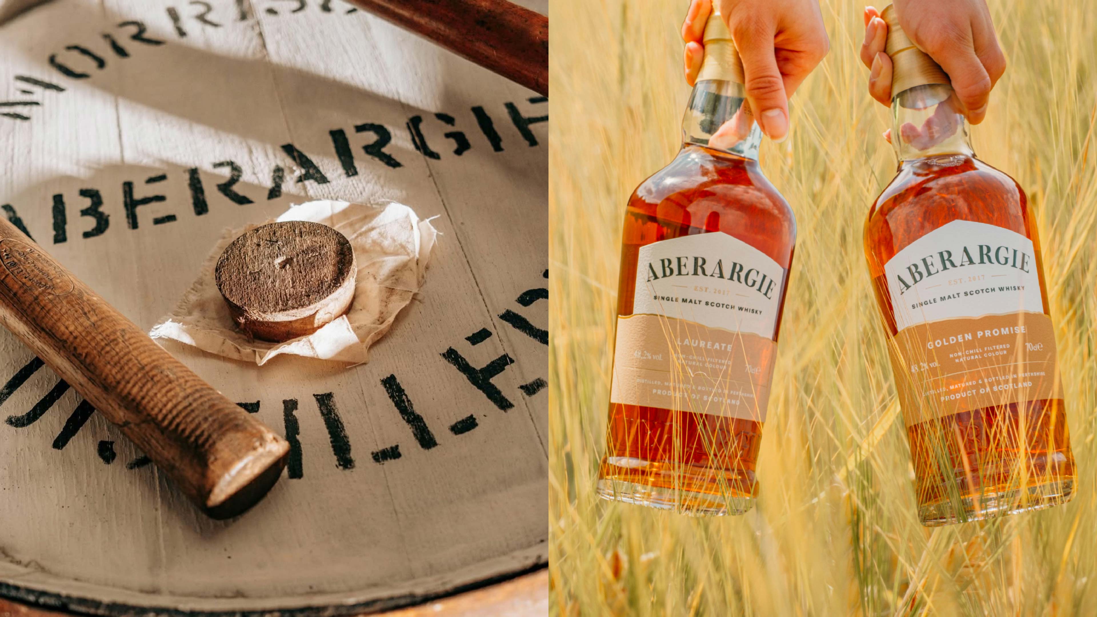
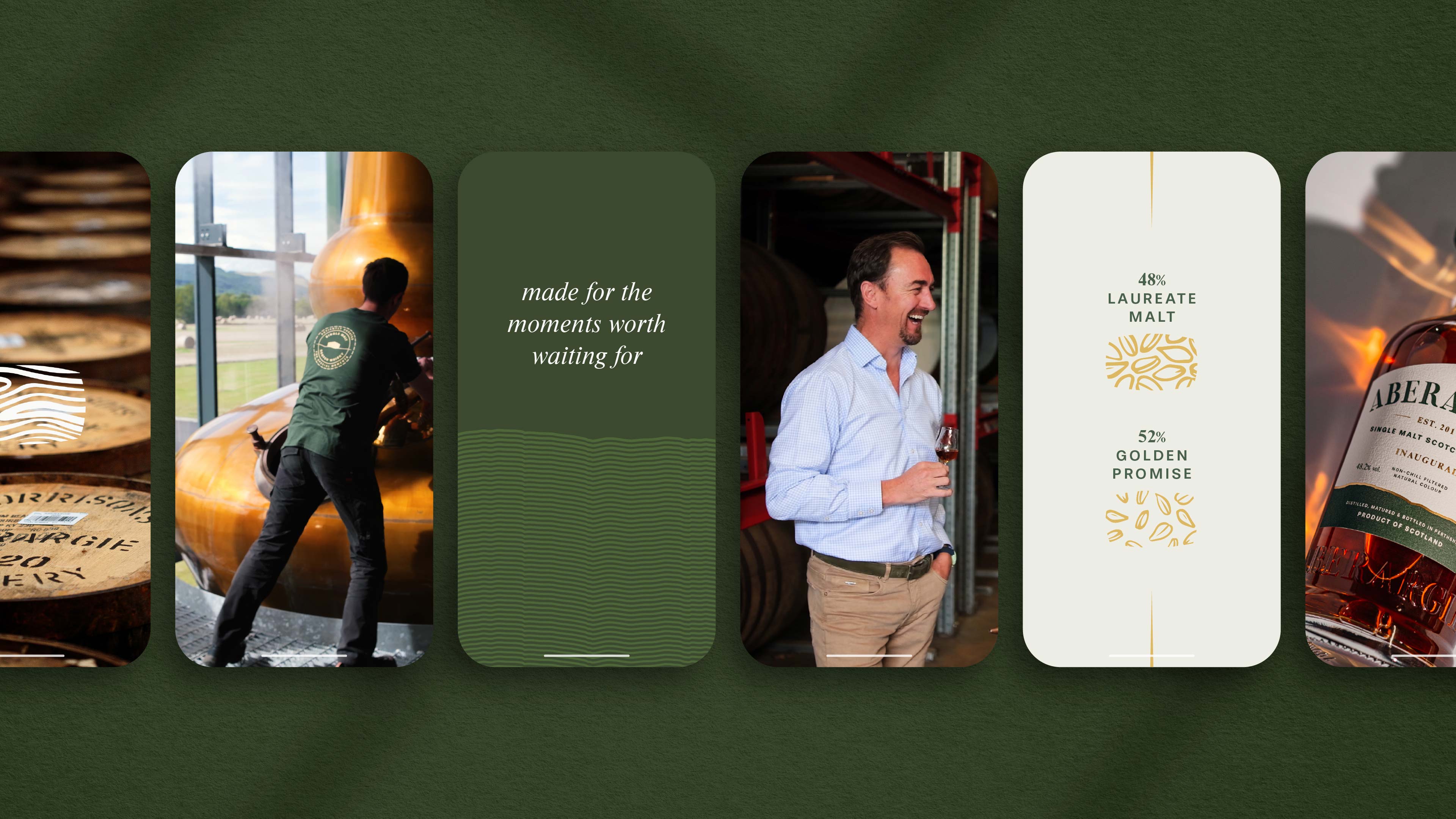
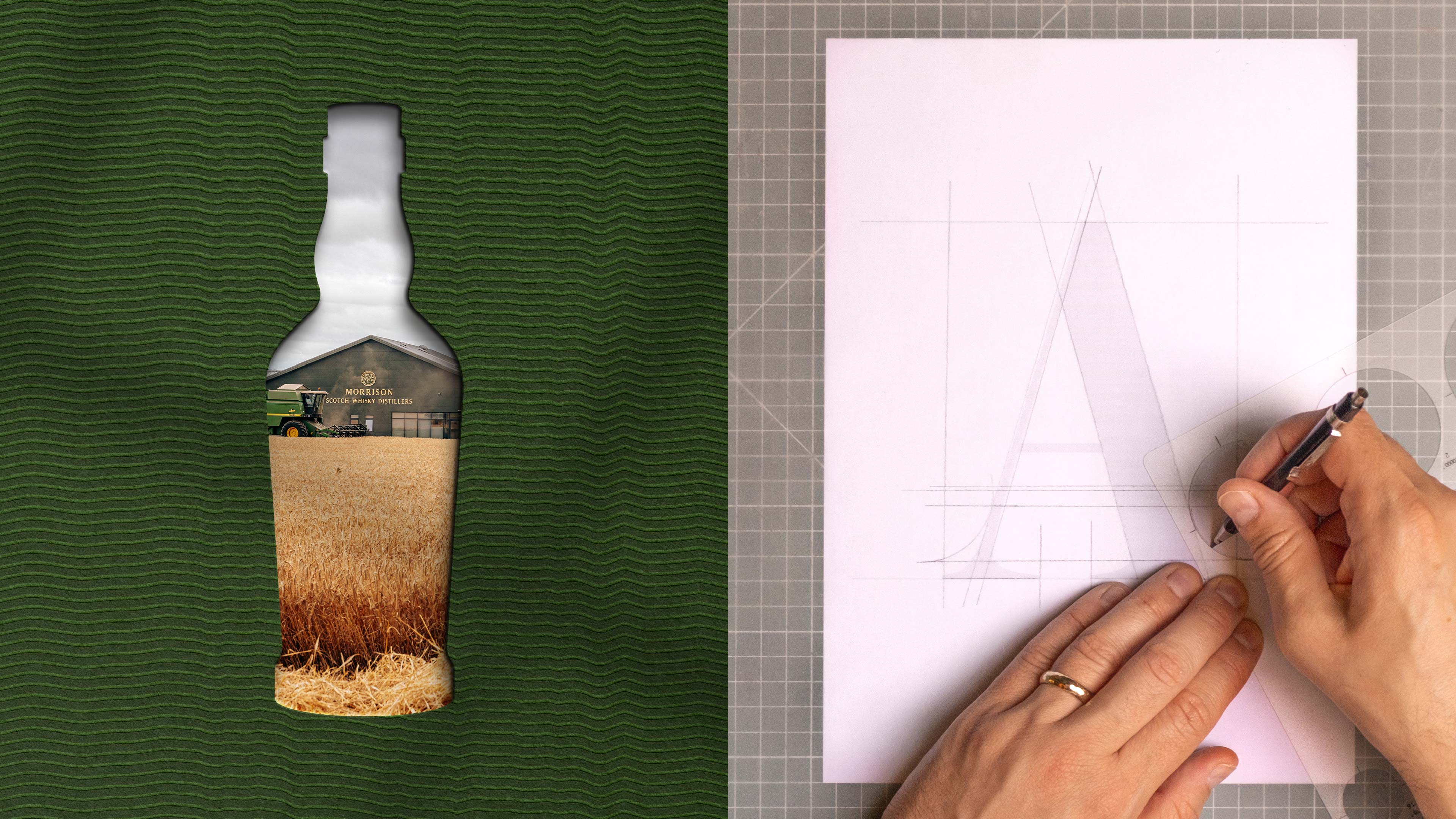
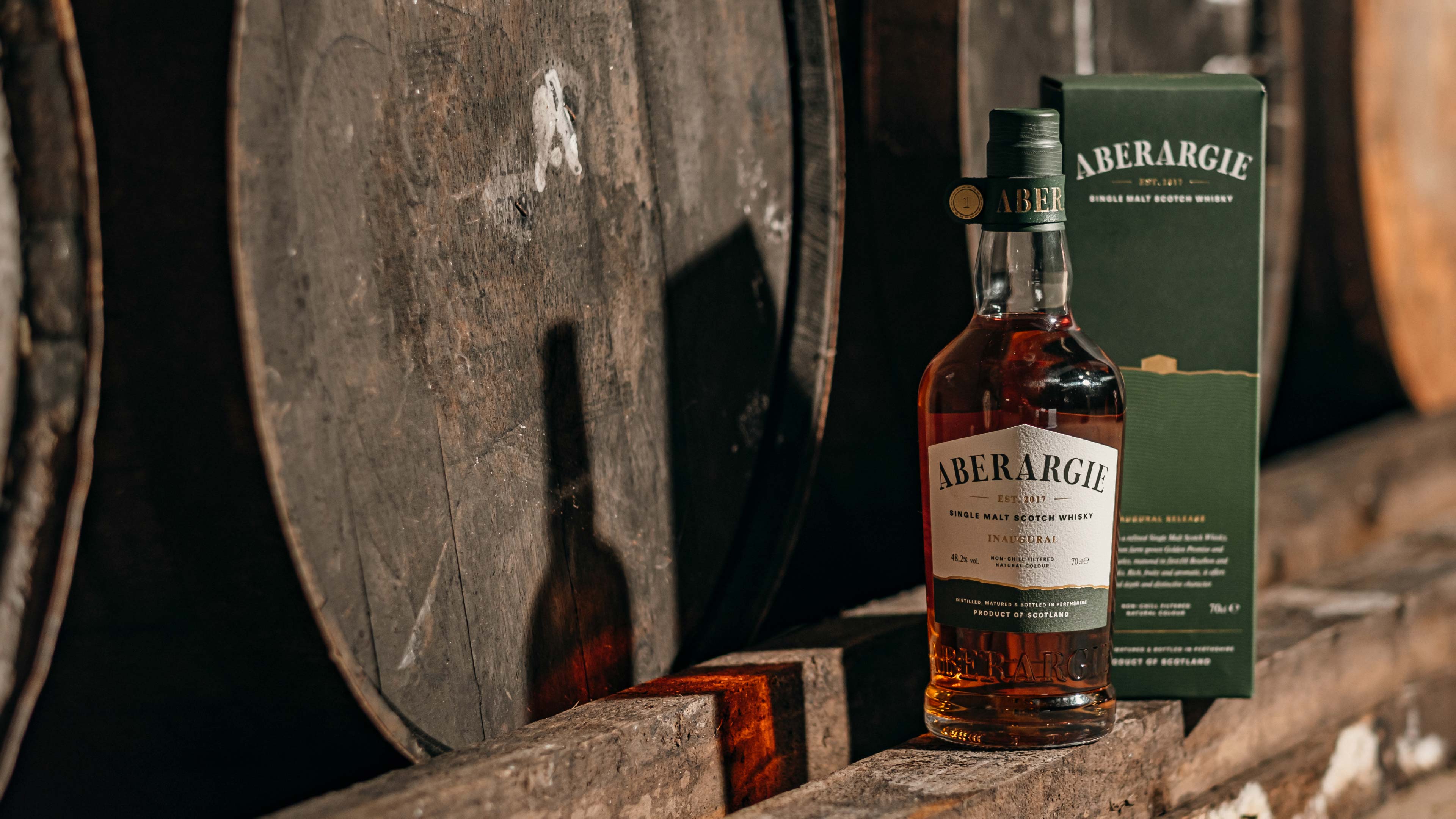
In the Lowland region of Perthshire in Scotland, Aberargie Distillery quietly set about distilling and maturing beautifully refined whisky and sought to tell their compelling story of patience and heritage through a series of single malt Scotch whisky releases. This required a brand that encapsulated the essence of their unique location and ‘barley-to-bottle’ philosophy, as well as demonstrating their deep knowledge of traditional distilling and the patience involved in crafting exceptional whisky.
Branding | Messaging | Positioning | Packaging
We worked closely with the team to build an identity around the distillery’s core values; an infatuation for what it takes to create exceptional whisky, the desire to highlight Perthshire as a geographically unique position and their wealth of generational experience and expertise.
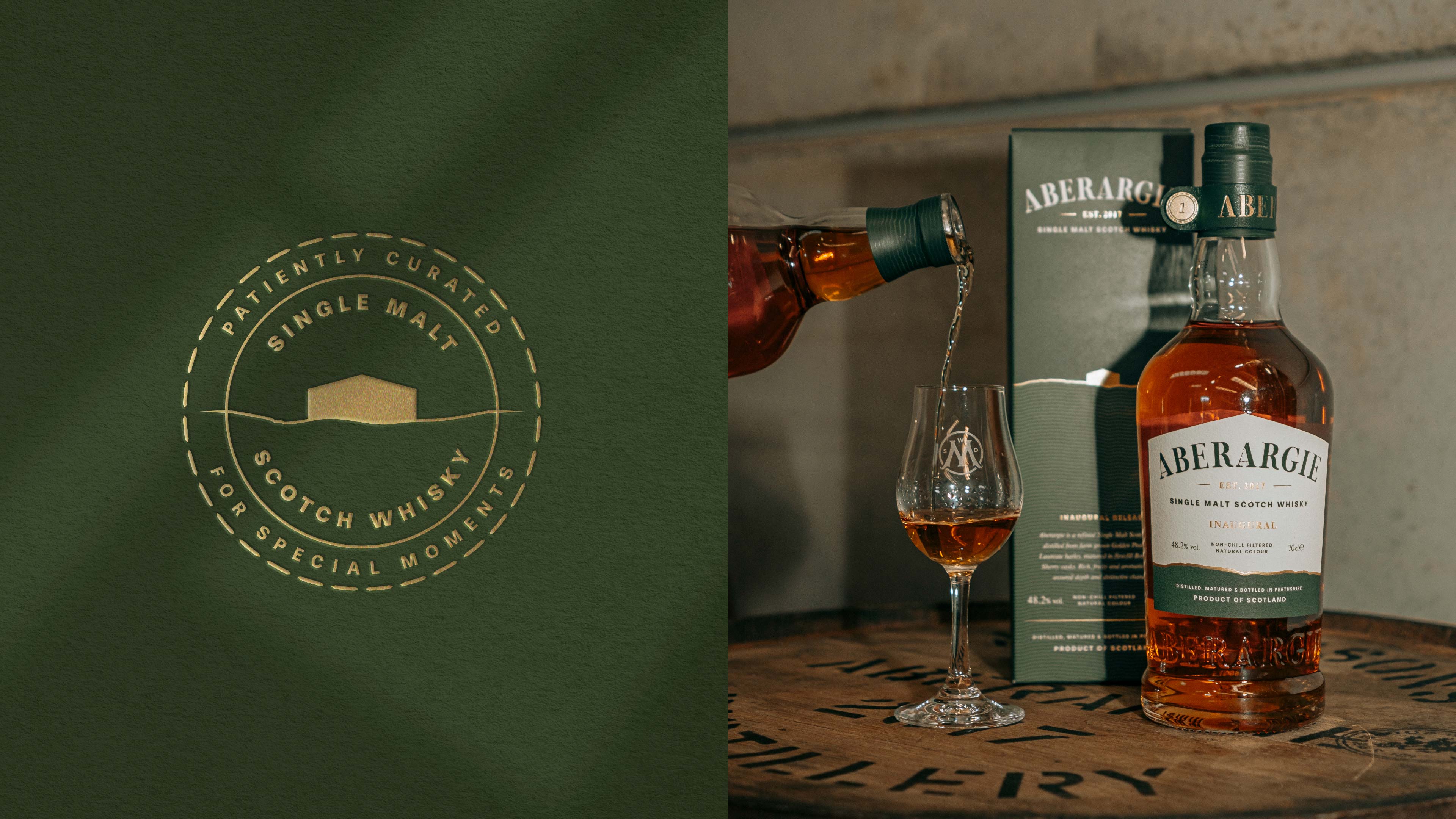
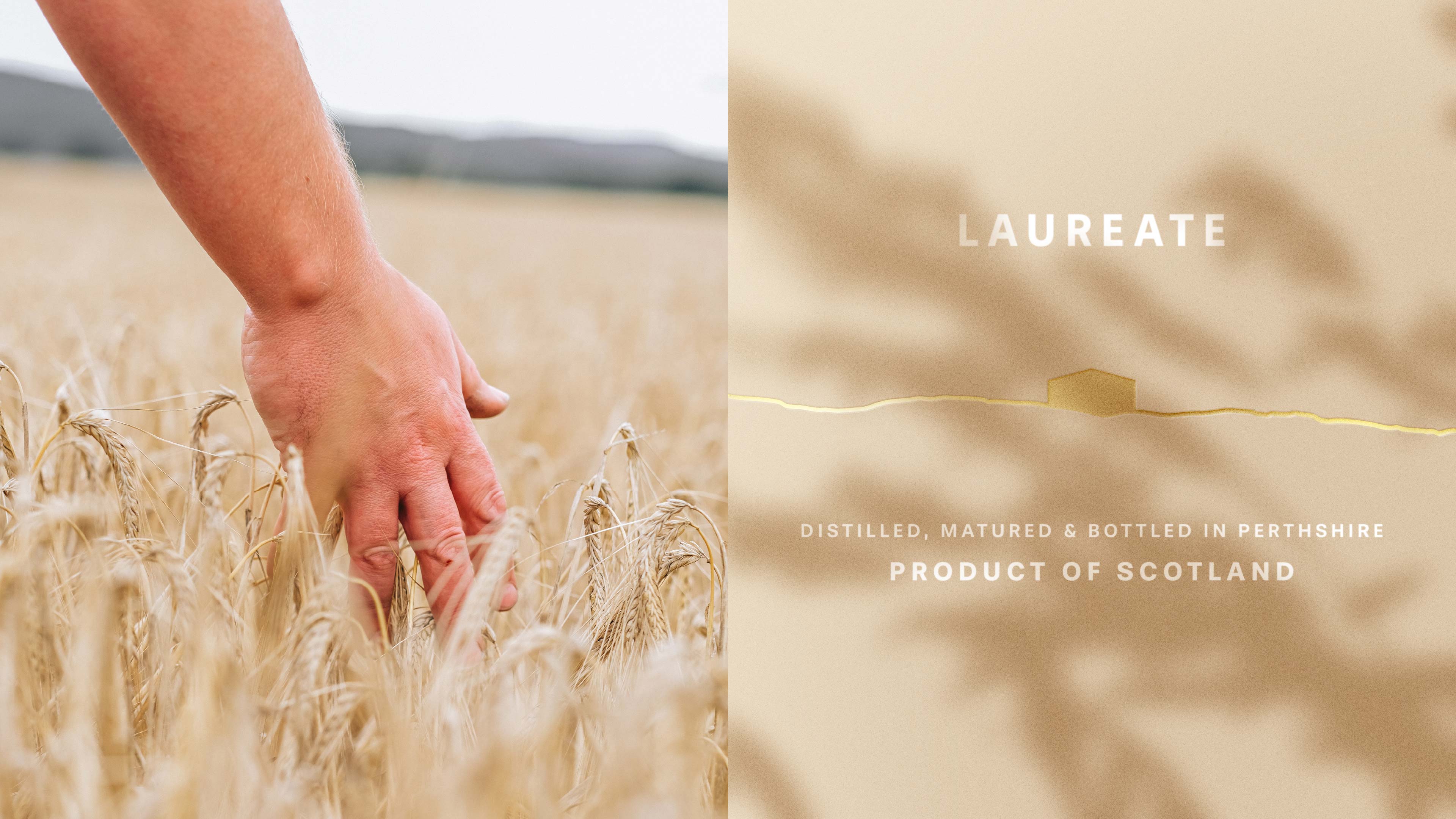
We crafted a sophisticated and informative aesthetic that appeals to both the whisky expert and the hobbyist, firmly grounding the brand in its patient, barley to bottle story. The distinctive silhouette of the distillery’s barn in its Lowland landscape forms the backdrop for the label to create an immediate and personal connection to the site. A horizon of gold foil traces the surrounding countryside and detailing on the label, elevating the design and heralding the barley and quiet dedication required to make the exceptional liquid.
“…this is truly a perfect summary of what we wanted to achieve from the start and I think Kingdom & Sparrow absolutely nailed it!”
Niel Hendriksz, Managing Director at Morrison Distillers
The final design is a physical embodiment of the distillery’s philosophy, balancing contemporary aesthetics with honest depictions of modern farming and the rich tradition of Scottish single malt whisky. The design effectively communicates the pride, patience, and essential connection to the land that defines Aberargie Distillery.
We use cookies to ensure that we give you the best experience on our website. If you continue to use this site we will assume that you are happy with it.