BOLD CANS, BIGGER IMPACT
Since its founding in 2007, Arbor Ales has been a cornerstone of Bristol’s beer scene. We’ve long admired their bold, flavour-first approach to brewing, and they came to us asking for a refresh to match!
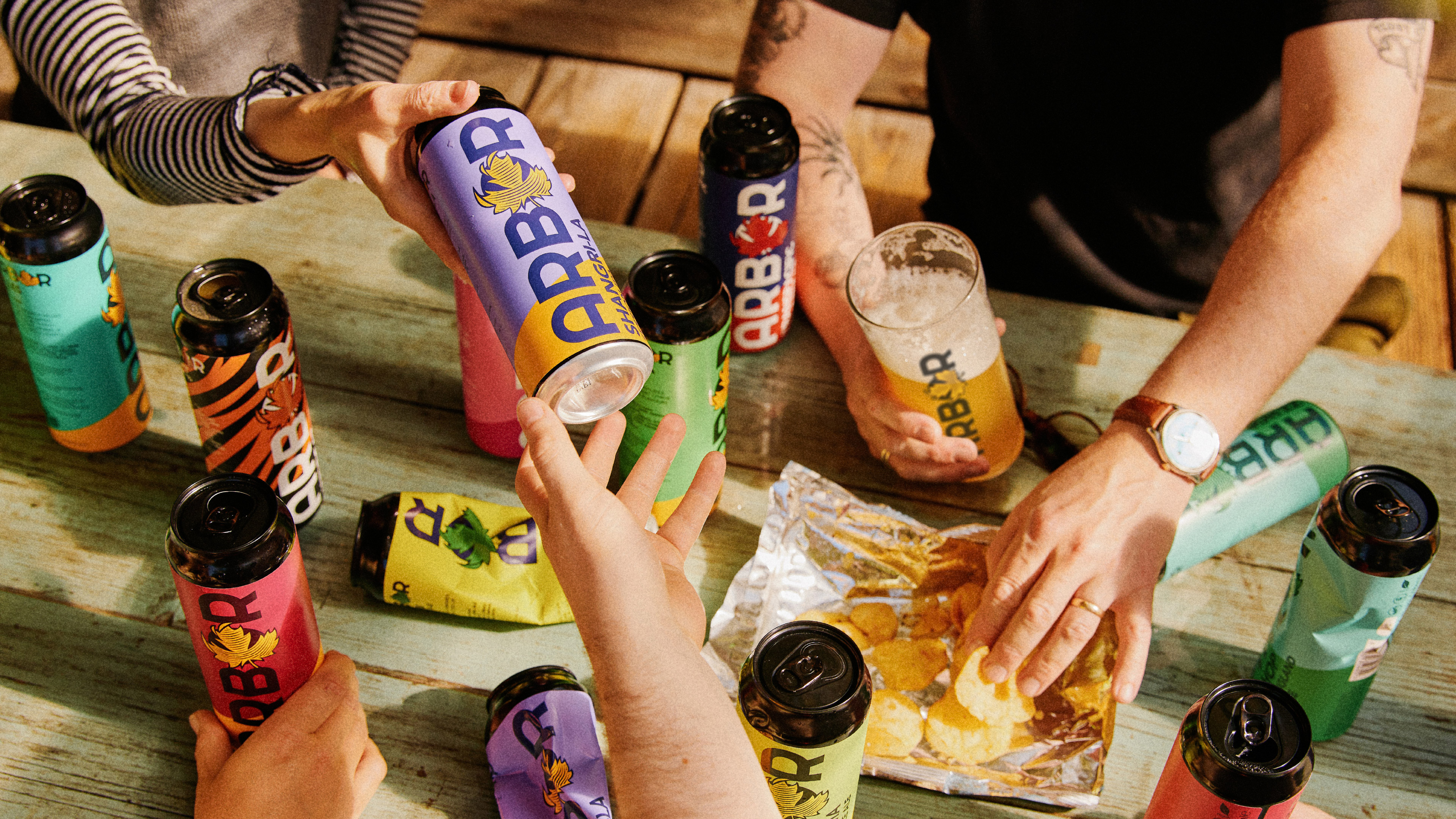
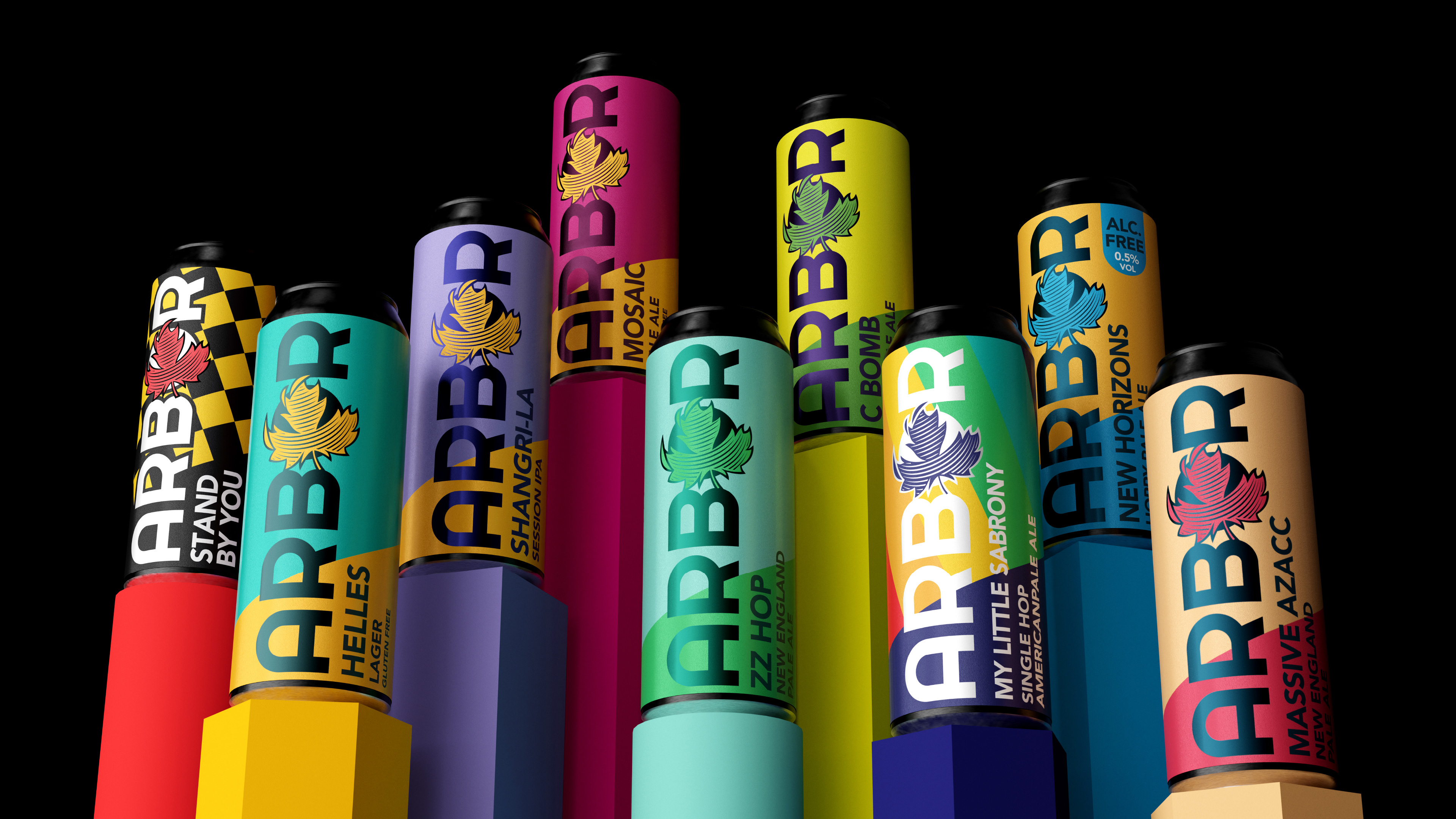
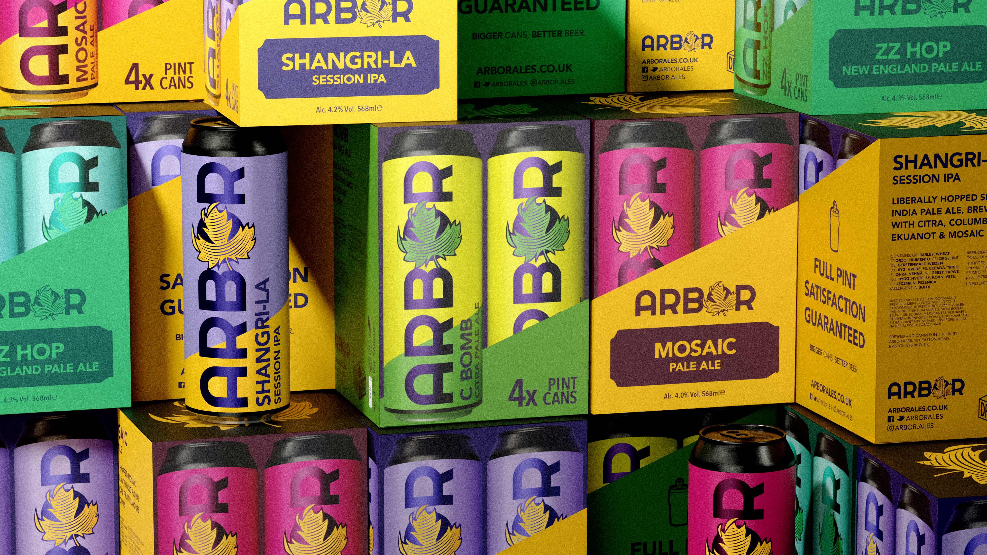
Arbor is expanding into supermarkets in 2025 so behind the brand evolution was a goal to create impact in a highly competitive and fast-evolving market. To achieve shelf standout amongst the, predominantly illustrative, craft beer market we stayed true to Arbor’s bold colourful can designs and introduced a vibrant visual system with a strong, dynamic strike of colour. This creates a clear and easily recognisable face on the shelf and allows for endless combinations for range expansion – allowing Arbor to brew and invent for years to come.
Branding | Packaging | Campaign
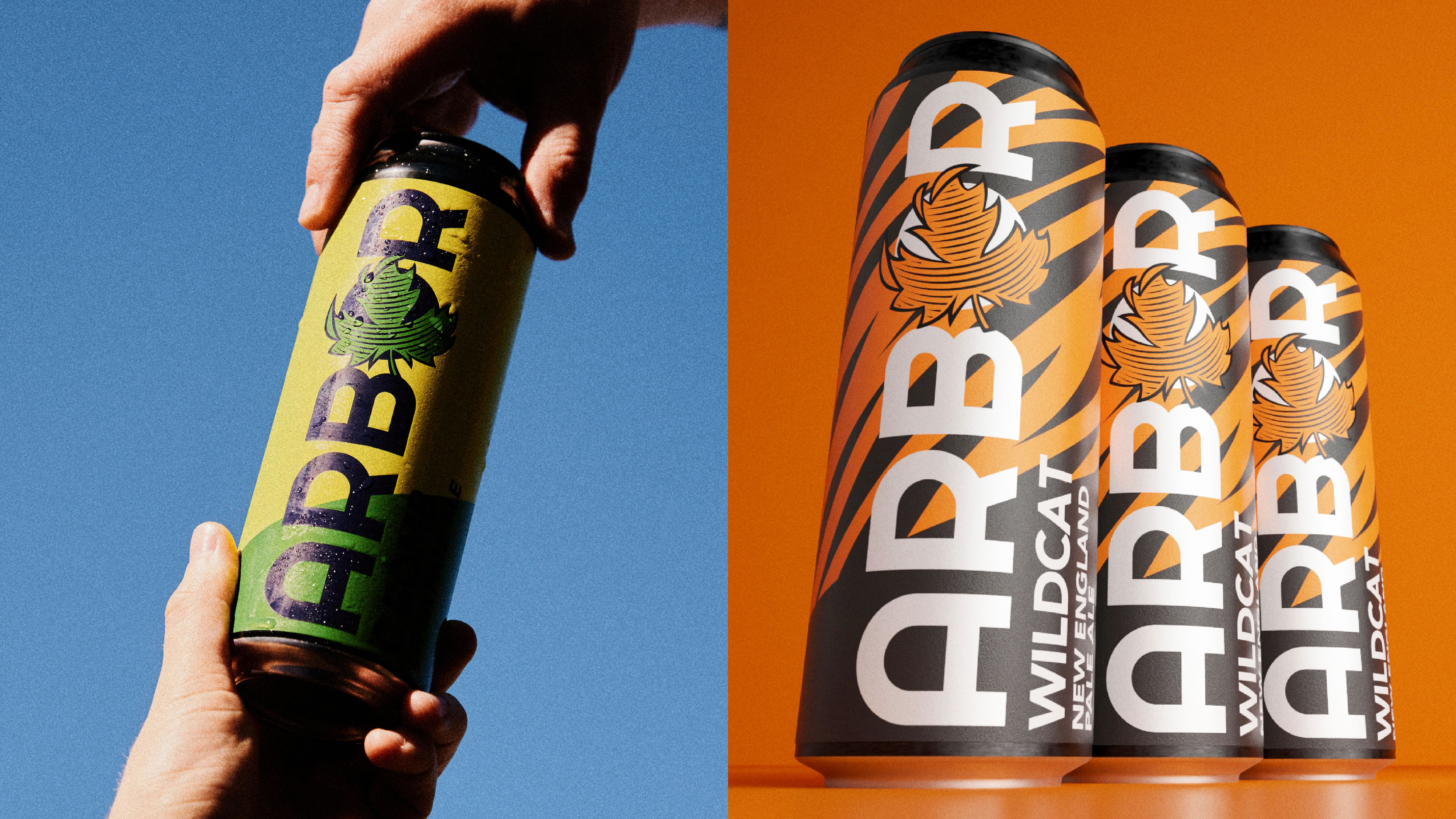
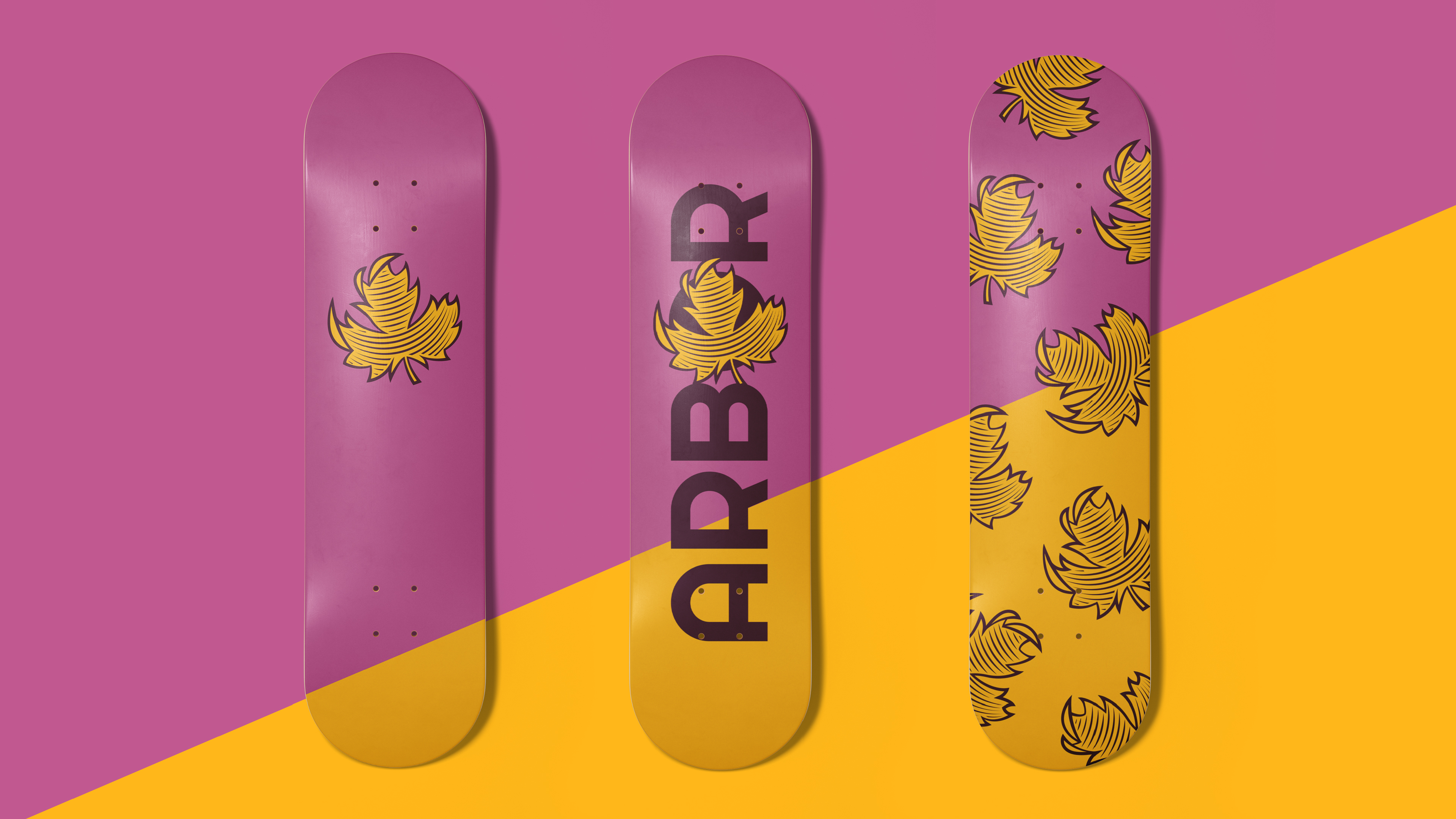
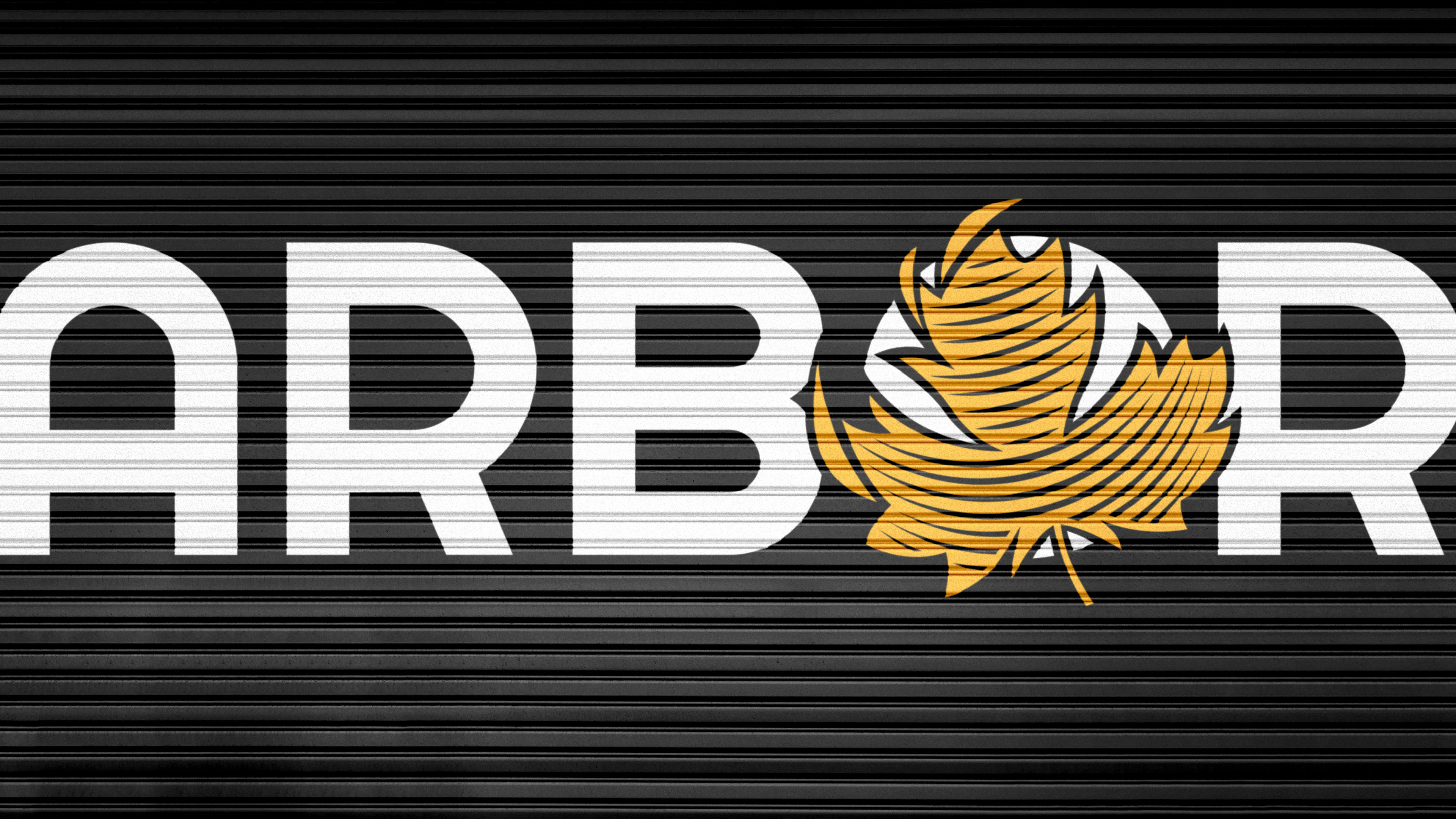
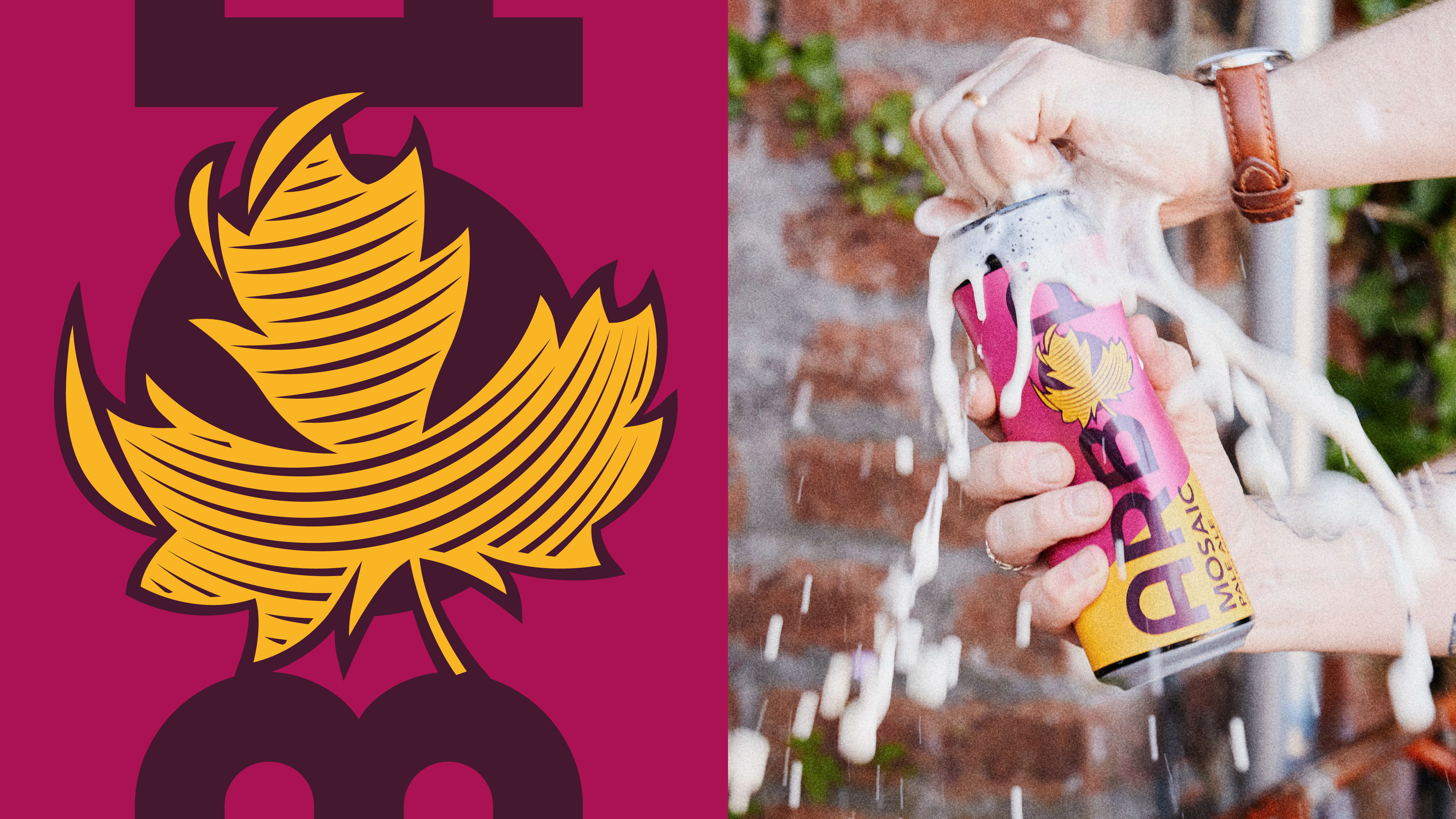
Their loyal fanbase knows Arbor for their signature maple leaf, so rather than lose that strong recognition, we evolved it. It firmly holds its place on front-of-pack but has been emboldened and made contemporary – satisfyingly balanced in place into the new logotype.
“Working with Kingdom and Sparrow has been an absolute joy. We went through many design agencies before K&S, as they simply couldn’t grasp the ‘Arbor voice’. However, within a few meetings with K&S, it felt as if they fully understood and appreciated the brief, and they executed it in record time. We didn’t have to go through many iterations, at all, to get to the final goal, and we couldn’t be happier with the result!
I would have no hesitation in recommending K&S’s services; they’ve made a great brand stand out even more, and the feedback we’ve had from everyone has been amazing.”
Meg Oliver, Co-Founder & Sales Director
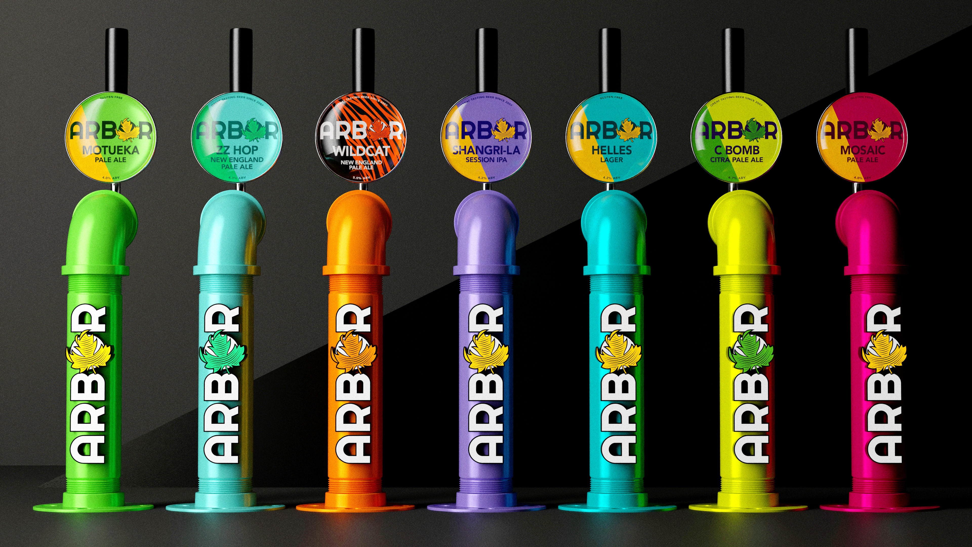
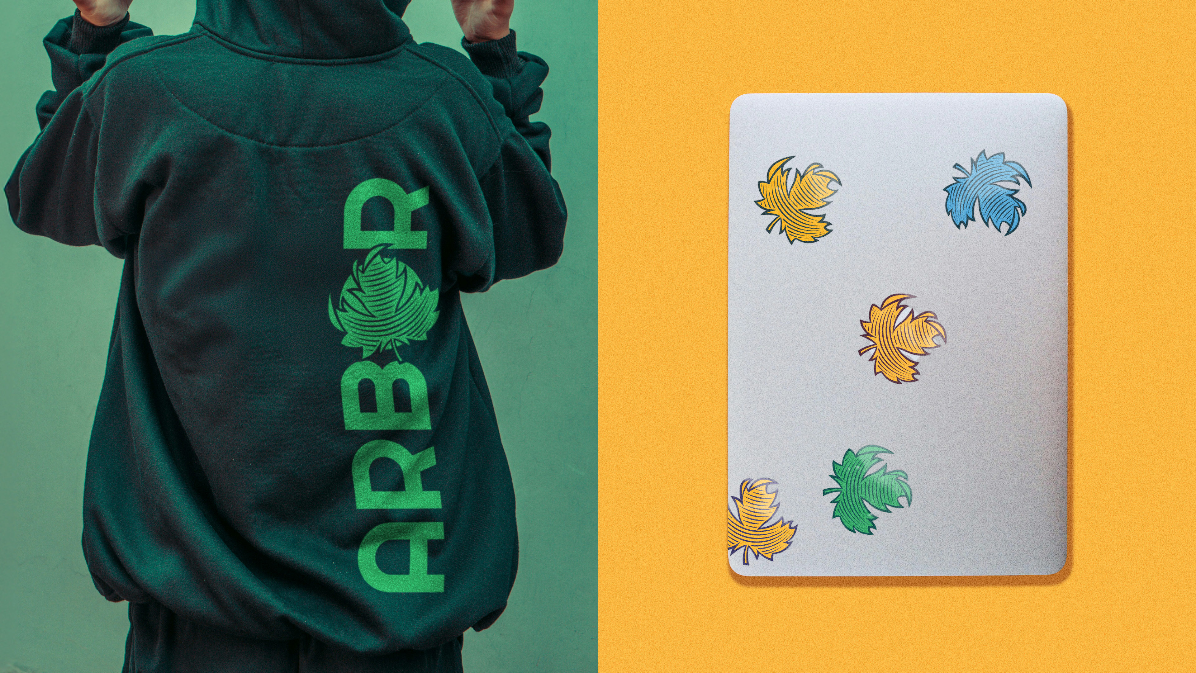
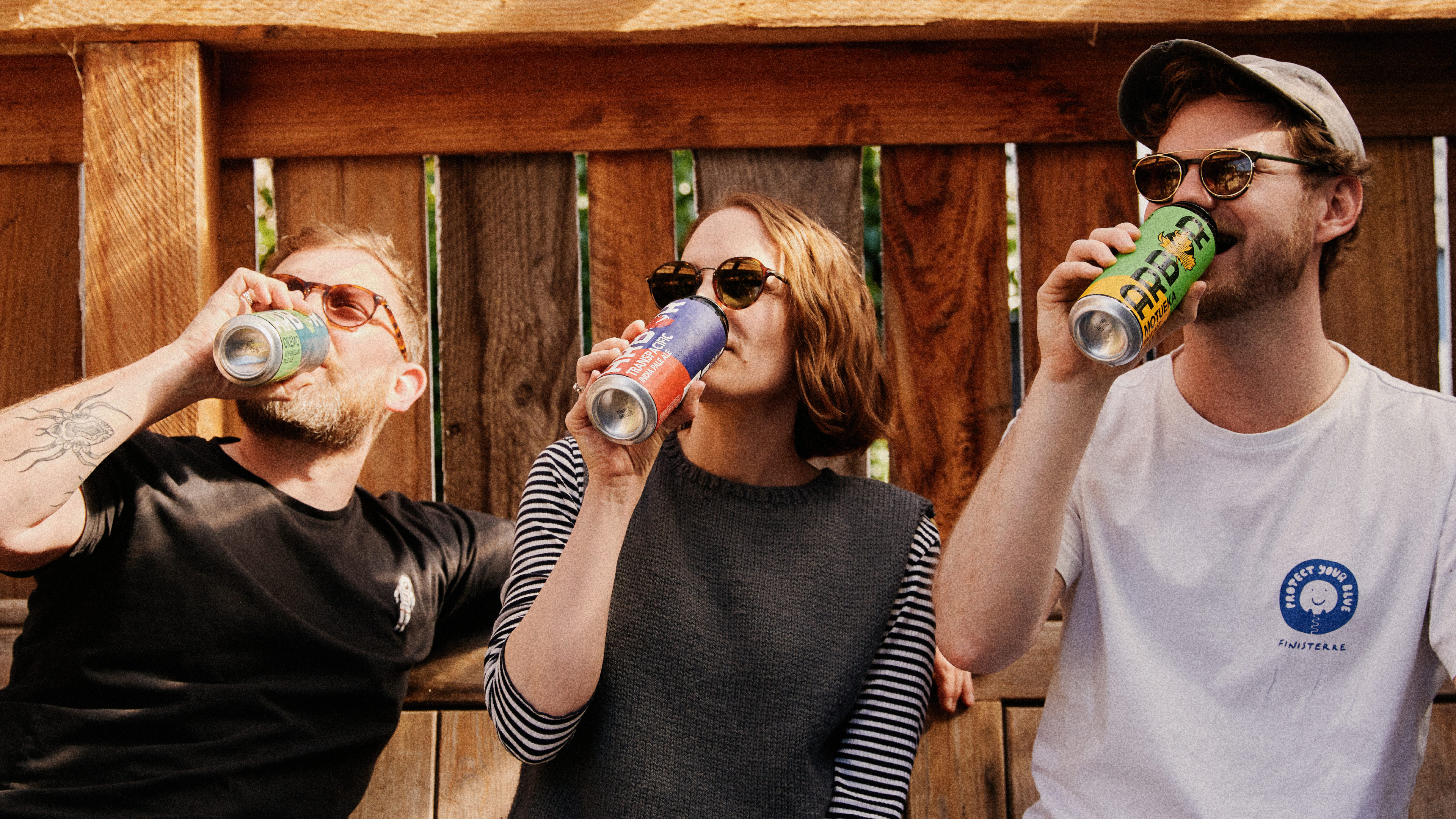
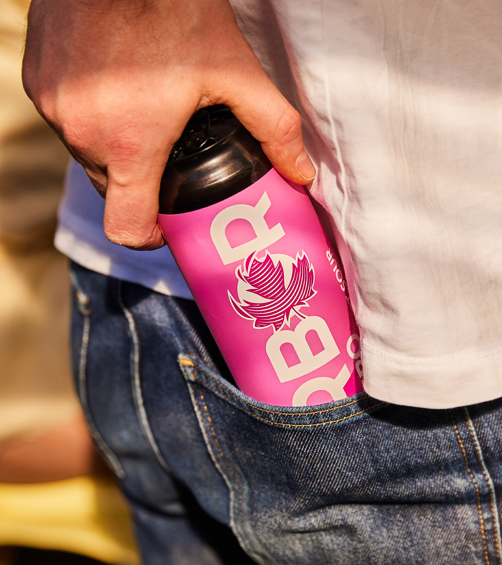
With Arbor’s supermarket debut in Tesco and Sainsbury’s on the horizon, we created a visual campaign to launch them into stores that celebrated their clear market differentiator – the pint can! We created imagery using towering perspectives that showed off the size and colourful presence of the rebrand.
Our process dialled up the ‘full pint satisfaction’ messaging and assured Arbor’s distinctive positioning in the beer aisle through a bold, dynamic identity and packaging design.
