Challenging the dominance of Scotch in the world of whisky
Cheshire based, Weetwood distillery wanted to challenge the belief that a good single malt whisky needs to be produced in Scotland.
We needed to create a distinct and ownable brand that looked like a trusted whiskey, without the tropes of Scotch.
Naming | Branding | Packaging | Guidelines

The Concept
The Cheshire; obviously English, but also reflective of the unique geography and its contribution to the production of the liquid. The unmistakable history displayed in Cheshire’s architecture gave us the right tone of heritage with evolution.
The Impact
“After previous projects, we had no hesitation in choosing K&S to create our Single Malt Whisky brand. They combine category understanding, real-world awareness and most importantly, creative excellence… the whole brand package is universally positively commented upon.”
Phil McLaughlin, Weetwood Brewery & Distillery, CEO
Positive Change
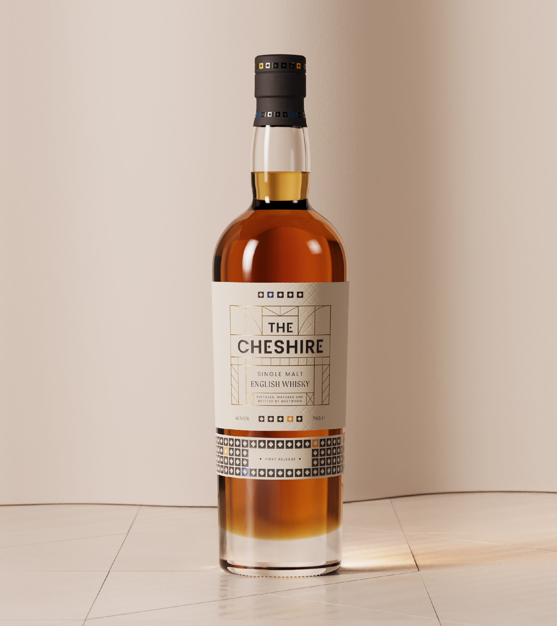
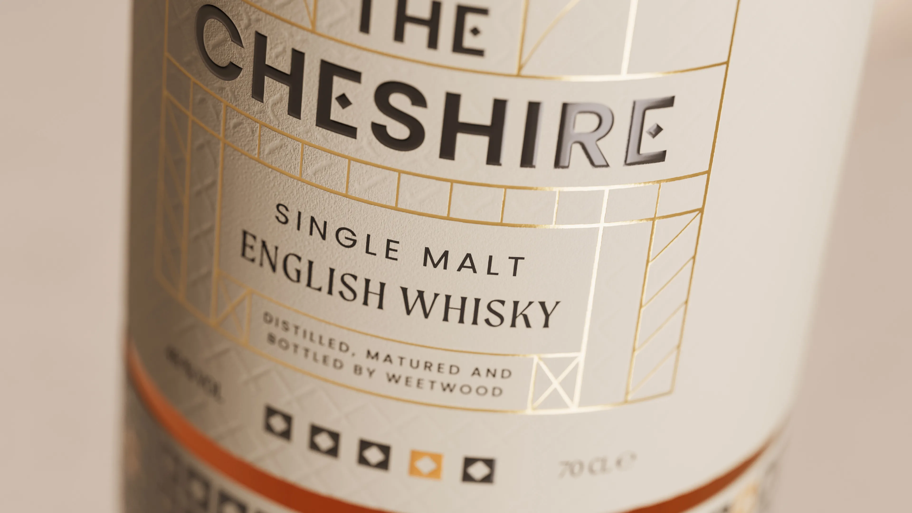
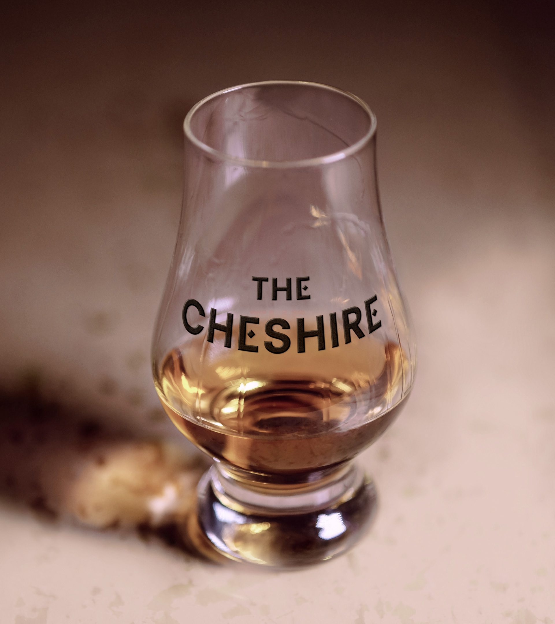
Our logo creation was influenced directly by the striking boldness of medieval timber buildings alongside ornate Victorian patterns visible across Cheshire’s towns and cities. The strong, solid, caps typeface reflects the black timbers and letters and are completed with small squares, hinting at the geometric Victorian patterns from flooring and stained glass.
The logo inspired the development of a bespoke font for the brand, where the bold typeface is embellished with our square ‘tile’ asset. A more traditional, serif typeface is utilised as a secondary typeface to reflect the heritage we wanted to embody.
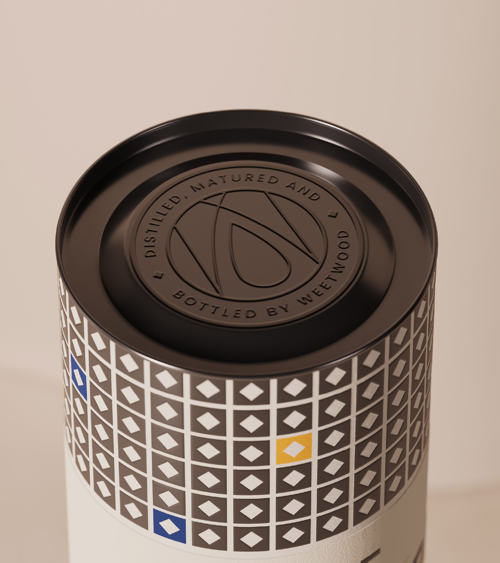
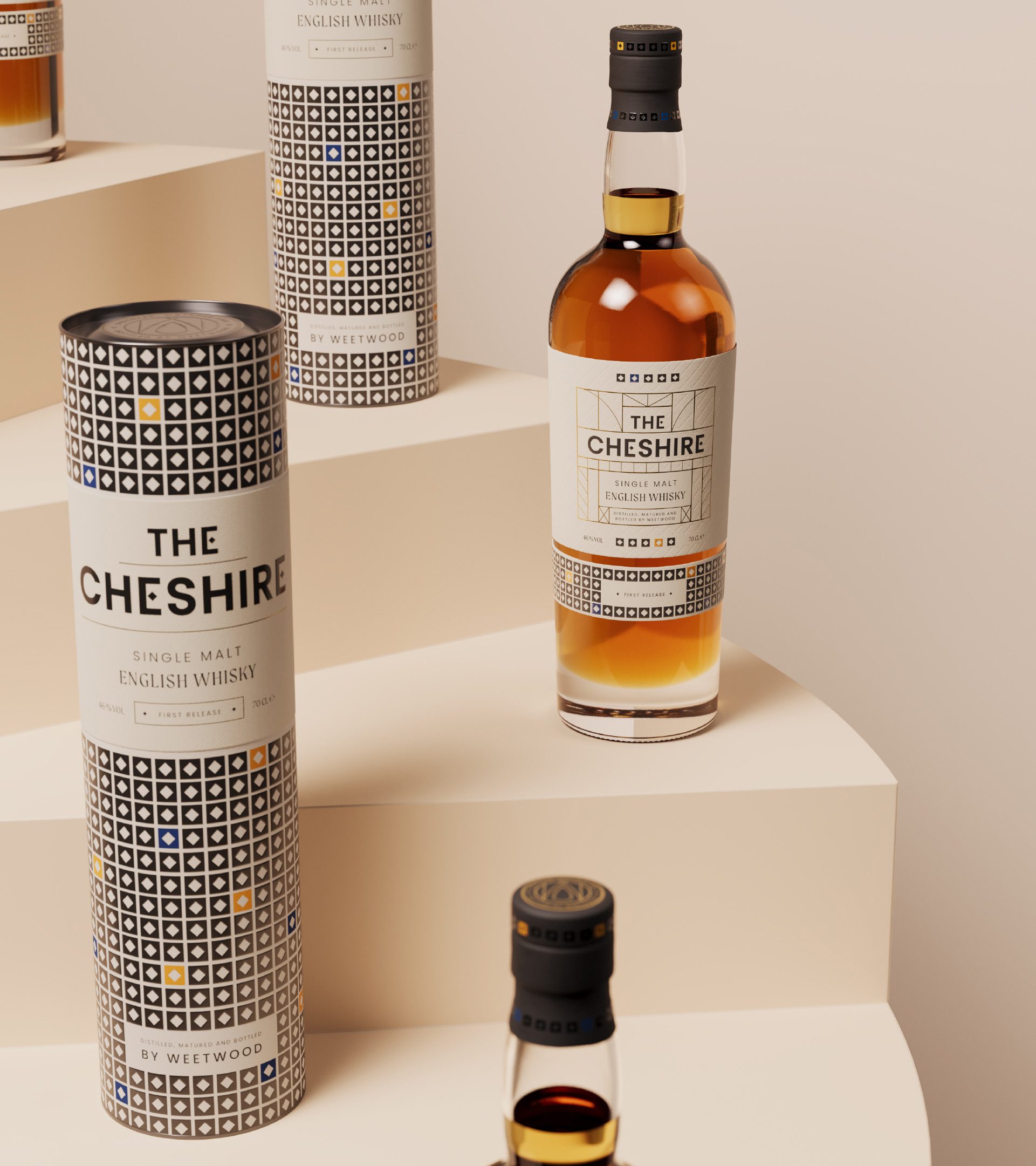
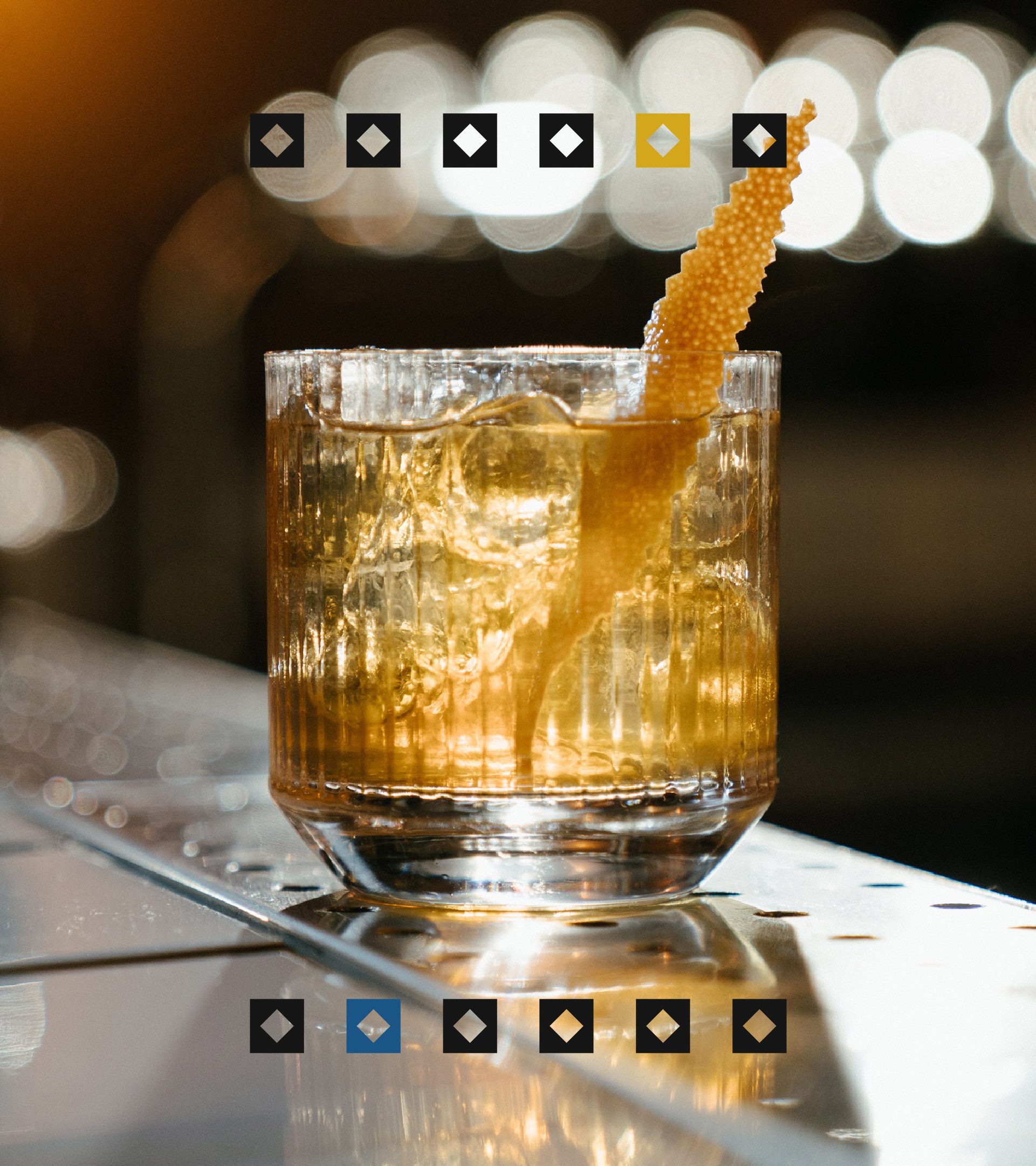
Our ‘tile’ became the literal cornerstone of our brand design. It is used to break-up copy, introducing detail and interest as well as the splashes of colour from our palette. It is also used to create real ‘off-the-shelf’ impact as a repeating pattern on the premium tube the bottle sits in.
Gold foil finishing on some finer details of the design again reflect the premium nature of the product.
A subtle, but beautiful, pattern on the front of the label is inspired by the patterns from Cheshire’s timber-framed buildings.
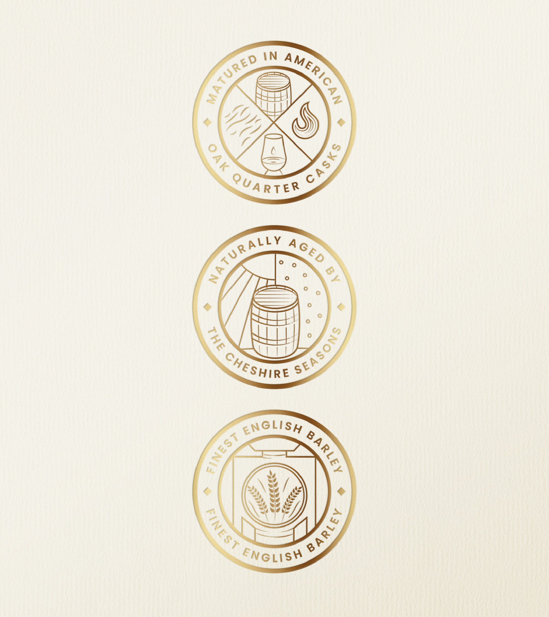
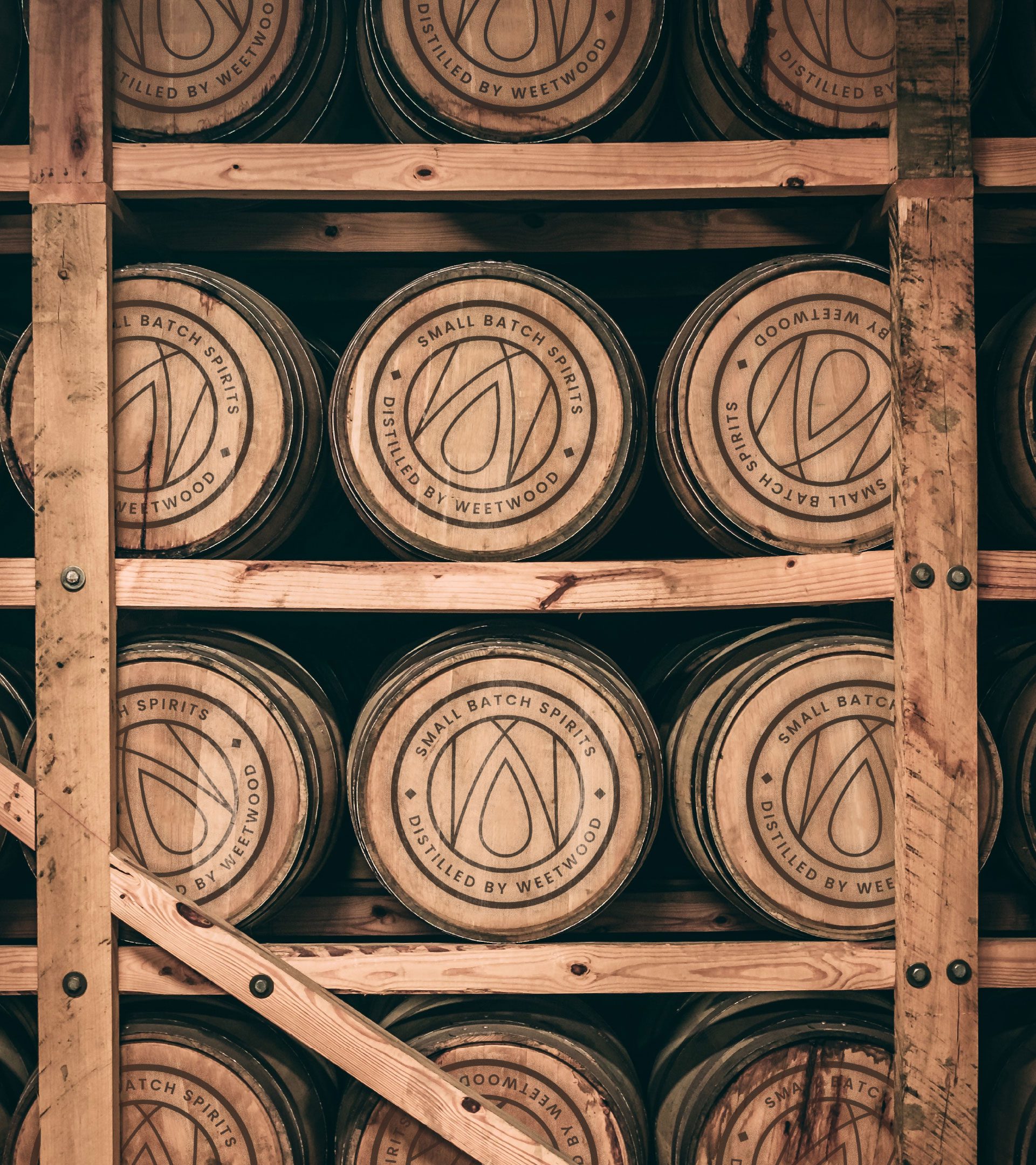
Bespoke ‘stamps’ link the product back to Weetwood, whilst also providing storytelling of the process and provenance of the whisky. Our master stamp is also on the top of the bottle and tube cap.
Holly, Designer