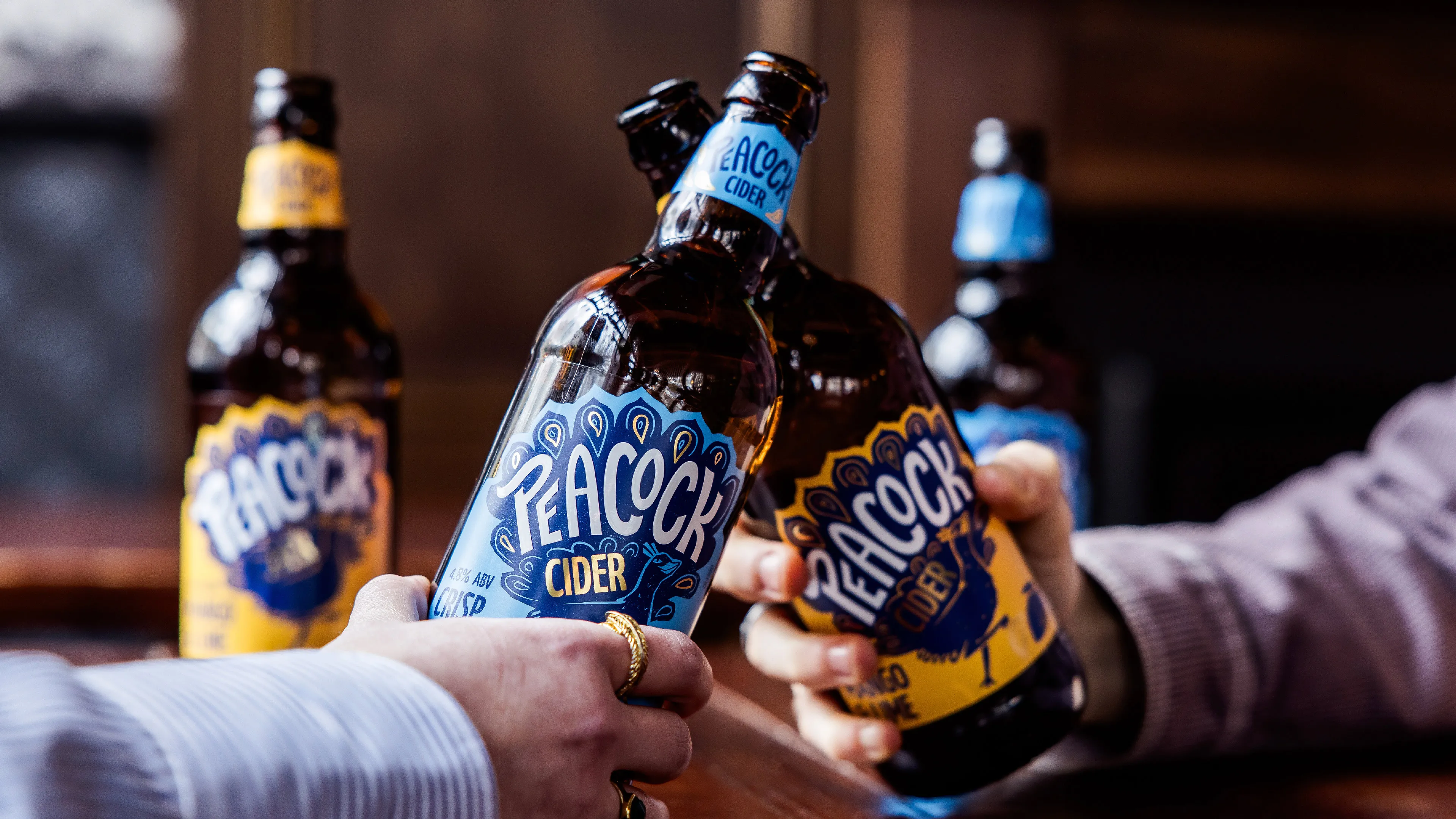
When long-standing clients of ours, Kingfisher Drinks, approached us with a cider brand that was all about taste, but didn’t have the category recognition that it deserved, we asked, why not… be more Peacock?
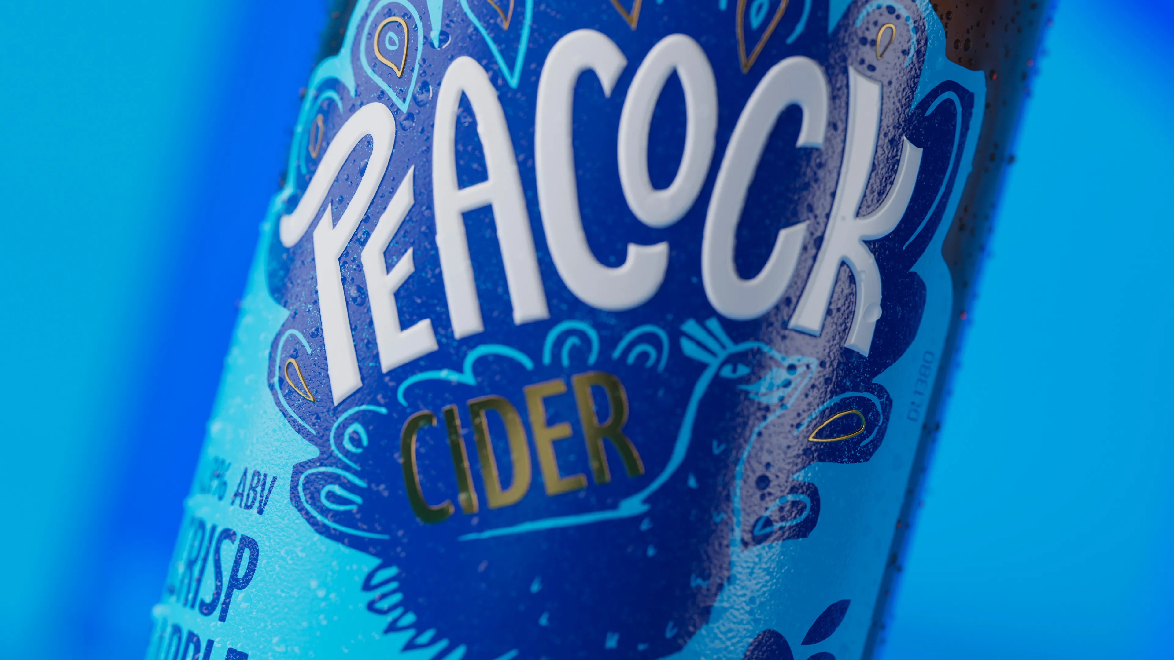
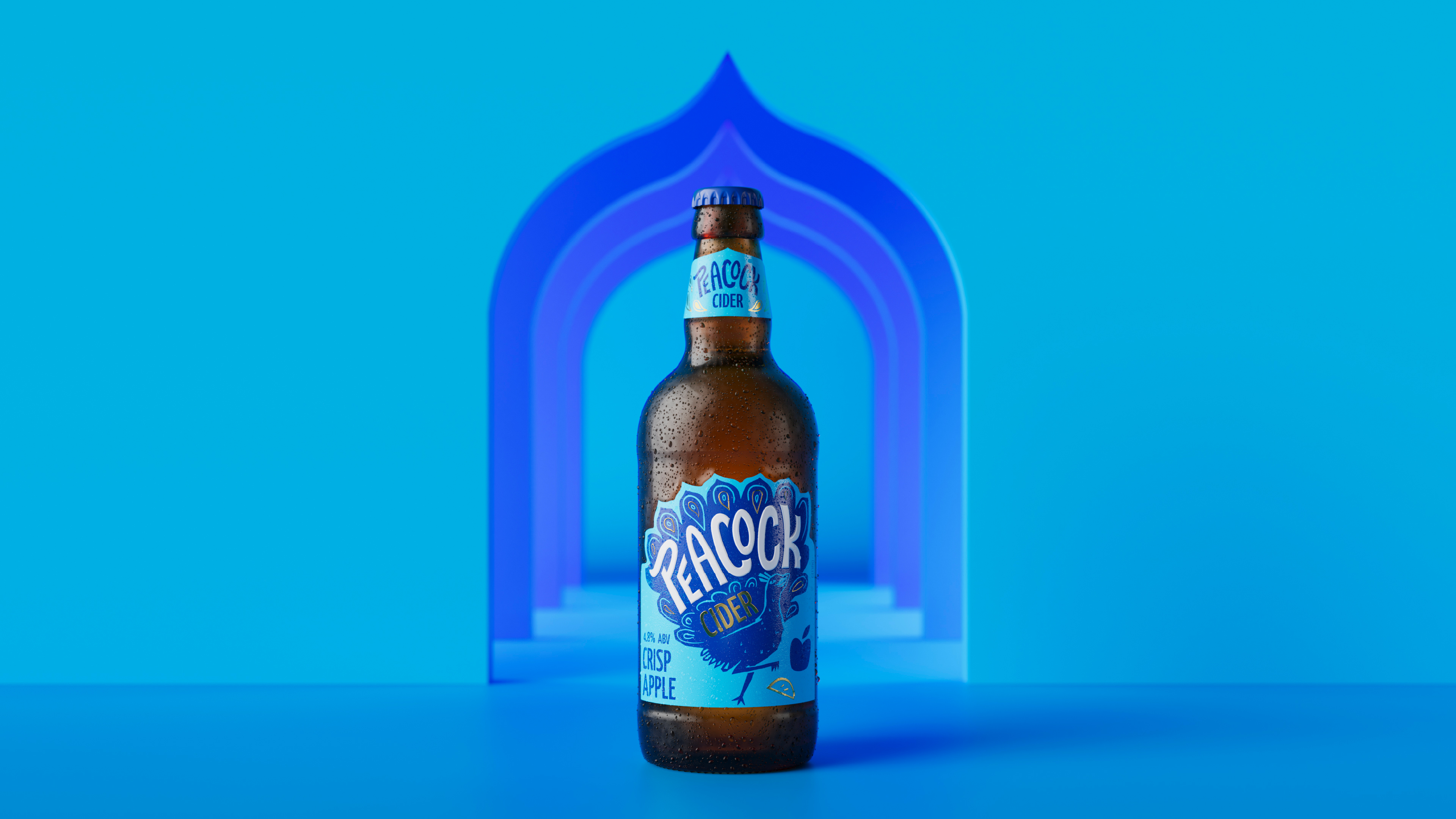

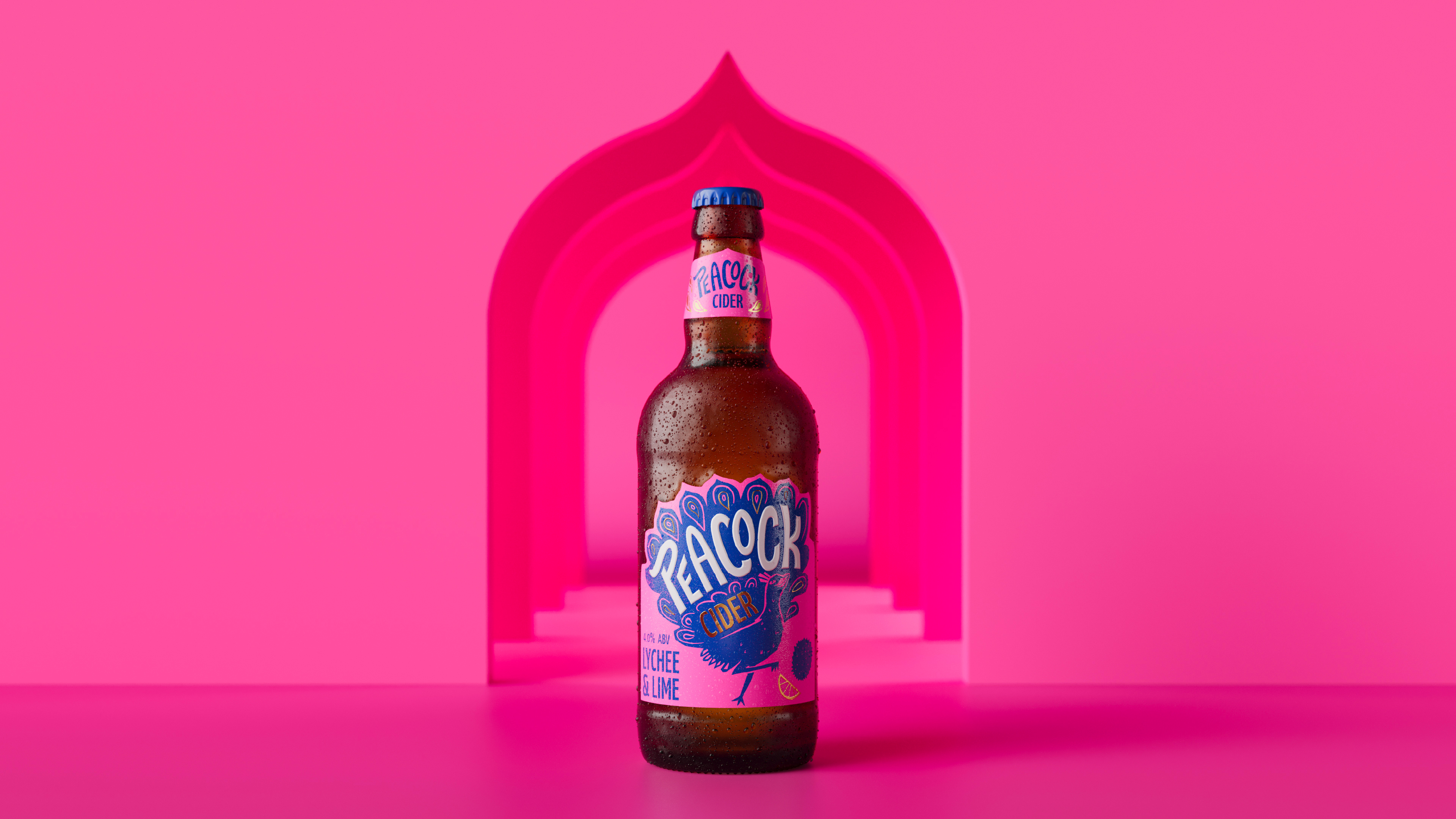
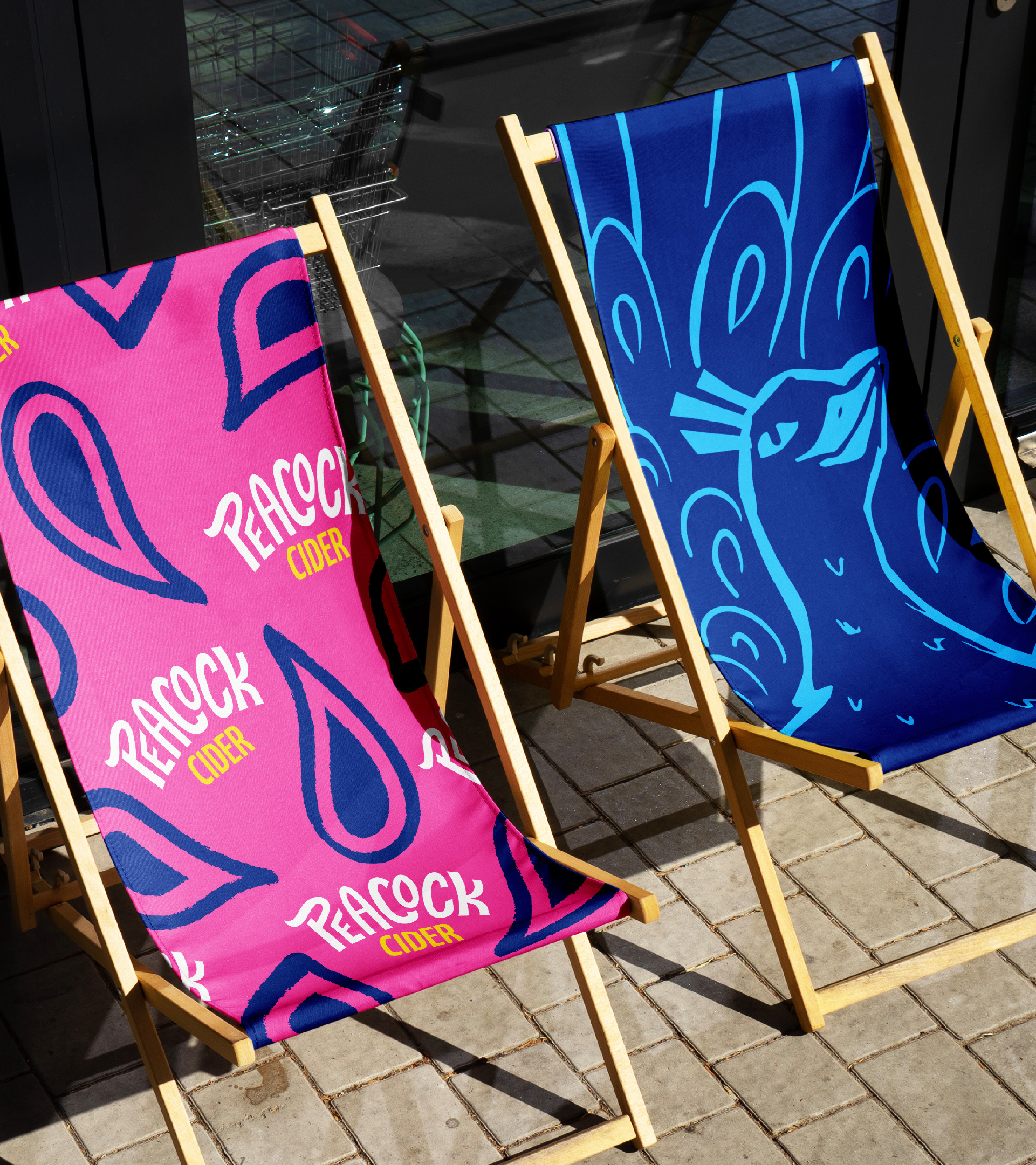
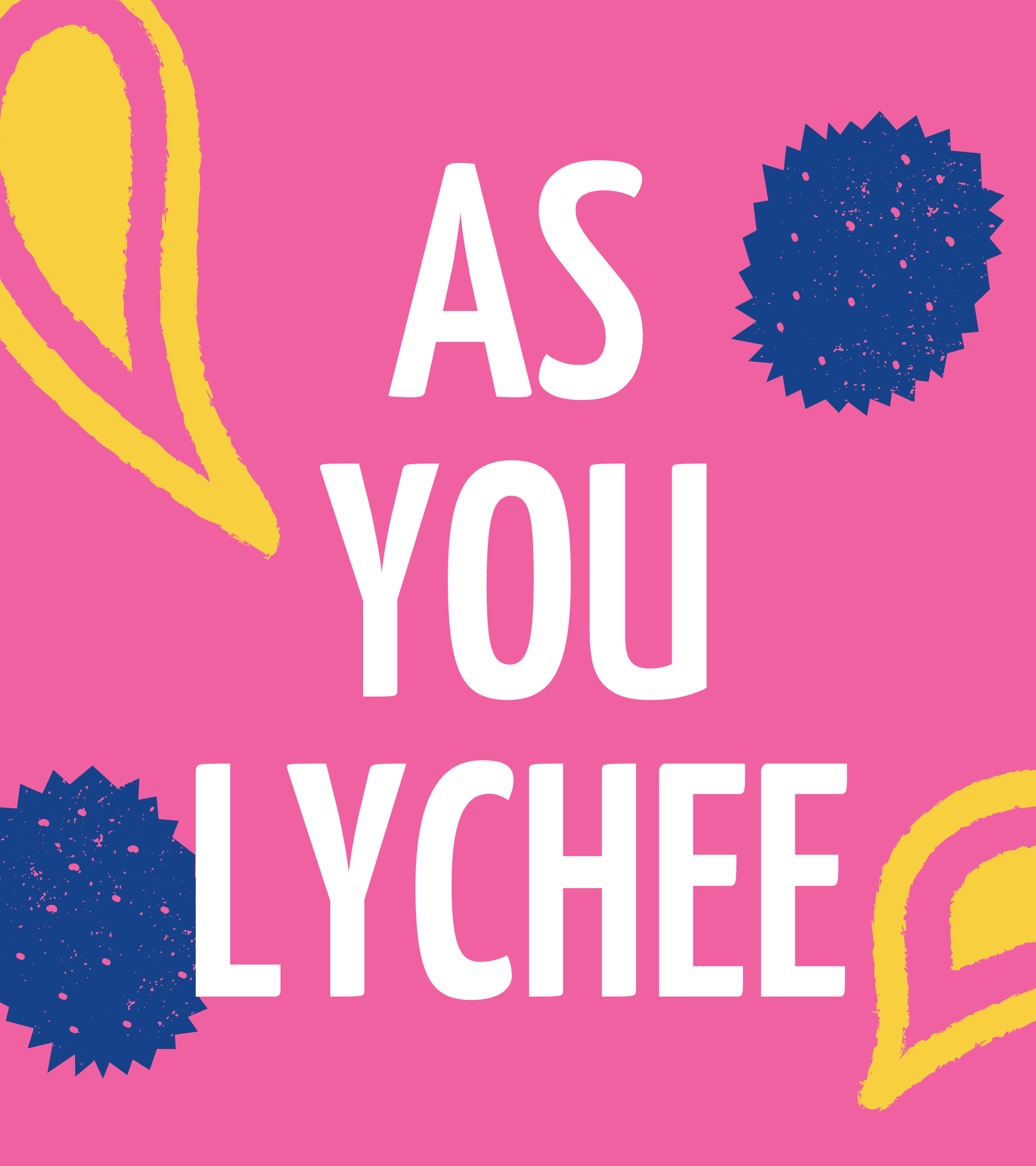
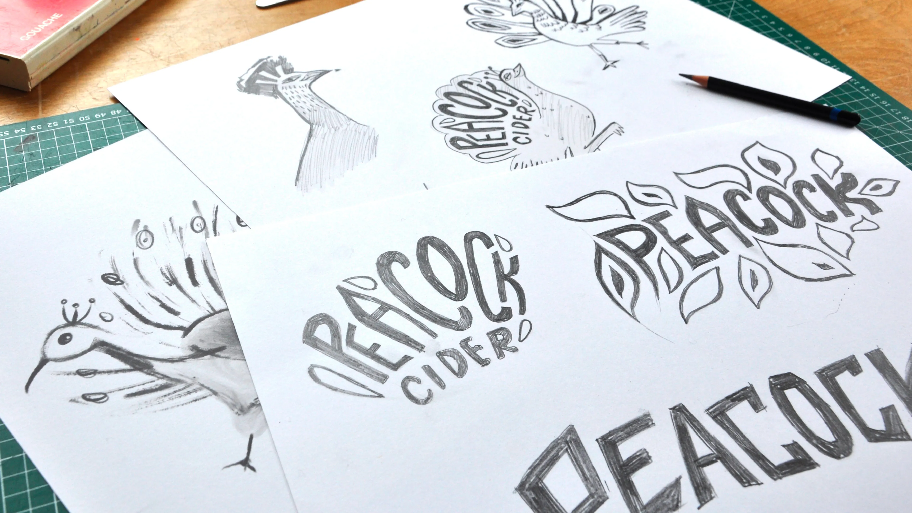
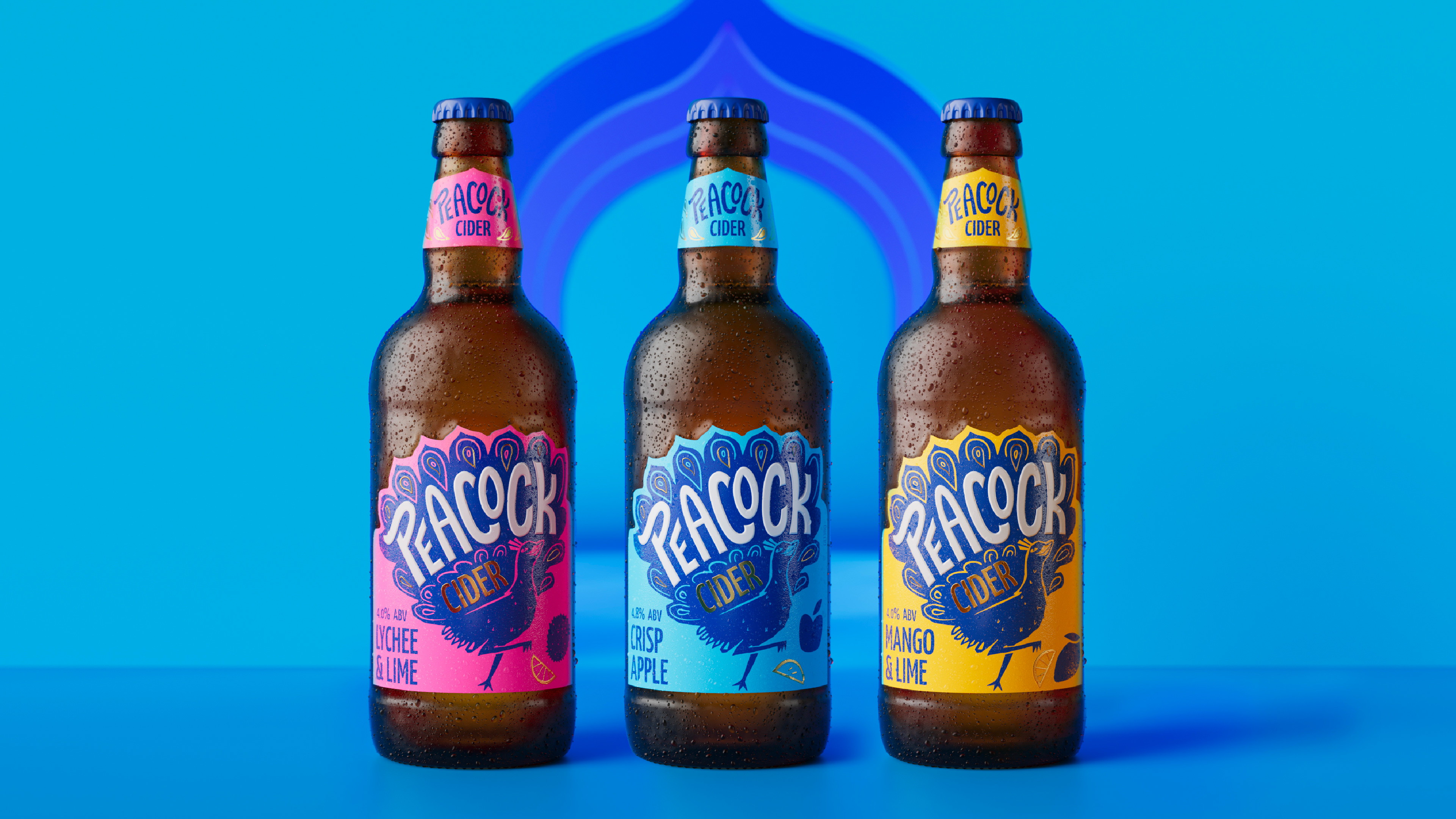
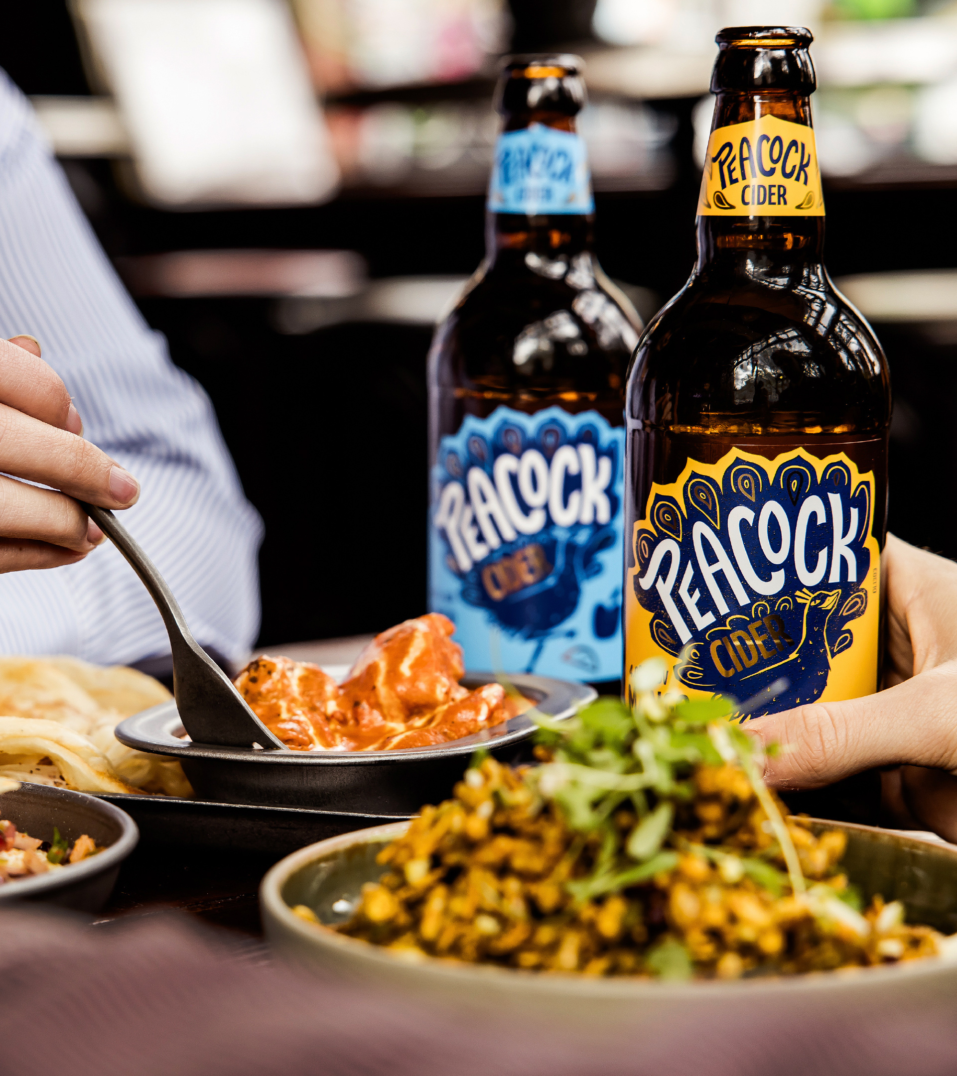
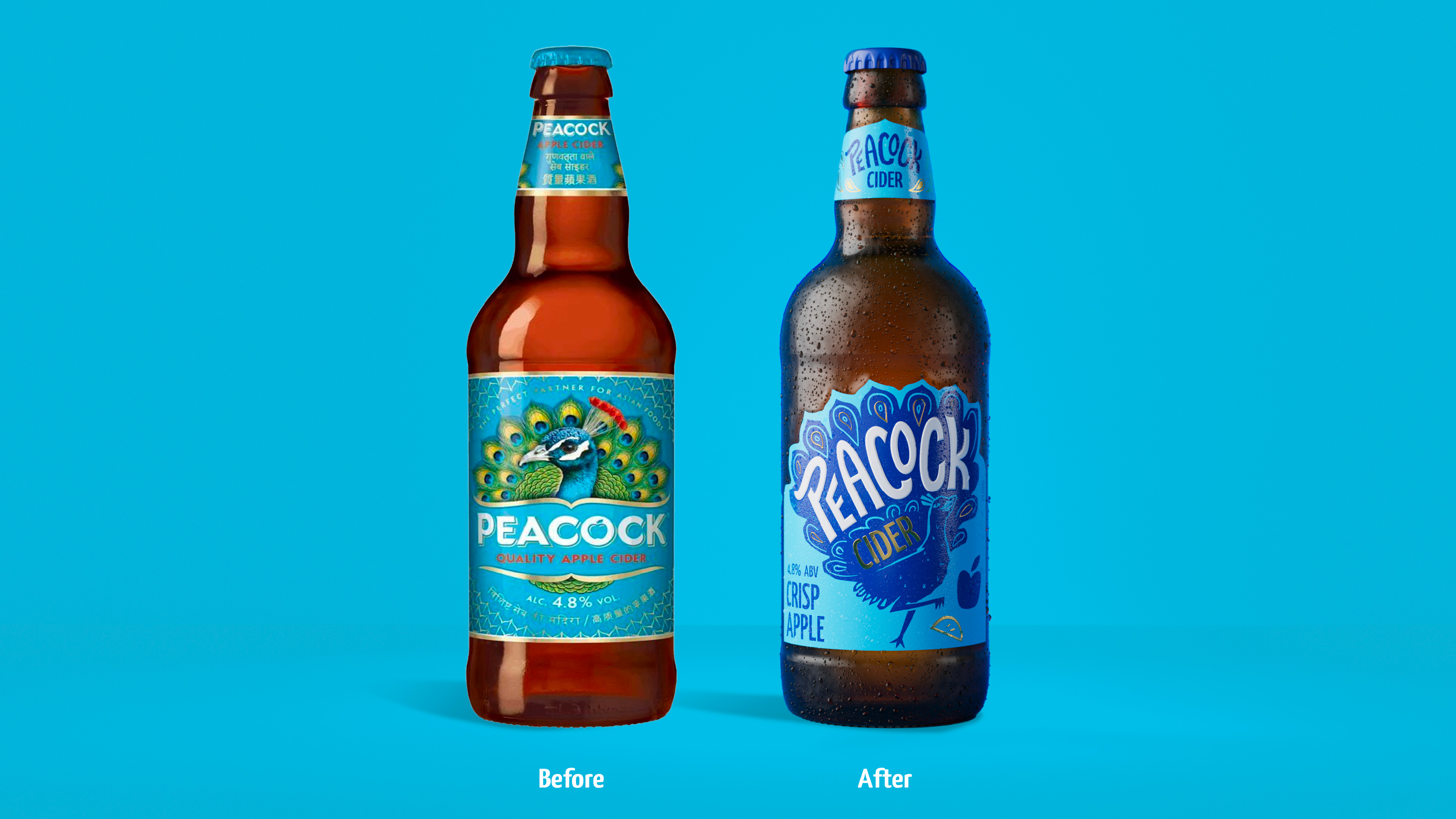
On-pack, the brand builds on its reputation in the on-trade, by retaining its striking colour palette and dialling up the zesty flavour profiles with fruity, gold, spot illustrations. The packaging now speaks better to the 60% of cider drinkers who prefer a flavoured cider, and gold foiling and embossing increases the premium feel, communicating quality to the 87% of cider drinkers who will spend more if they know the quality is second-to-none. Leaning into the liquid’s Pan-Asian character, the label features a unique die cut that references architecture and the brand’s Asian background. Also echoing the Peacock’s tail feathers, the label shape gives a point of difference to cut through in a competitive bar and restaurant environment. The hand-crafted wordmark distinguishes itself by featuring subtle gestures to the brand’s roots, and reminds the consumer that while the brand grows a broader consumer base, it continues to be the cider of choice for pairing with Asian cuisine.
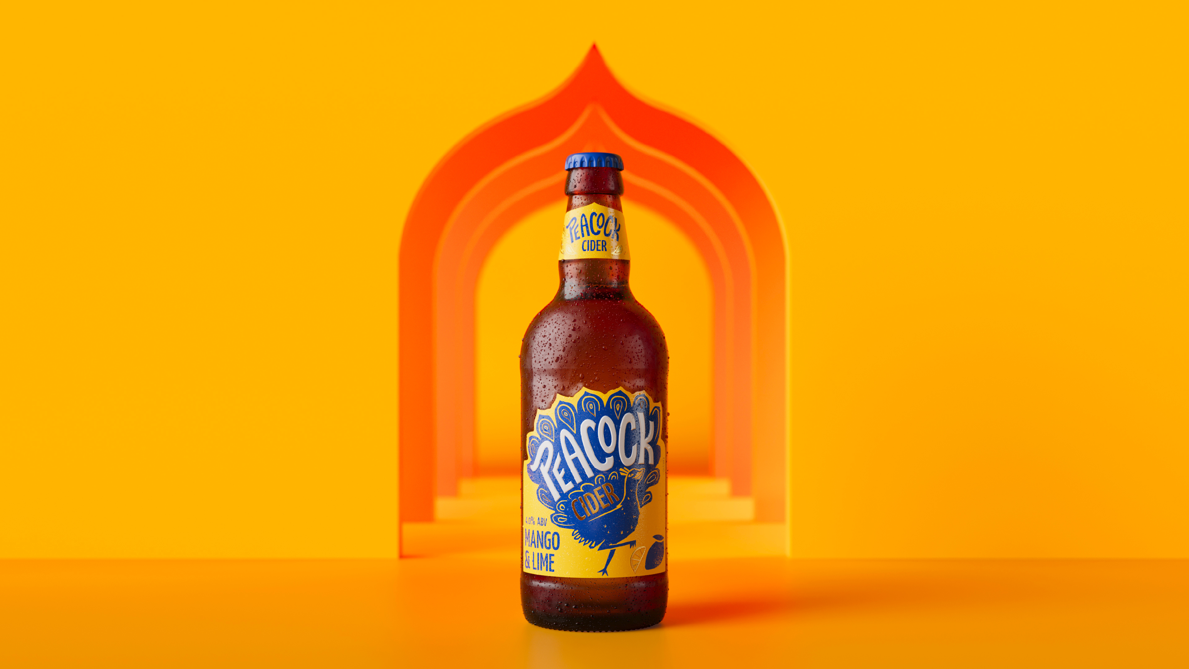
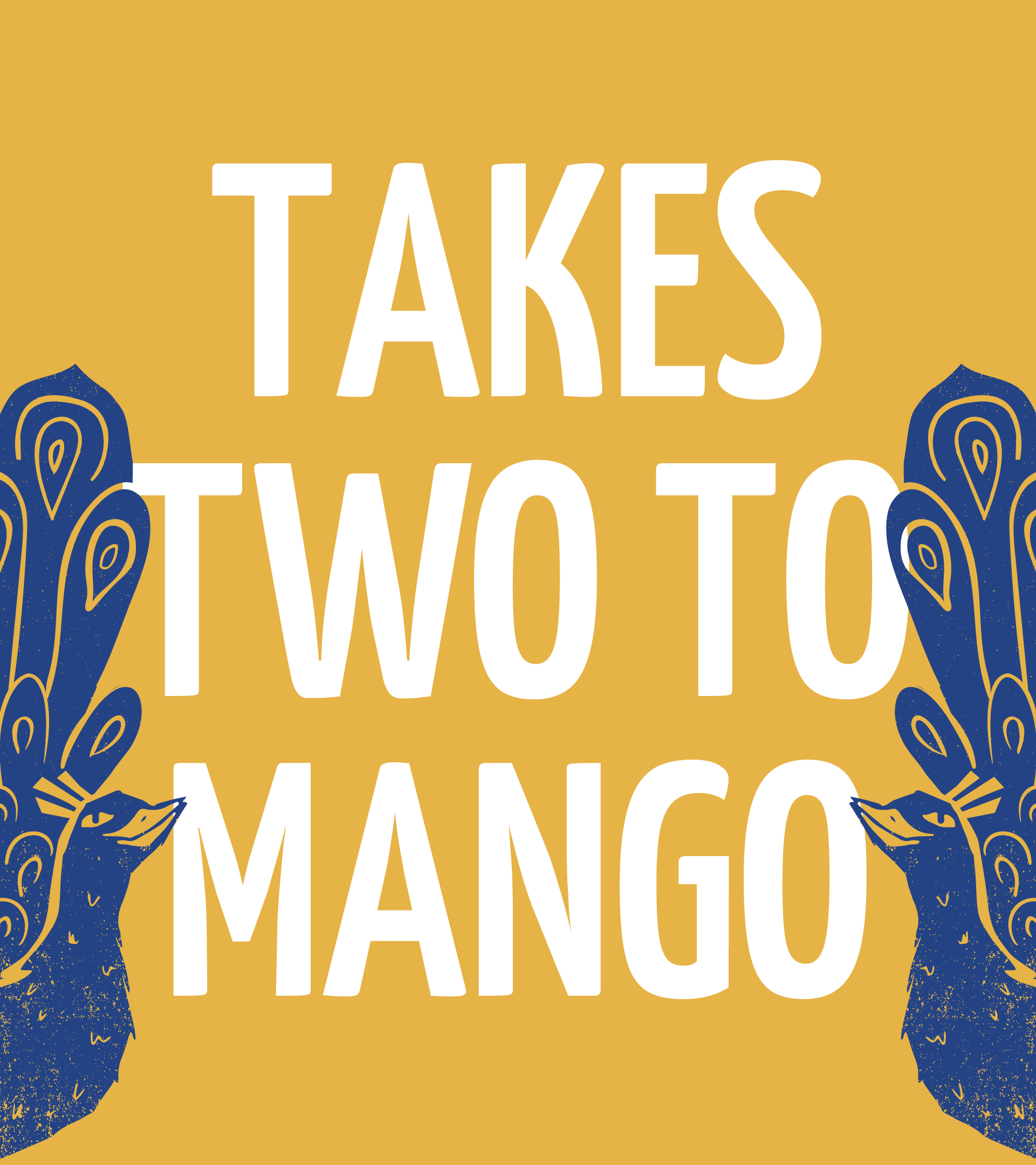
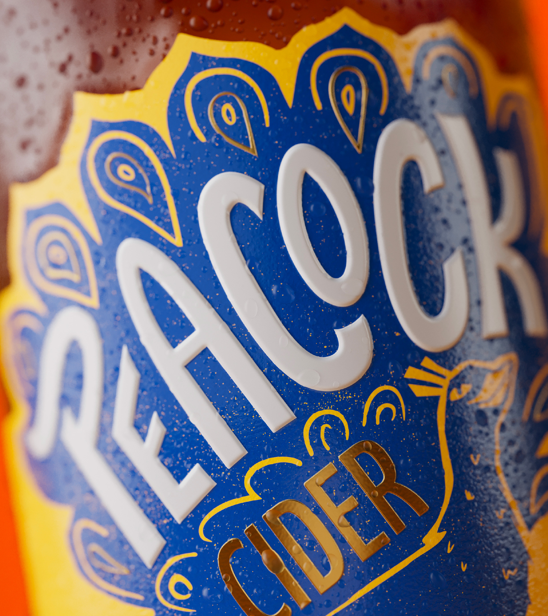
We worked closely with Kingfisher Drinks’ packaging manufacturers throughout, ensuring roll-out of designs was as envisaged across multiple touchpoints, including glassware and packaging. This was particularly crucial, when it came to a label substrate that allowed for premium finishing but would stand up to condensation, ensuring the perfect serve every time.
“Working with Kingdom & Sparrow on the rebrand of Peacock Cider was an absolute pleasure. Their brand development expertise is exceptional, and they delivered outstanding results that exceeded our expectations. The team’s extraordinary attention to detail ensured that every aspect of our new brand identity was thoughtfully crafted and perfectly executed. From the initial brainstorming sessions to the final design, Lenny and the K&S team were delightful to work with, always bringing creativity, professionalism, and a deep understanding of our brand objectives. We couldn’t be happier with the outcome and highly recommend Kingdom & Sparrow to anyone looking for top-notch branding and marketing support.”
Andy Sunnucks, Senior Brand Manager, Kingfisher Drinks
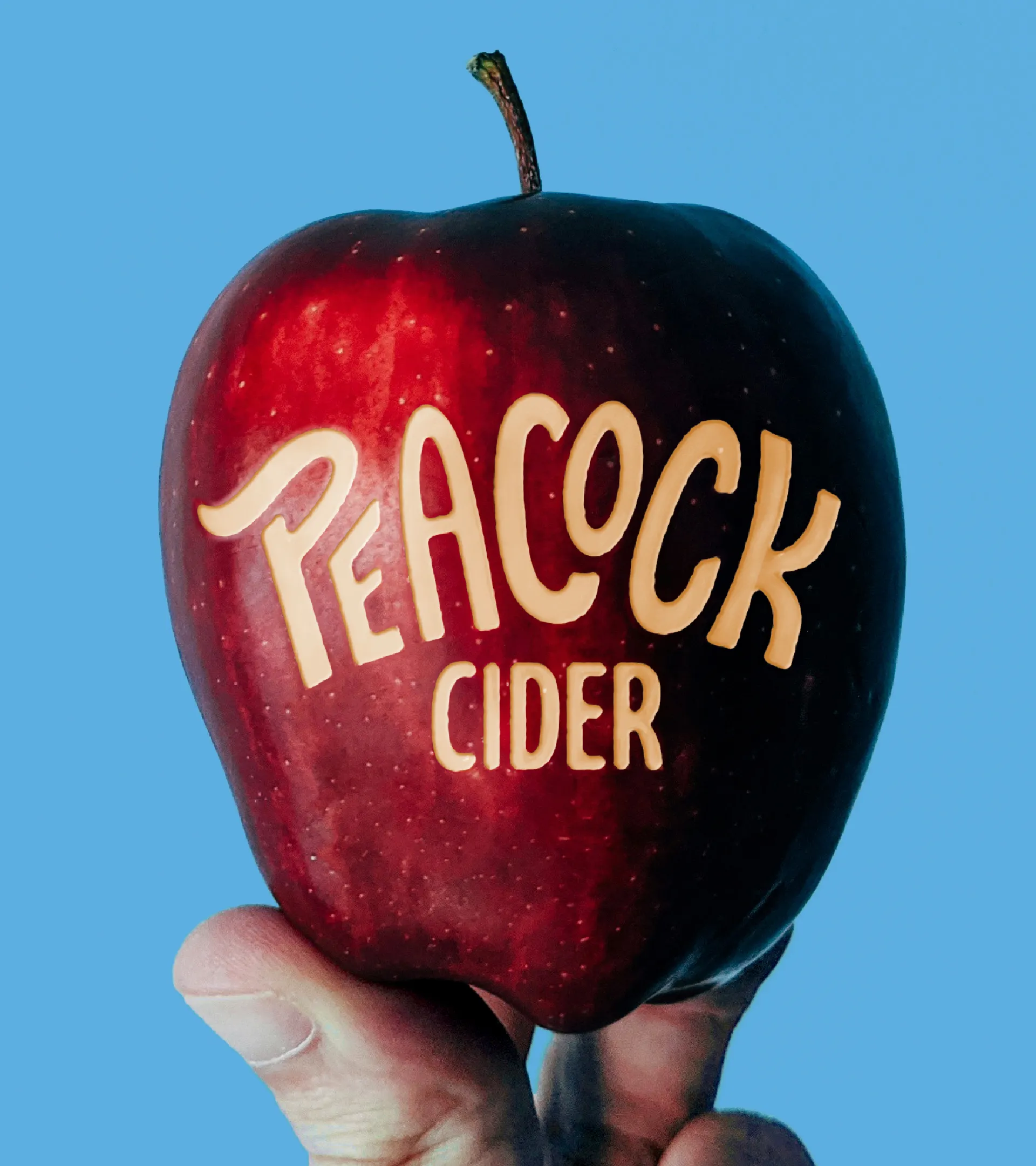
Animation credit: Adam Mitchell
Render credit: Where Giants Roam
Product photography credit: Kate Darkins