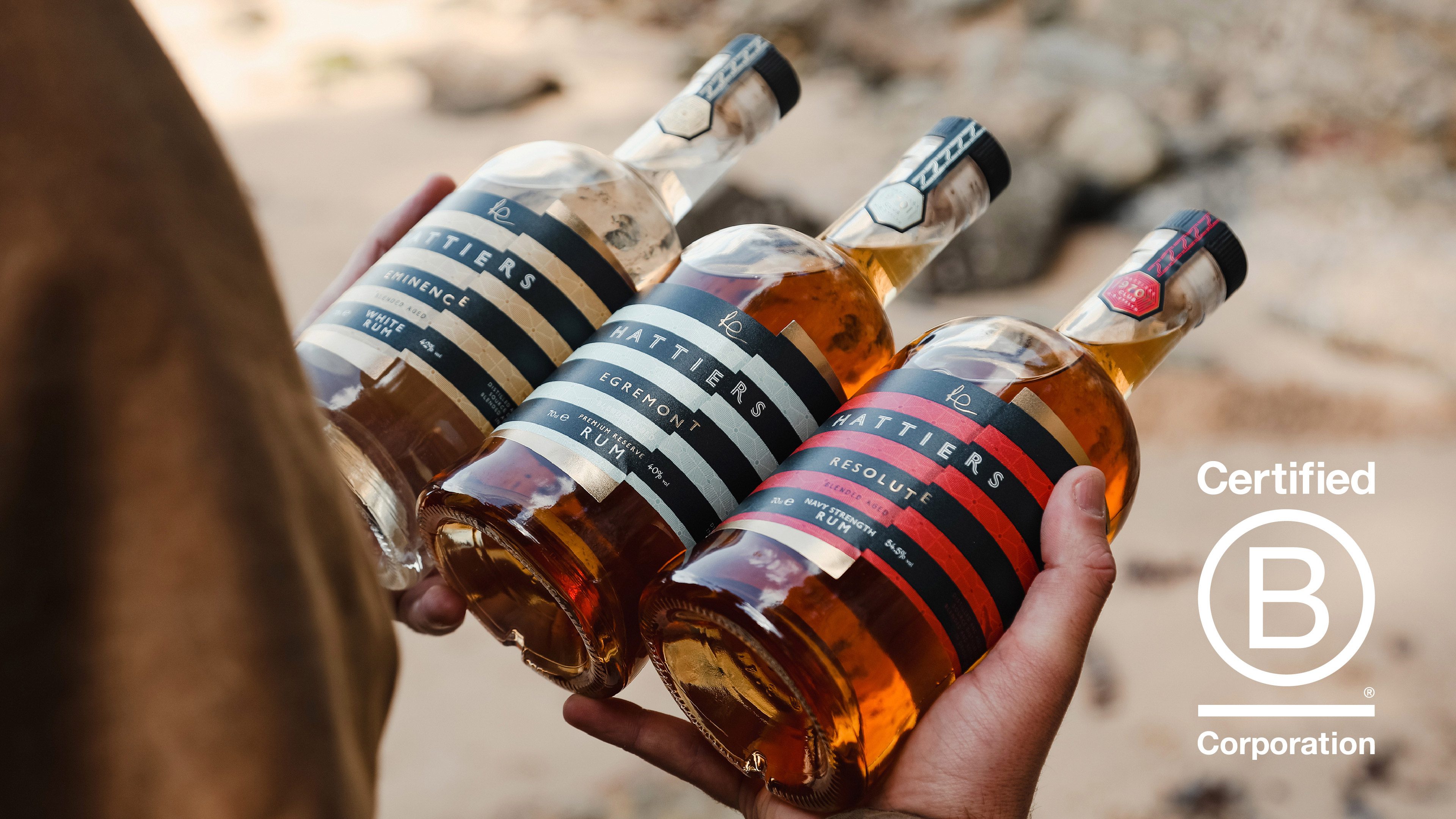
A premium brand identity for the UK’s first B Corp certified rum
Philip Everett-Lyons came to us in 2018 with an exciting vision – to launch a premium, 8 year aged sipping rum, blended and bottled in Devon. As a prominent voice and face of the brand, it was integral for founder Philip’s personality and family story to be a core part of the identity, as well as his strong people, purpose and planet values.
To fit with both Philip’s and the rum’s character, the brand needed to look and feel premium and respected – but also environmentally-conscious, warm and jovial. We also needed to ensure that, whilst this brand was quite personal to the founder, it would appeal to discerning rum lovers on a national, and eventually international, scale.

The Concept
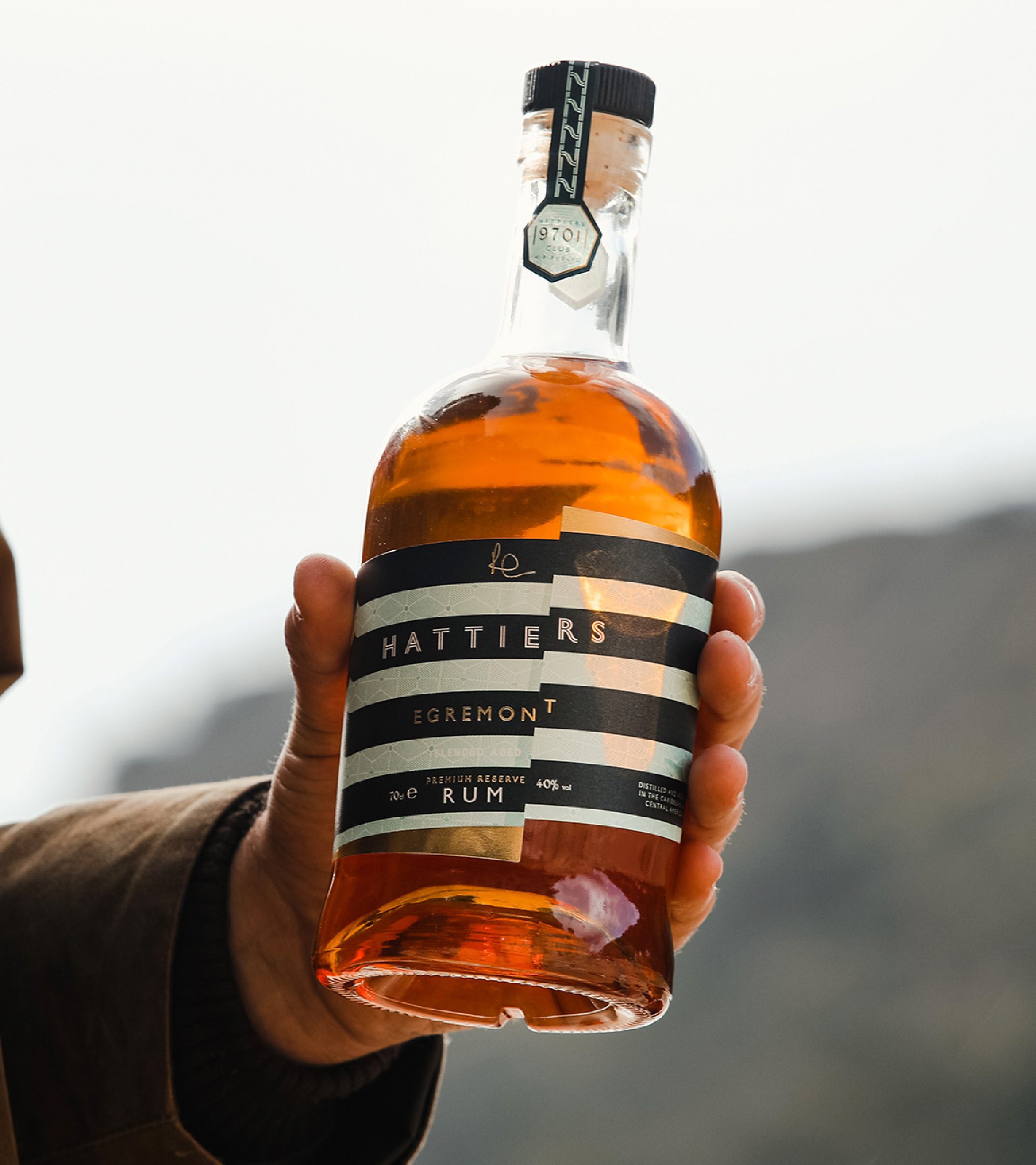
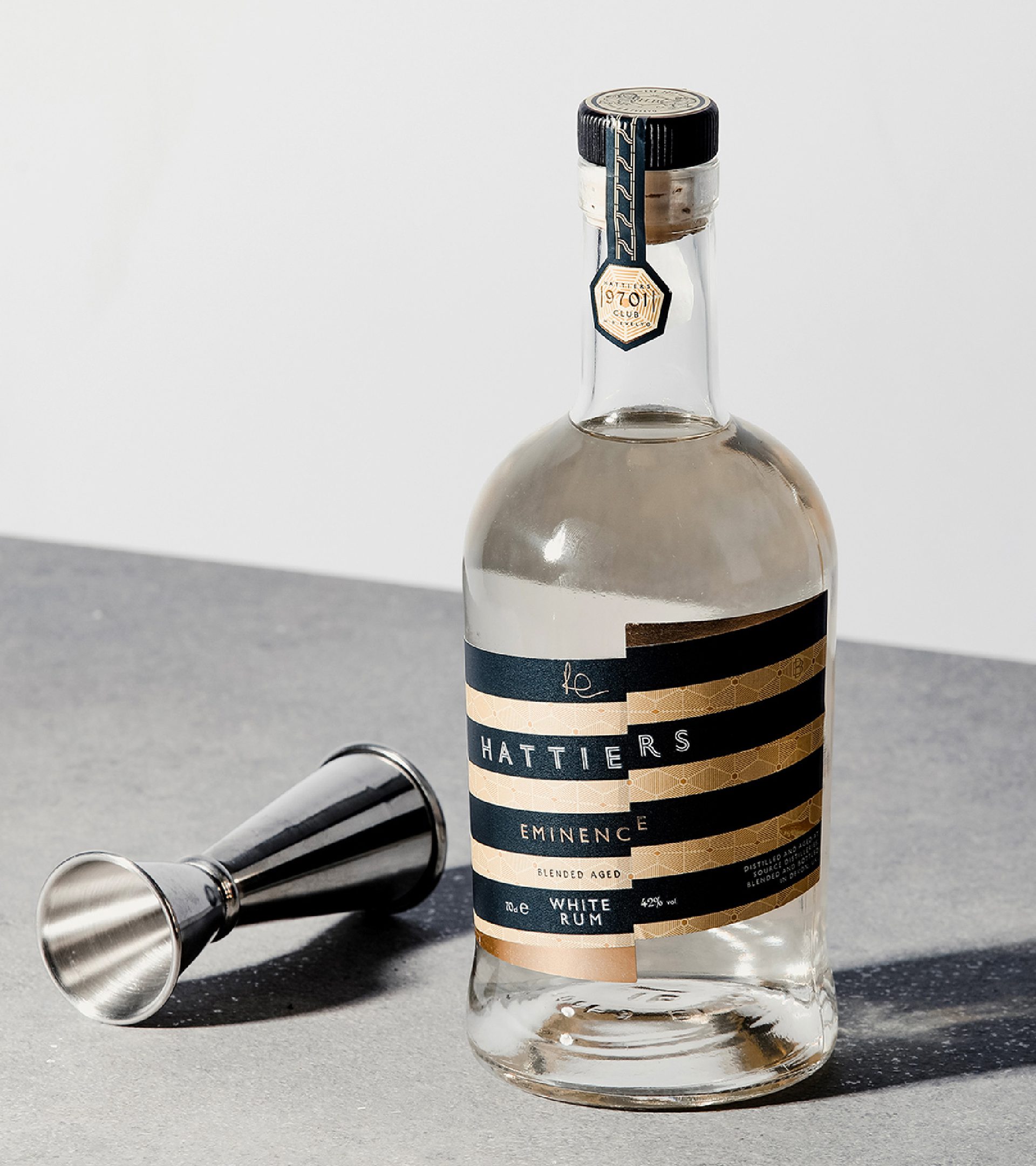
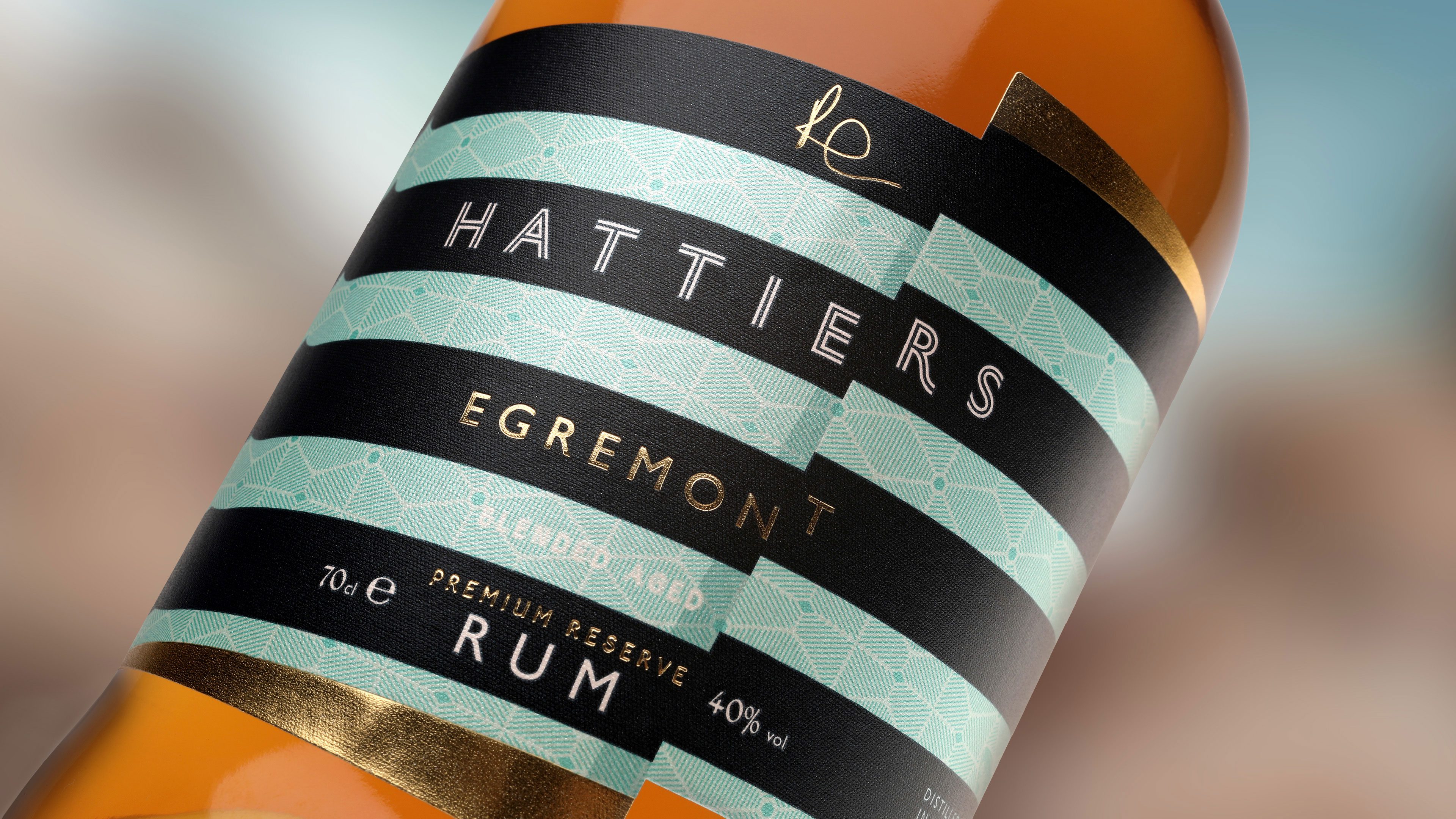
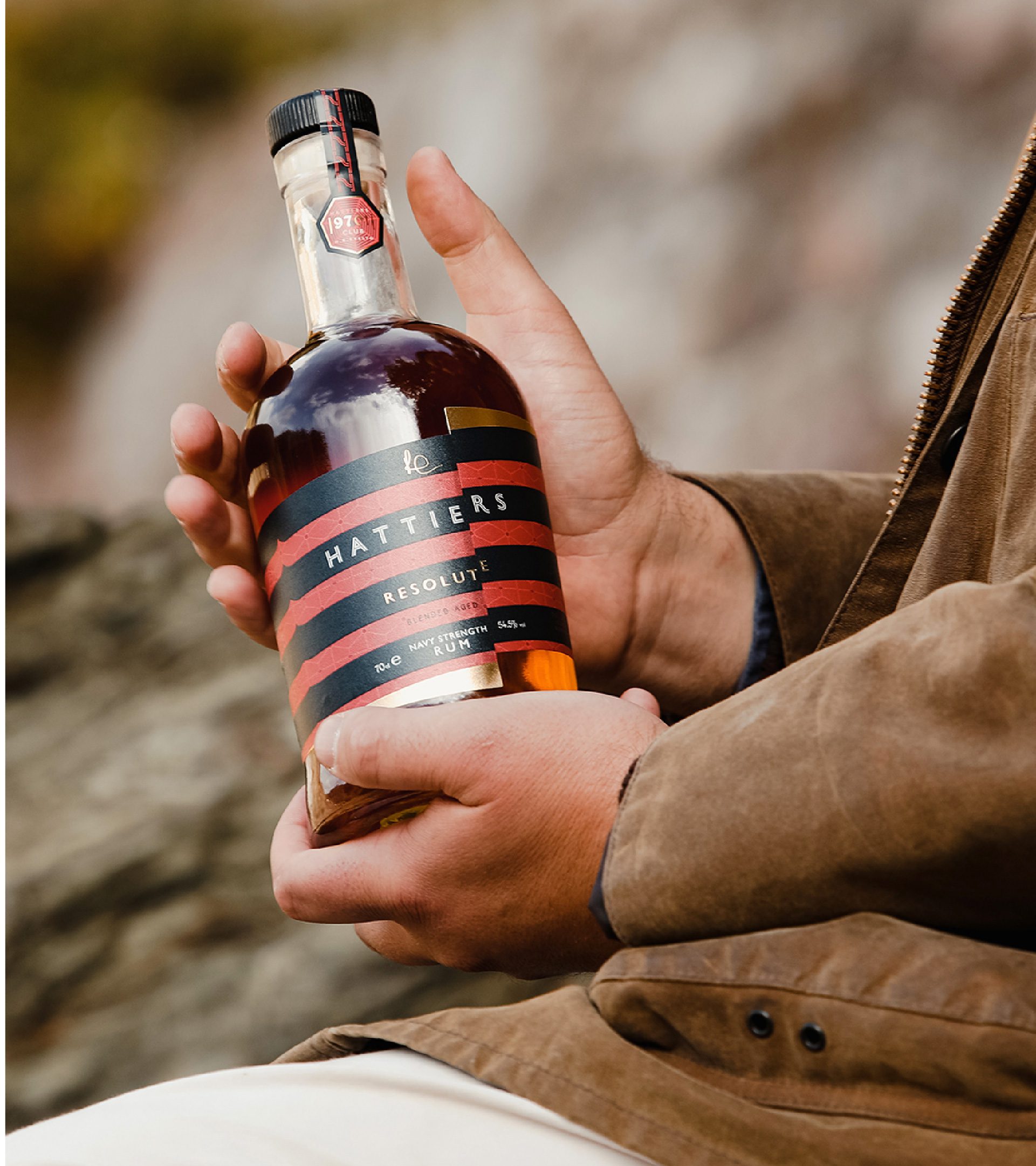
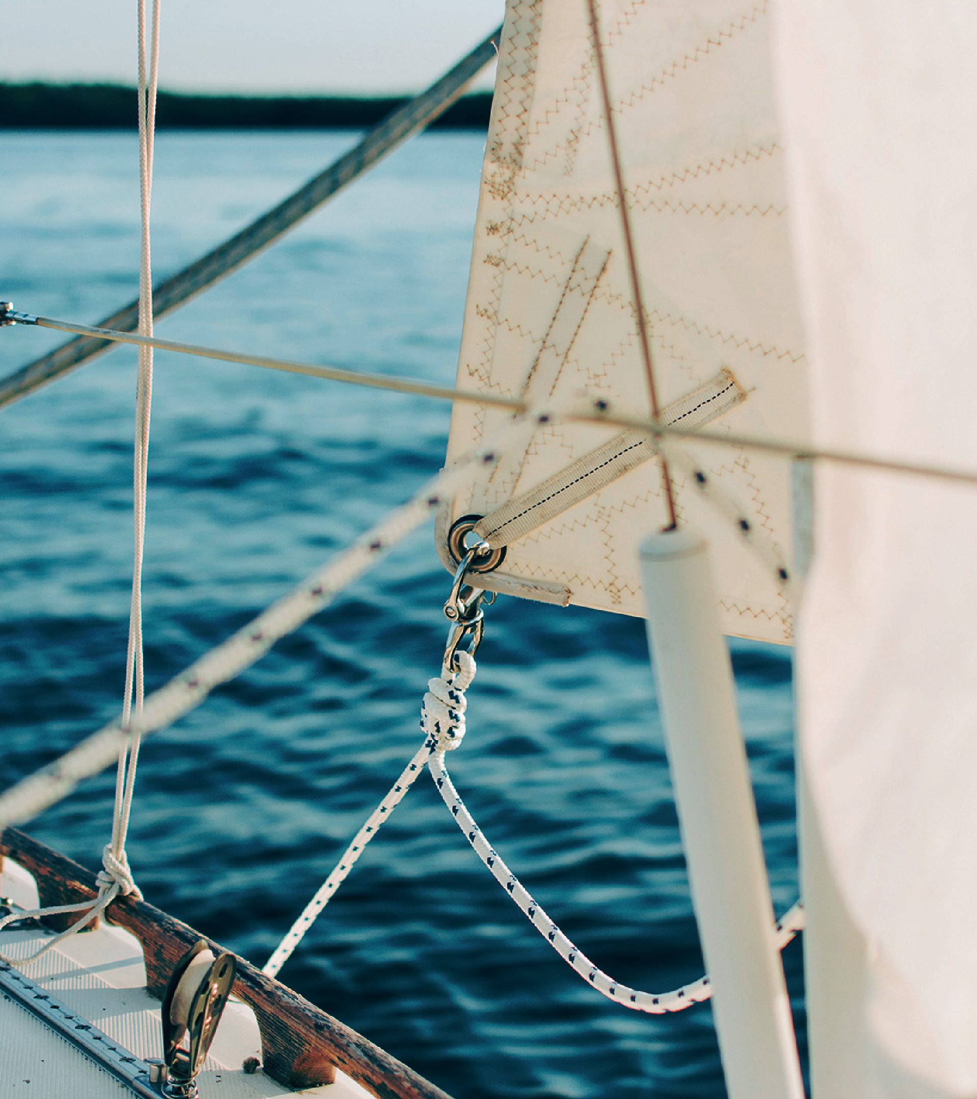
To help the brand stand out we wanted to do something that challenged expectations in the rum category. We decided to take Philip’s love of sailing as a key inspiration, capturing his personality and passions but also communicating the brand’s Devon coastal provenance and a premium, aspirational lifestyle.
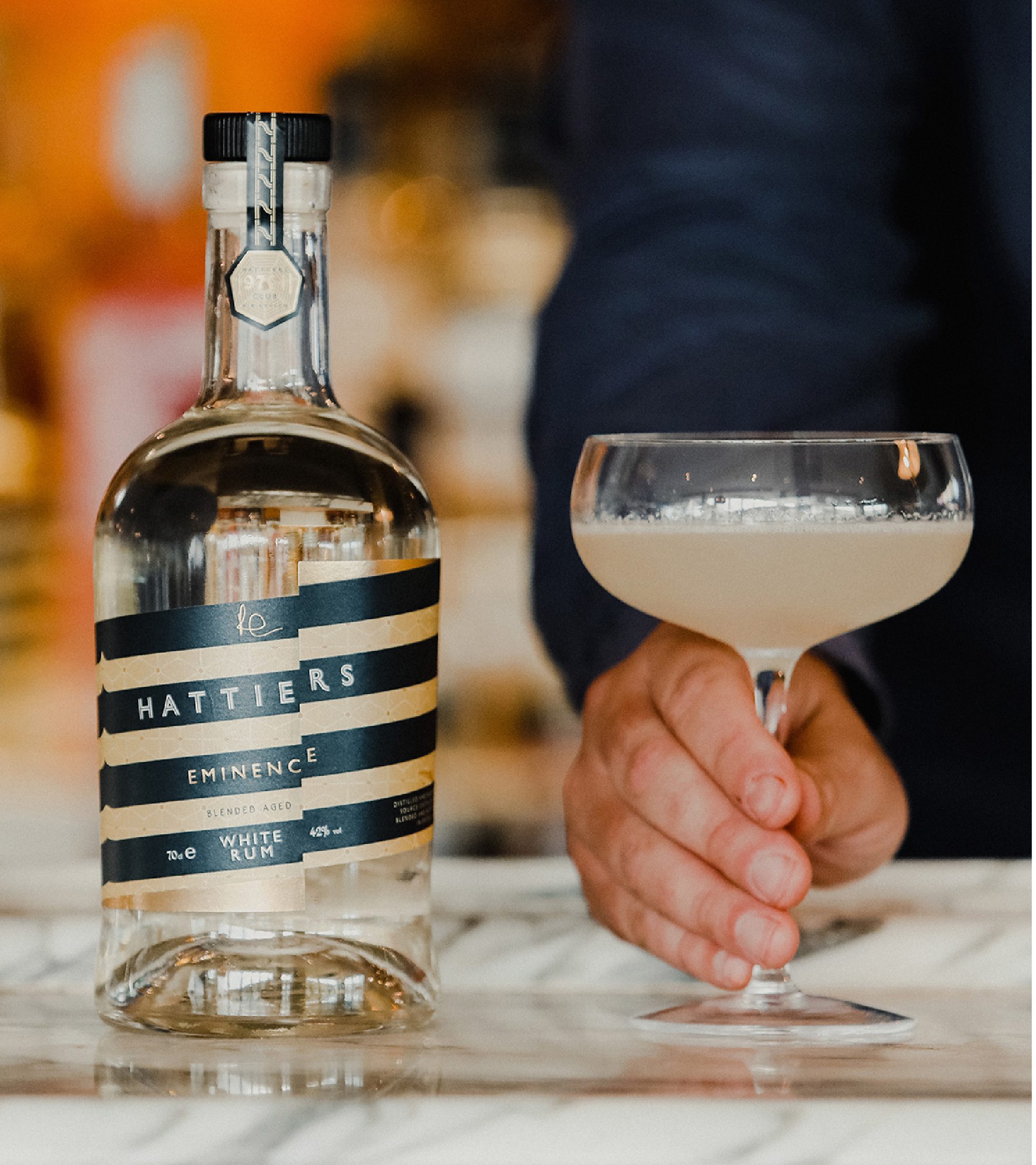
We included lots of nautical nods, such as bold stripes and a logotype inspired by wake lines, as well as subtle secret messages in the brand pattern to tell more of Philip’s story and engage consumers. Even the brand name Hattiers was derived from Philip’s daughters’ names. The shift in the label represents breaking the mould – something this rum brand is certainly doing with its focus on people and planet.
The Impact
“A real pleasure working with such an amazing team. Great, great, great! A real pleasure working with such an amazing team. Thank you Kingdom & Sparrow… you are tip top!”
Philip Everett-Lyons, Hattiers Founder