Challenger Cider Branding
Hawkes Cider | UK
Urban Orchards: a cider brand with a London edge
The Challenge
Back in 2016 just as the craft cider category was emerging, Hawkes came to us with an exciting mission – to disrupt the industry and challenge perceptions. We needed to bring a fresh approach to their (then) small scale cider brand, to attract a new crowd of craft drinkers and prepare them for the next phase of growth.
The Process
We wanted to create a brand that maintained Hawke’s rebel heart and outlook, whilst telling the story of their London roots. Taking cues from craft beer, we designed a distinctive apple-skull brand asset to represent their underdog craft positioning.
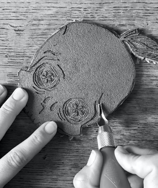

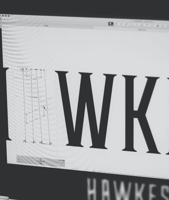
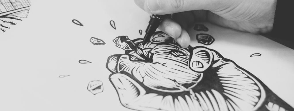
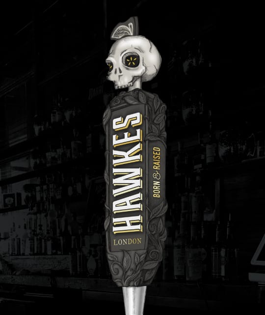
We paired these new assets with hand-drawn illustrations and a refined logomark inspired by Victorian London, harking back to Hawkes’ brand name influenced by street hawkers from that time.
The Results
Following the rebrand Hawkes have gone from strength to strength, becoming one of the UK’s most well-loved craft cider brands – and in 2018 they were acquired by industry giants Brewdog. They’ve since had another brand refresh but their core skull asset and rebellious voice has remained at the heart of the brand.
Explore More Work
-
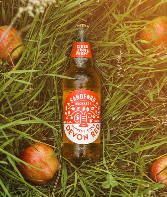
Sandford Orchards Cider
A fresh cider rebrand for Sandford Orchards. We gave this Devon orchard some bold new can and bottle label designs to match their great tasting cider.
-
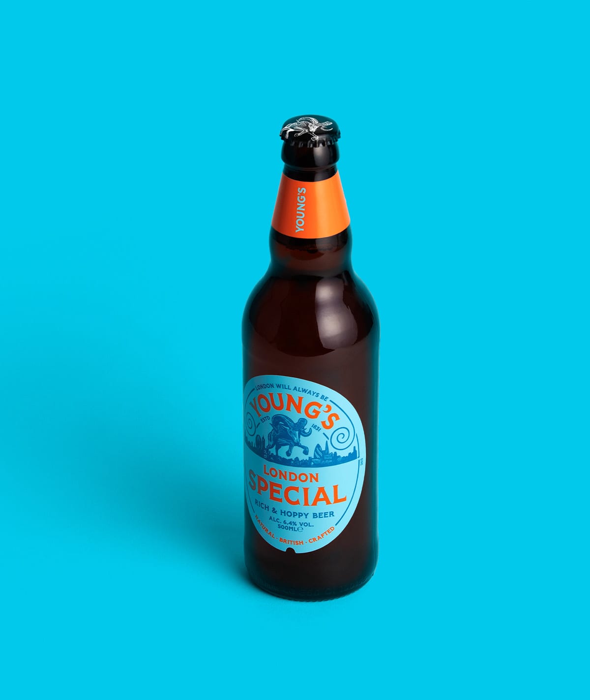
Young’s
Cask ale rammed with attitude: a progressive repositioning for a heritage brewery.
-
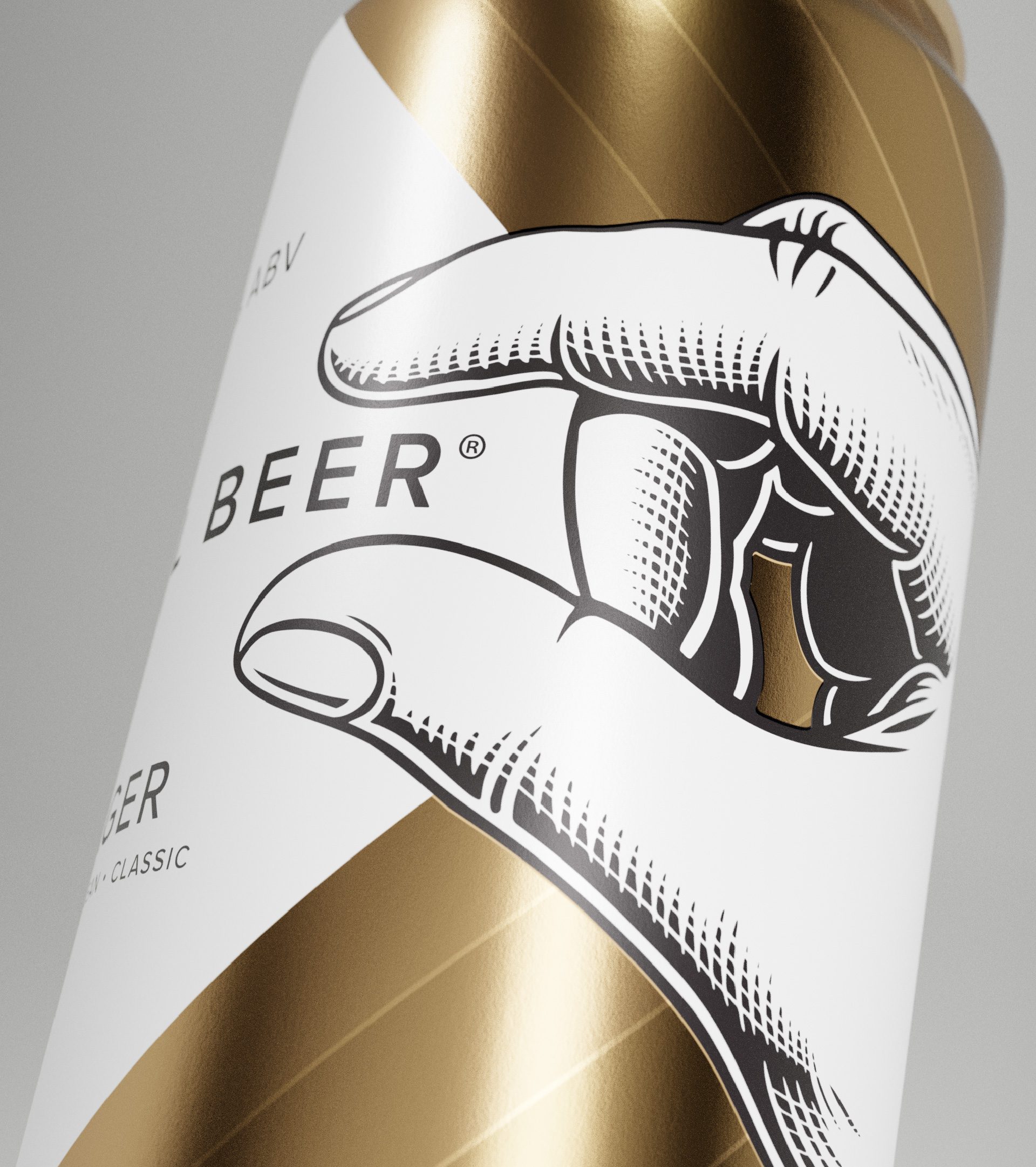
Small Beer
Award-winning beer branding for sustainable brewery, Small Beer. Since branding Small Beer, the packaging design has won awards and been picked up by multiple national retailers!