Refreshed brand to cut-through the cocktail clutter
The Concept
The Impact
Positive Change
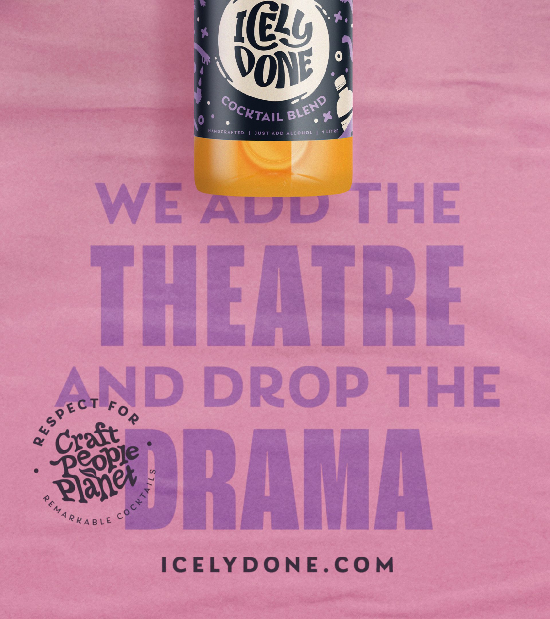
Our strategic approach uncovered an important insight; cocktails are about fun, creativity and theatre. Pre-mixed cocktails solve problems around speed and consistency, but take away the elements consumers and bartenders love about them. Icely Done’s mixer blends had a clear role in the category – to take away the hassle, but not the joy. Icely Done, is proof that remarkable cocktails can be served at speed.
Their cocktail blends are the foundation, inspiration and catalyst for great tasting, simply served drinks.
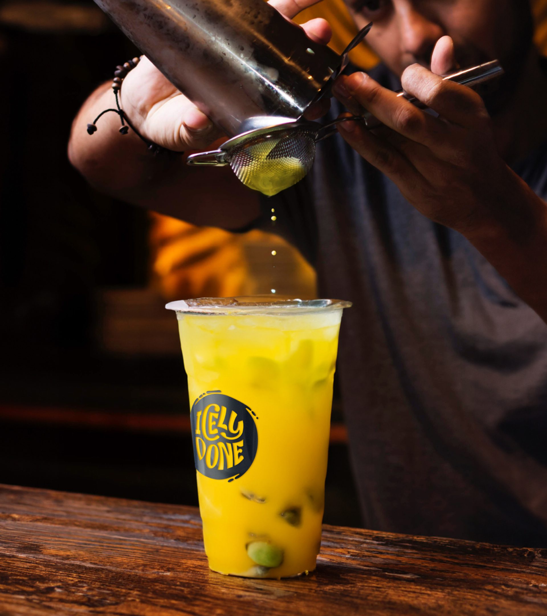
Bartenders can create fresh, delicious cocktails fast without compromising on craft or quality. They’re the start of something remarkable.
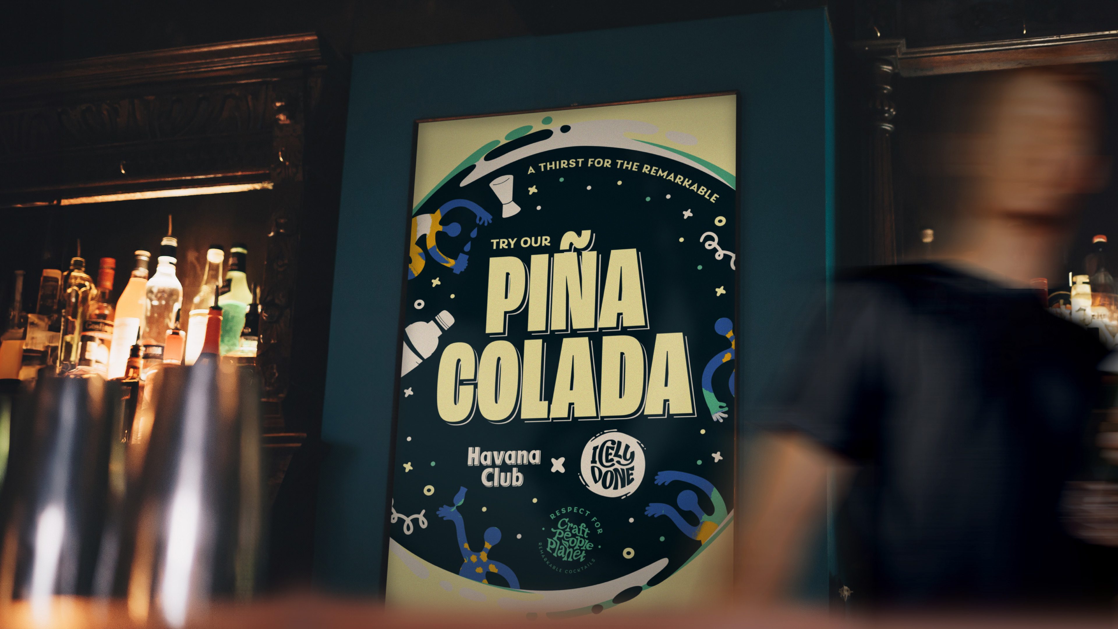
With this creative springboard, we needed to capture the energy of the start of great nights and the creativity of cocktail making.
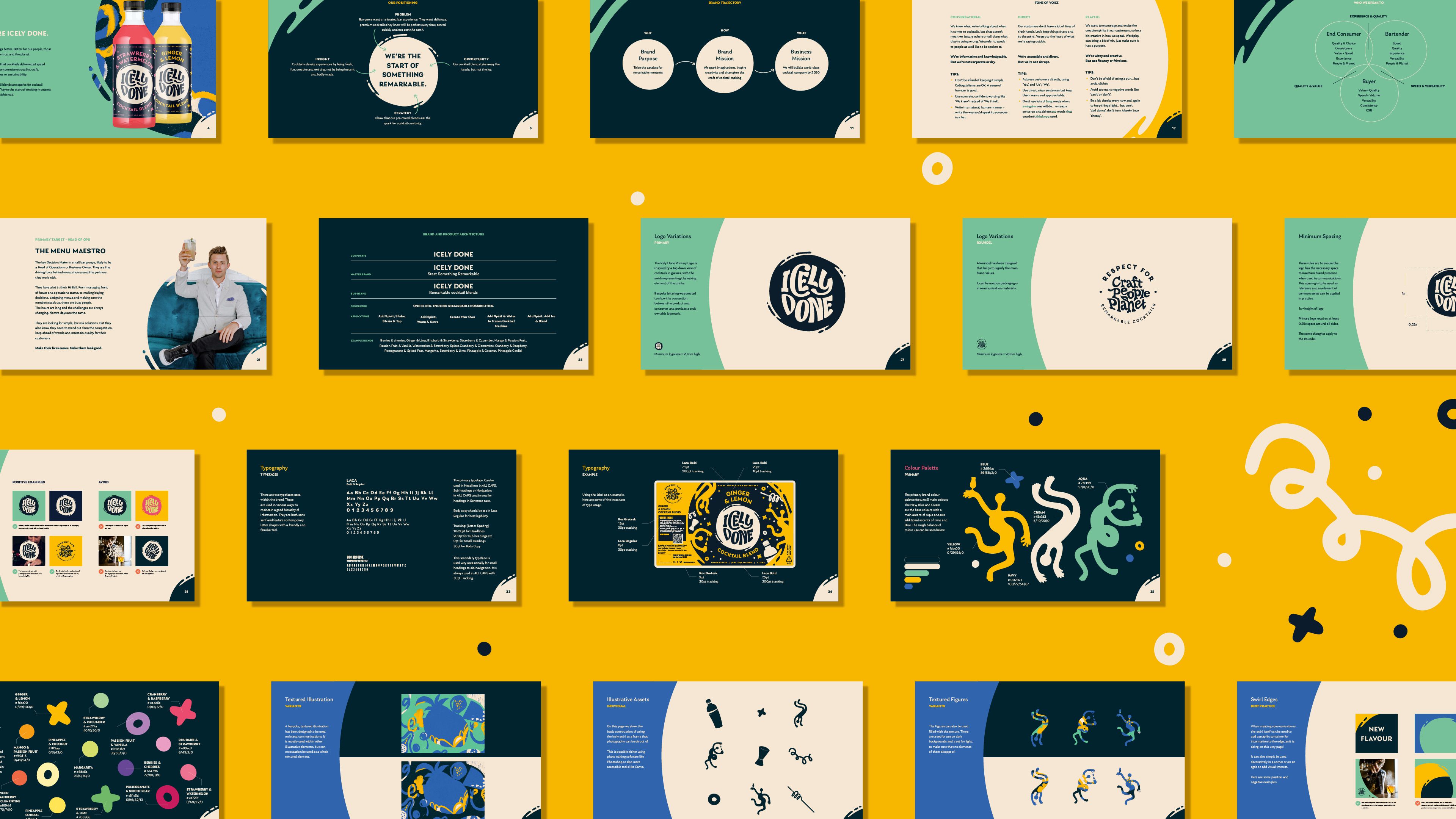
We started by defining the brand vision, mission, values, tone of voice and personality to underpin our brand development. This would also provide a consistent culture for the brand internally.
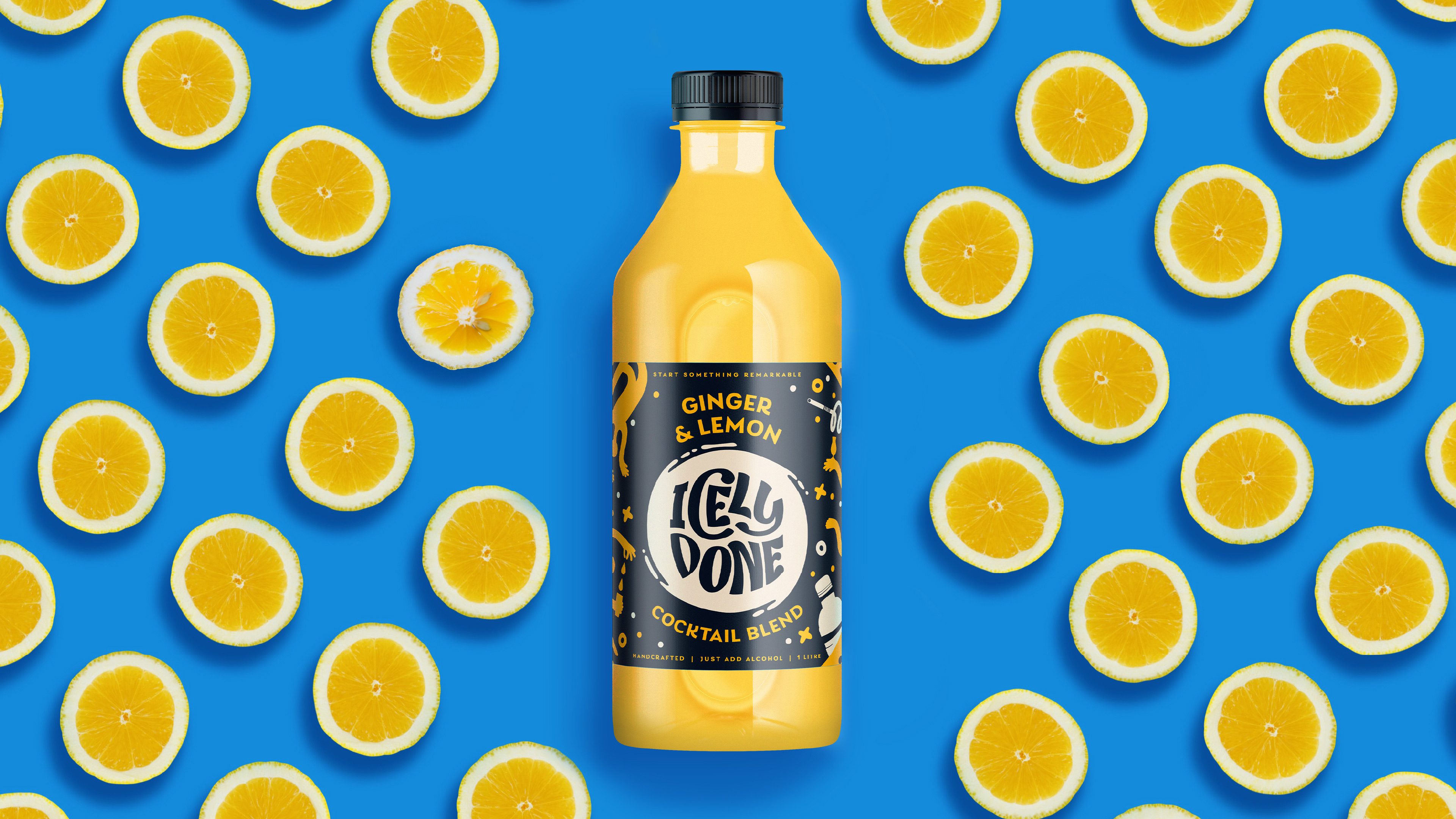
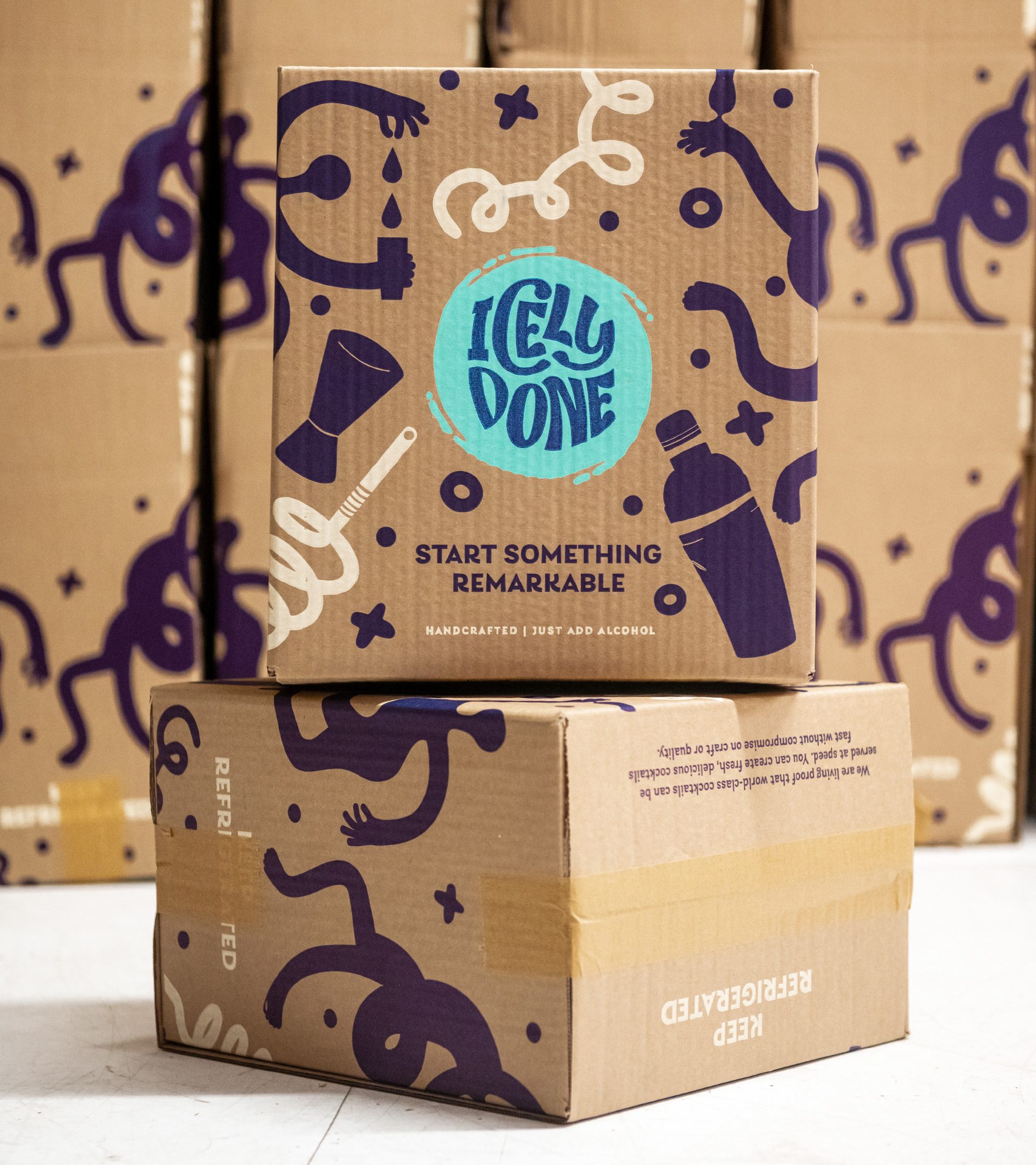
Our brand development had to feel like to lived in the world of cocktails and evening economy without losing the sense of refreshment and naturalness of the blends. The logo was inspired by a top down view of cocktail glasses, with the swirling motion providing a sense of energy and representing the mixing element of the blends themselves.
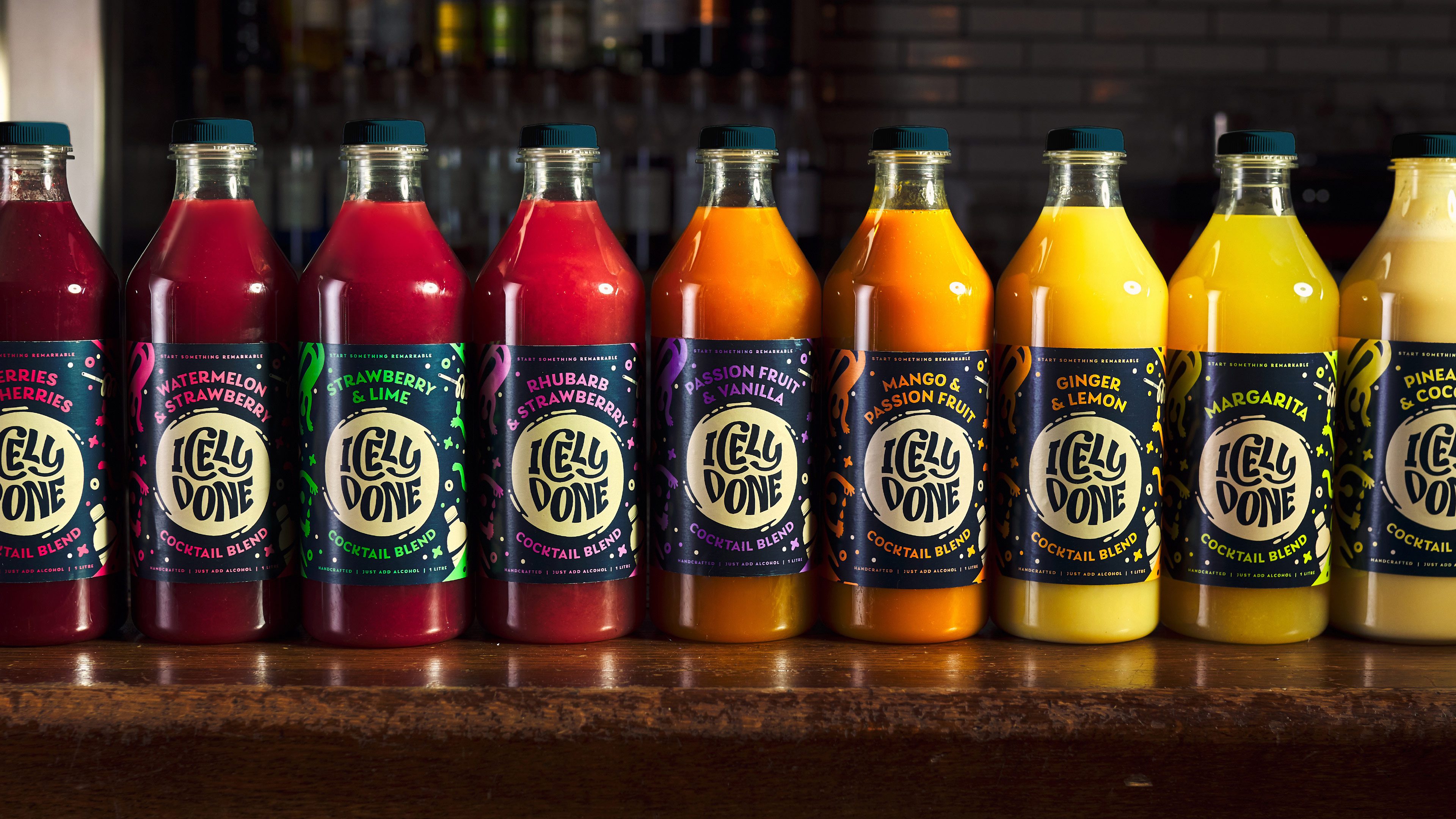
The primary colours used a darker navy to be in the cocktail world, but freshened with a lighter cream and vibrant green. The broad secondary pallet was vibrant and punchy to capture the fruity juiciness of the product and allow multiple variants to be easily identified by bartenders.
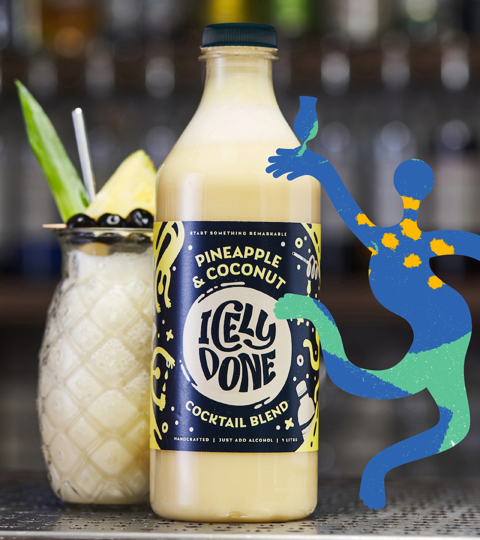
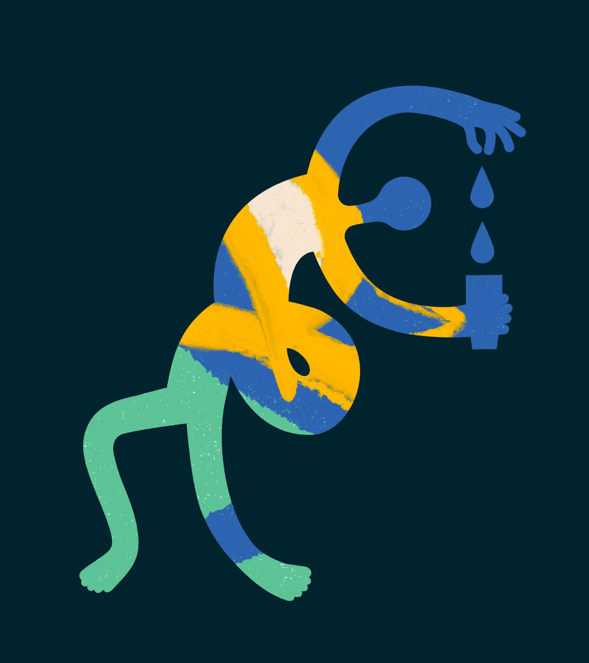
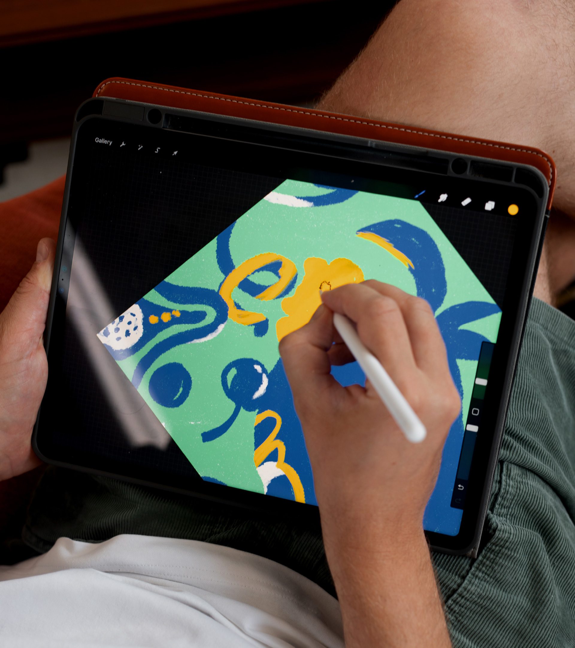
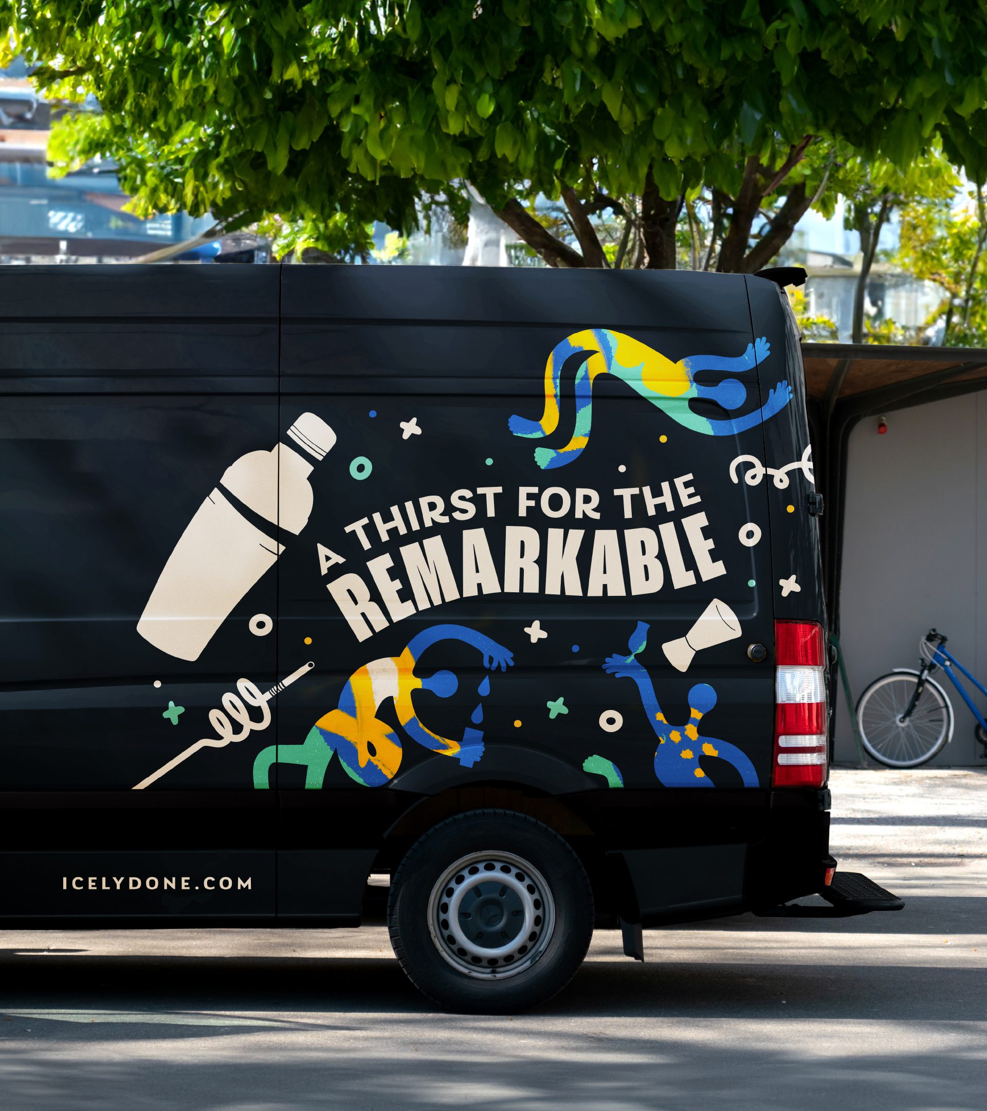
All of this was supported by a range of dynamic illustrations, including figures representing bartenders and the tools they use to make their cocktails. These could also work with photography to bring a sense of ownership and consistency to the brand at every touchpoint.
Johnny Paton, Creative Director