Taking craft coffee to the next level
Mission Coffee Works is a London-based coffee roaster enabling everyone – from specialist baristas to casual coffee drinkers – to drink incredible coffee everyday. Mission came to us ready for the next phase of growth as a nationally recognised brand with strong values and a playfully upbeat attitude.
Branding | Illustration | Packaging | Typography
Play Video

The Concept
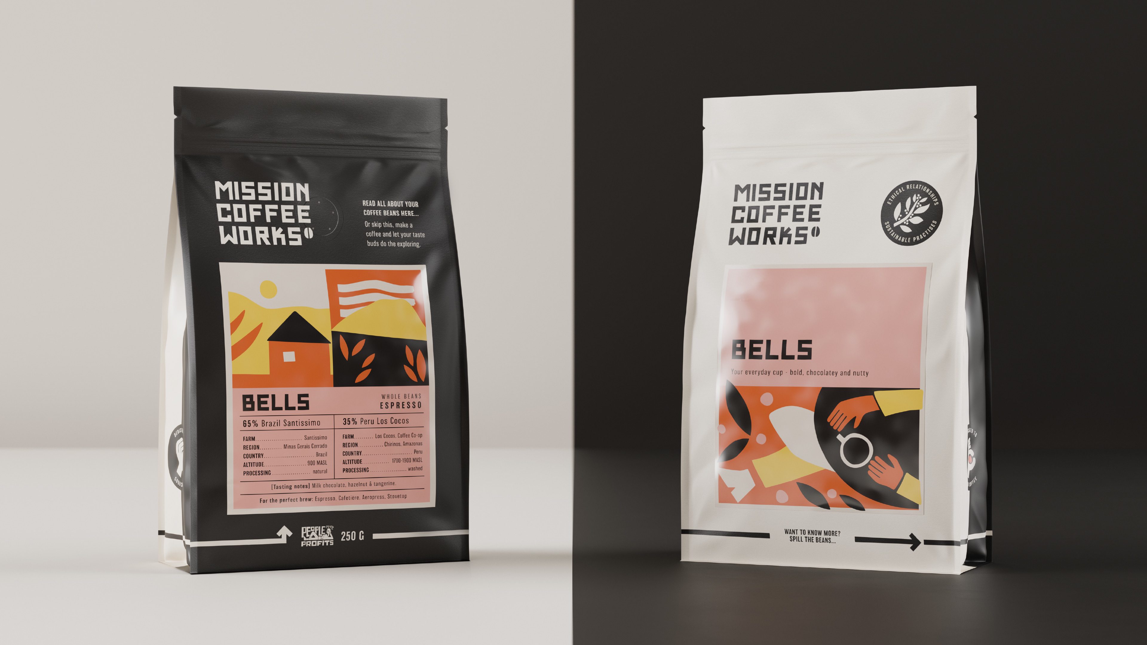
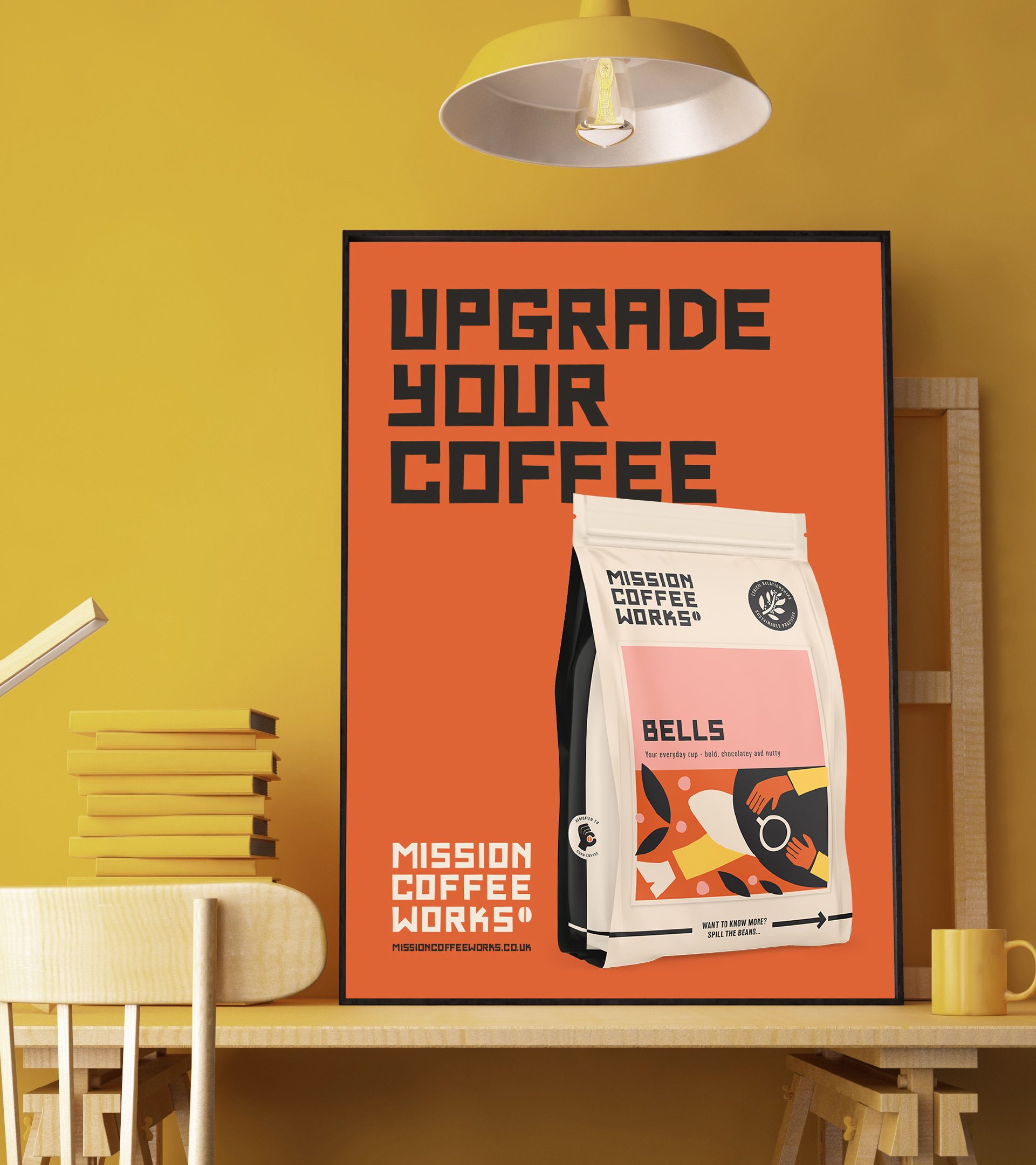
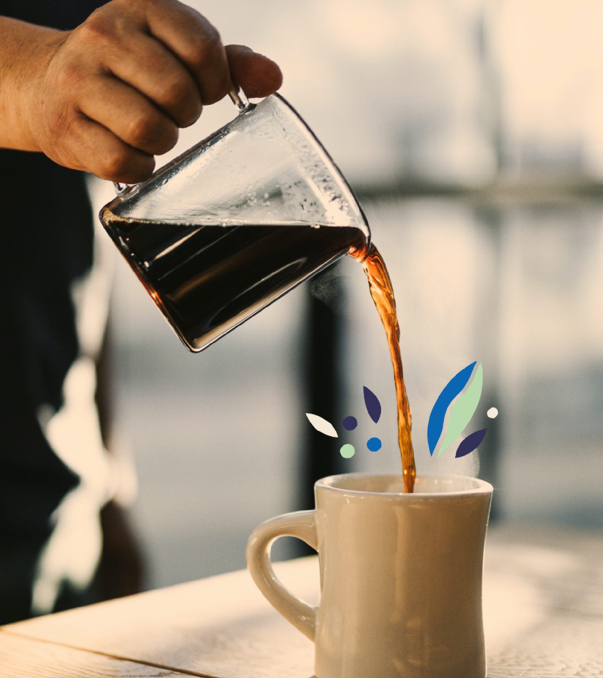
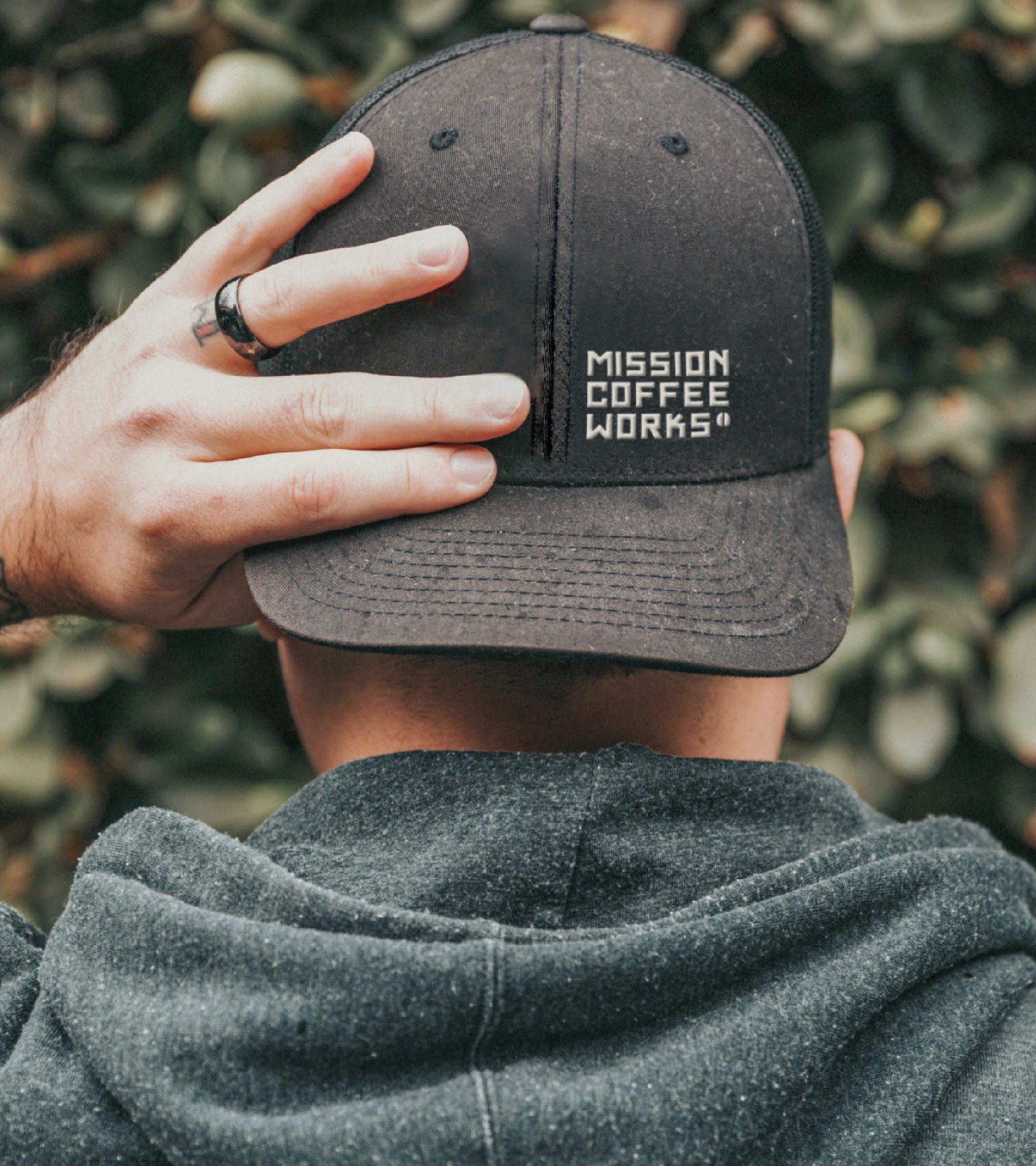
Refining Mission Coffee’s brand proposition to a more accessible ‘Upgrade your coffee’, we developed the brand for the casual coffee drinker AND the coffee geek. While the brand is consistent, the comms focuses on a different audience group, depending on what side you look at.
Positive Change
“We’re thrilled with the result…
The Kingdom & Sparrow team are so creative and easy to work with. Communication was always fantastic and flexible to us. We’ve ended up with really beautiful and artistic design and strong brand messaging.”
Rachel Kaines, Head of marketing and events at mission coffee works.
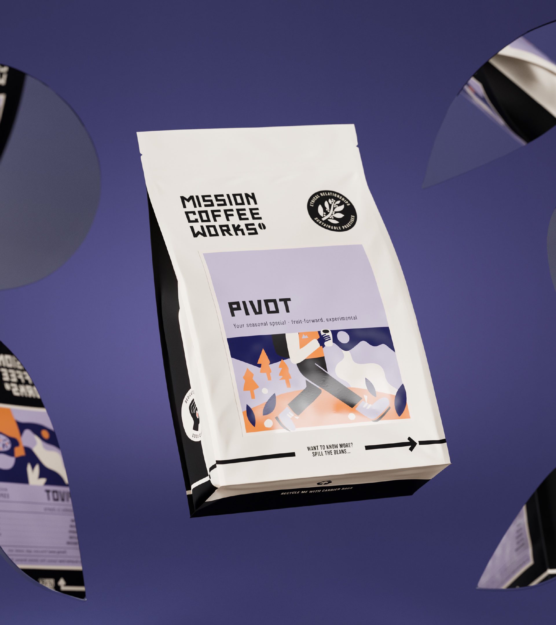
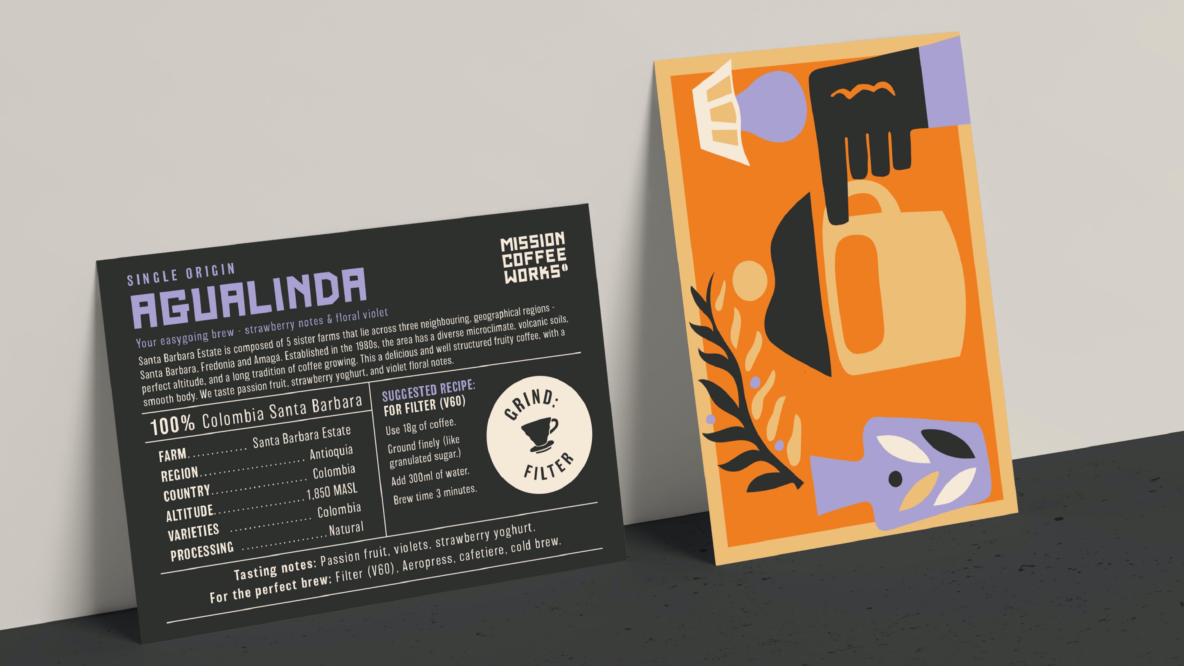
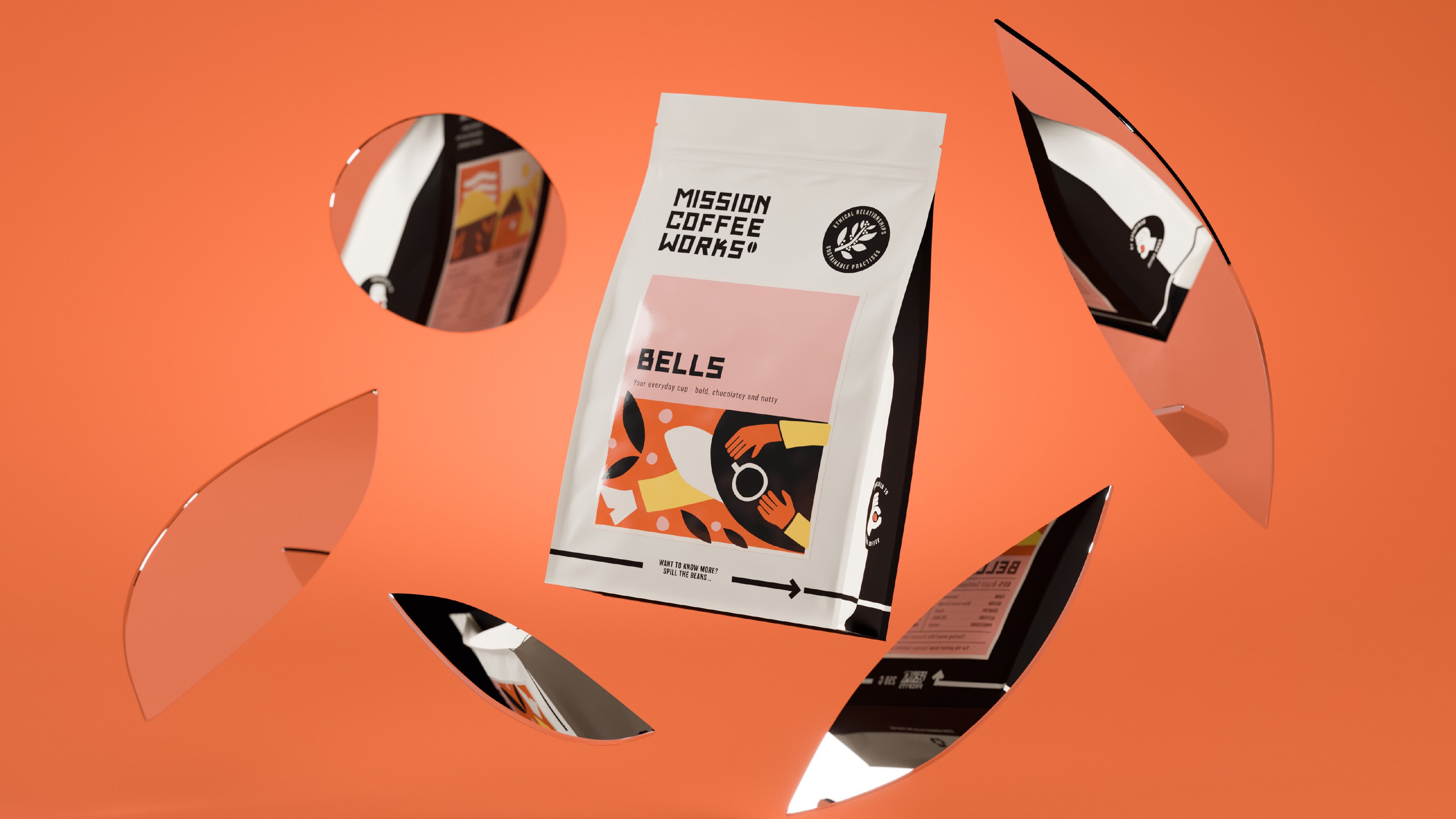
“To ensure we’re engaging both the casual coffee drinker and the coffee geek, we based the creative idea around ‘the two sides of Mission Coffee’, and this translates onto the two tone brand colours and split coffee bag design. One side is simply taste and lifestyle orientated; the other is more informative on origin, processing, altitude and more, so you can really get into the details if you want to – or you can skip over that and simply enjoy upgrading to a better cup of coffee.
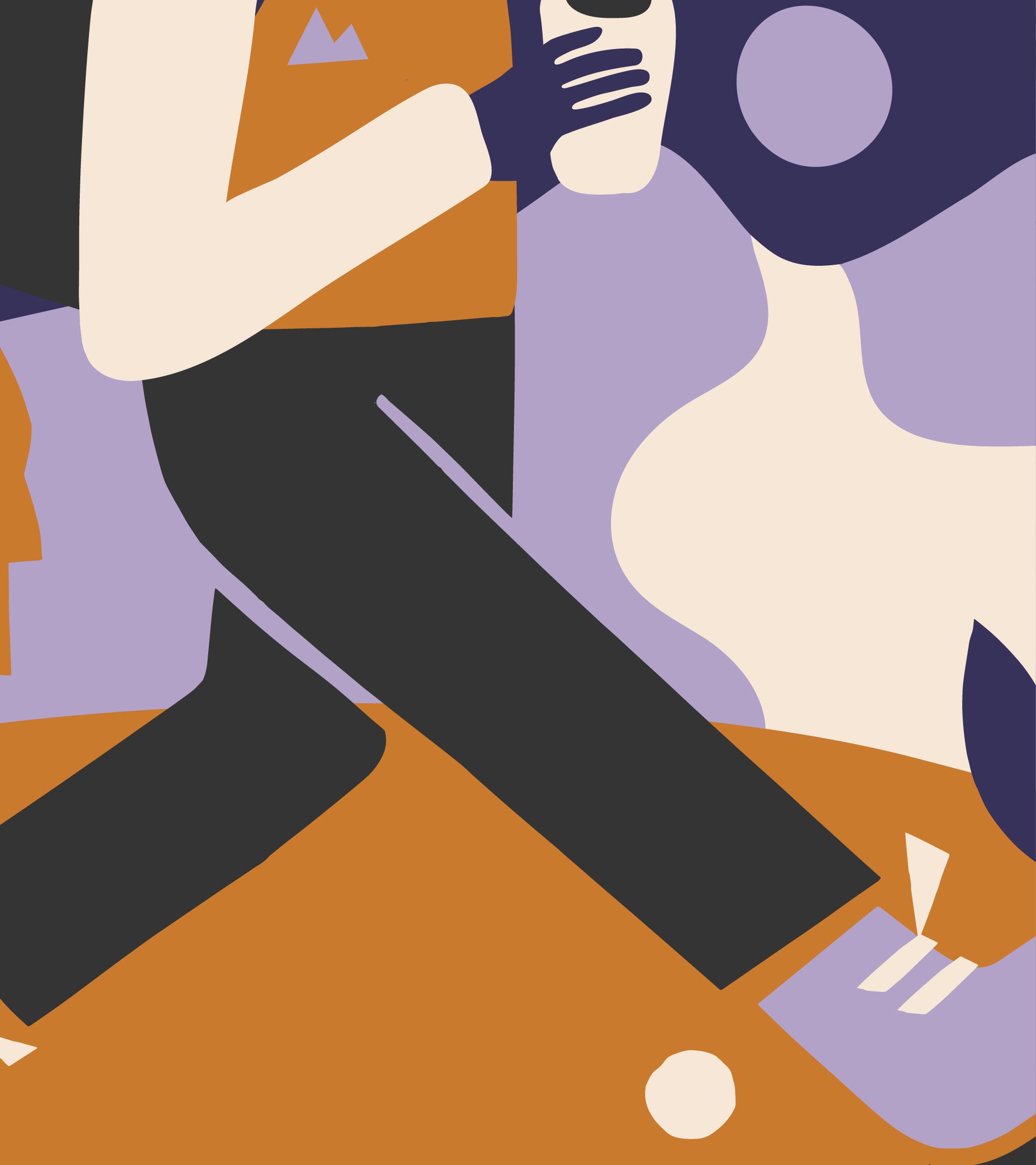
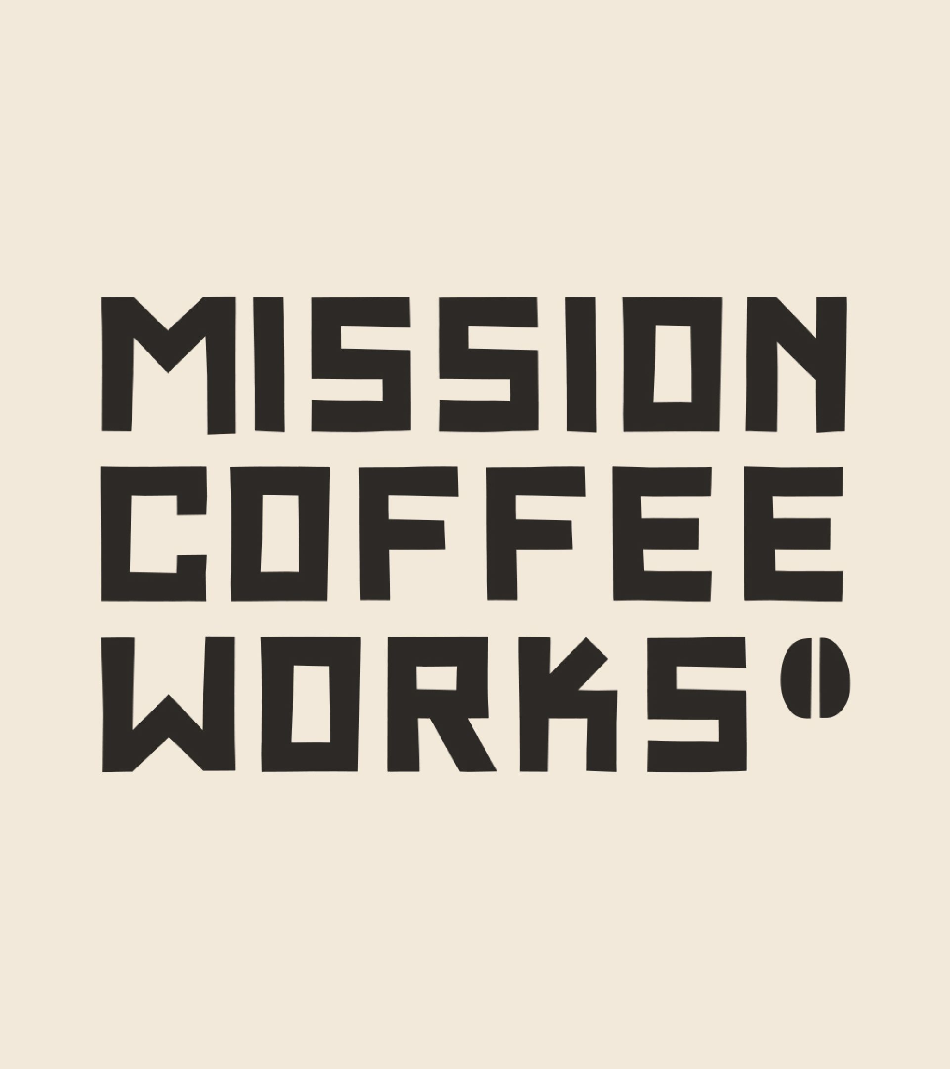
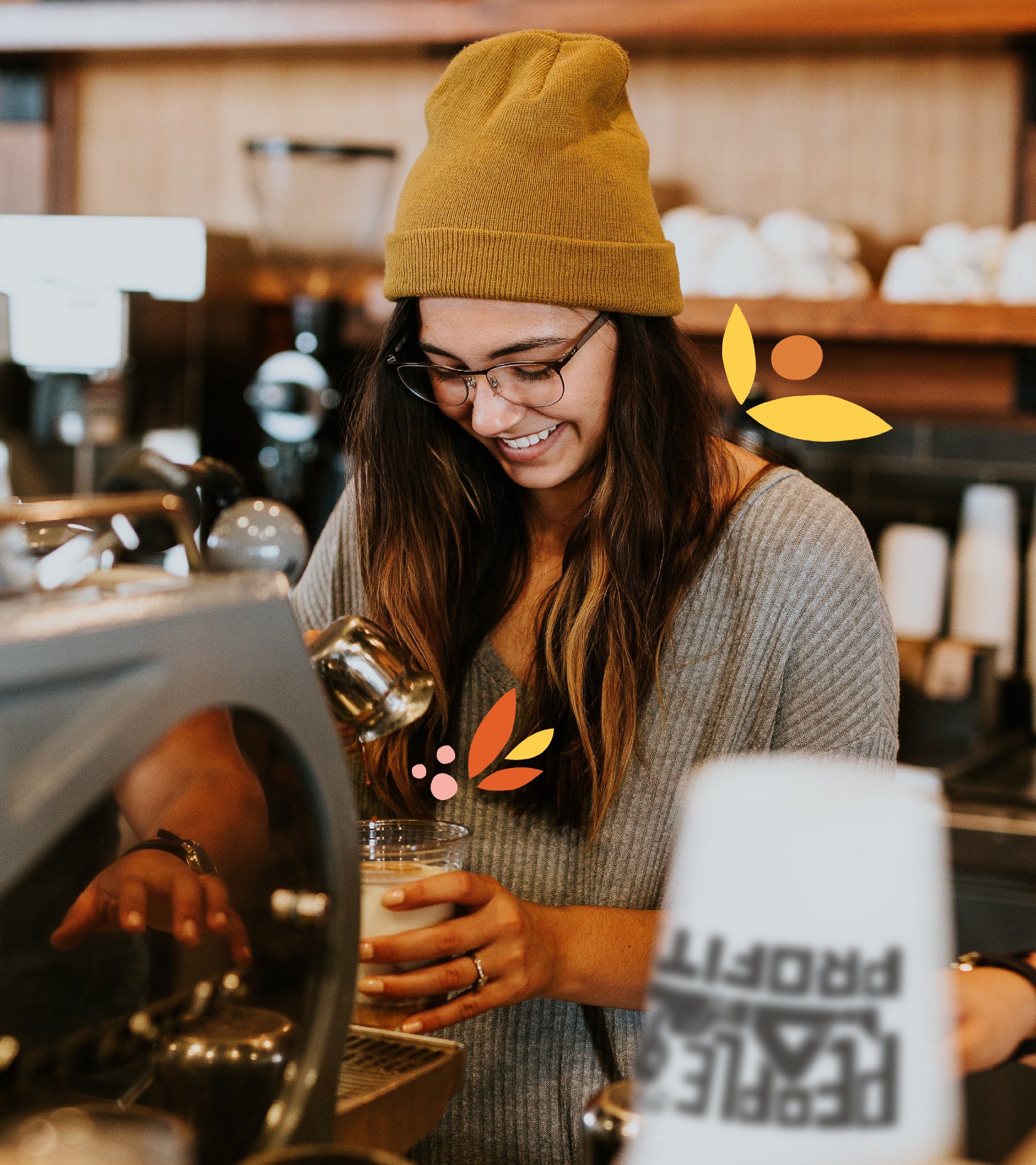
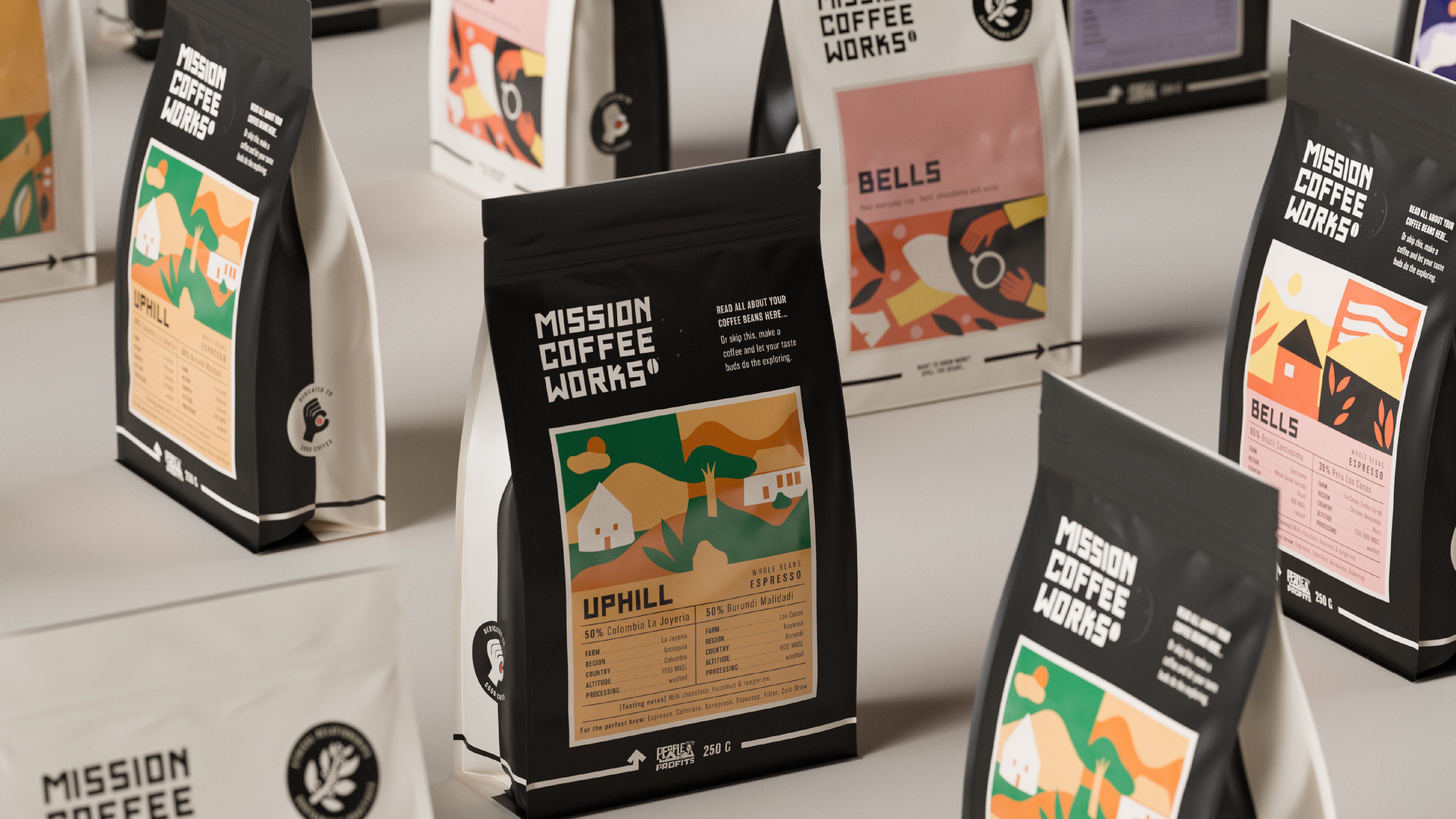
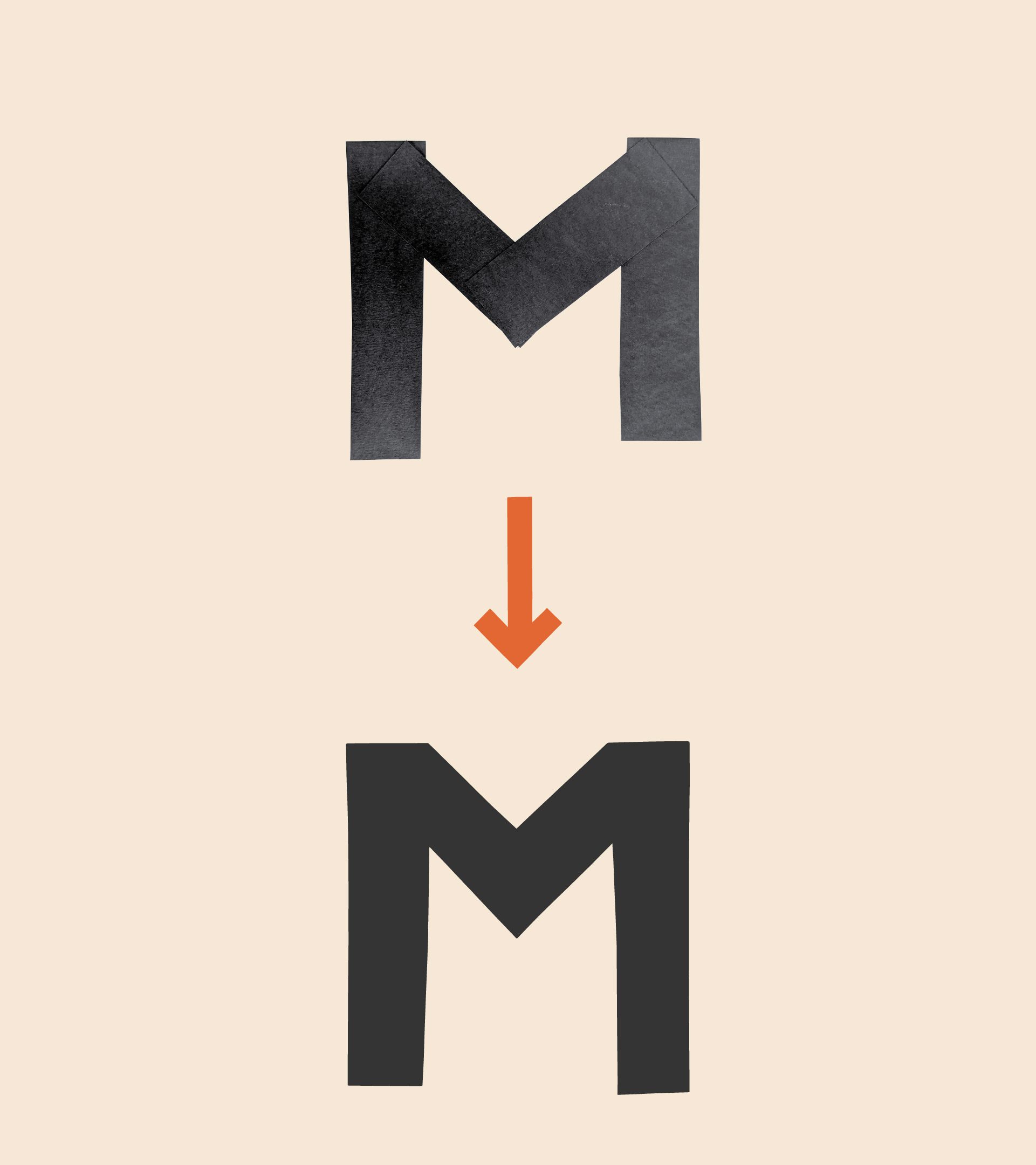
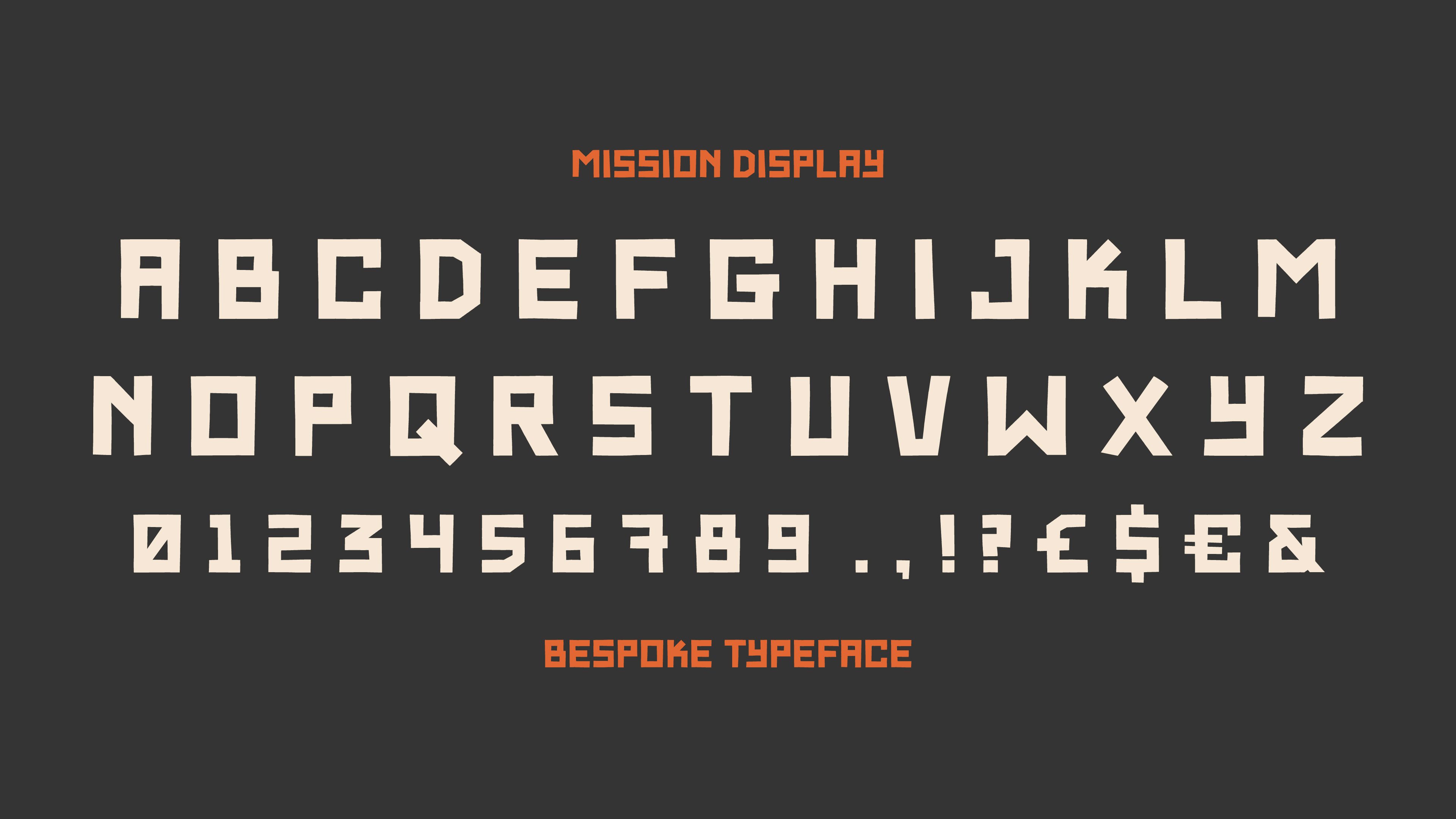
To communicate the brand’s personality we put the emphasis on enjoyment and the relaxed coffee occasion, creating colourful, paper-cut collage illustrations that change with each variant. We also created a bespoke typeface and logotype that gives a bold, confident feel and playful messaging and assets to communicate Mission Coffee’s ethos and sustainable practices.”
Holly Irons, Designer
The Impact
Mission Coffee Works are in cafés, retailers and homes across the UK. They successfully launched their new B2B and B2C subscriptions and have a flexible brand which allows them to bring out multiple limited edition coffees regularly.