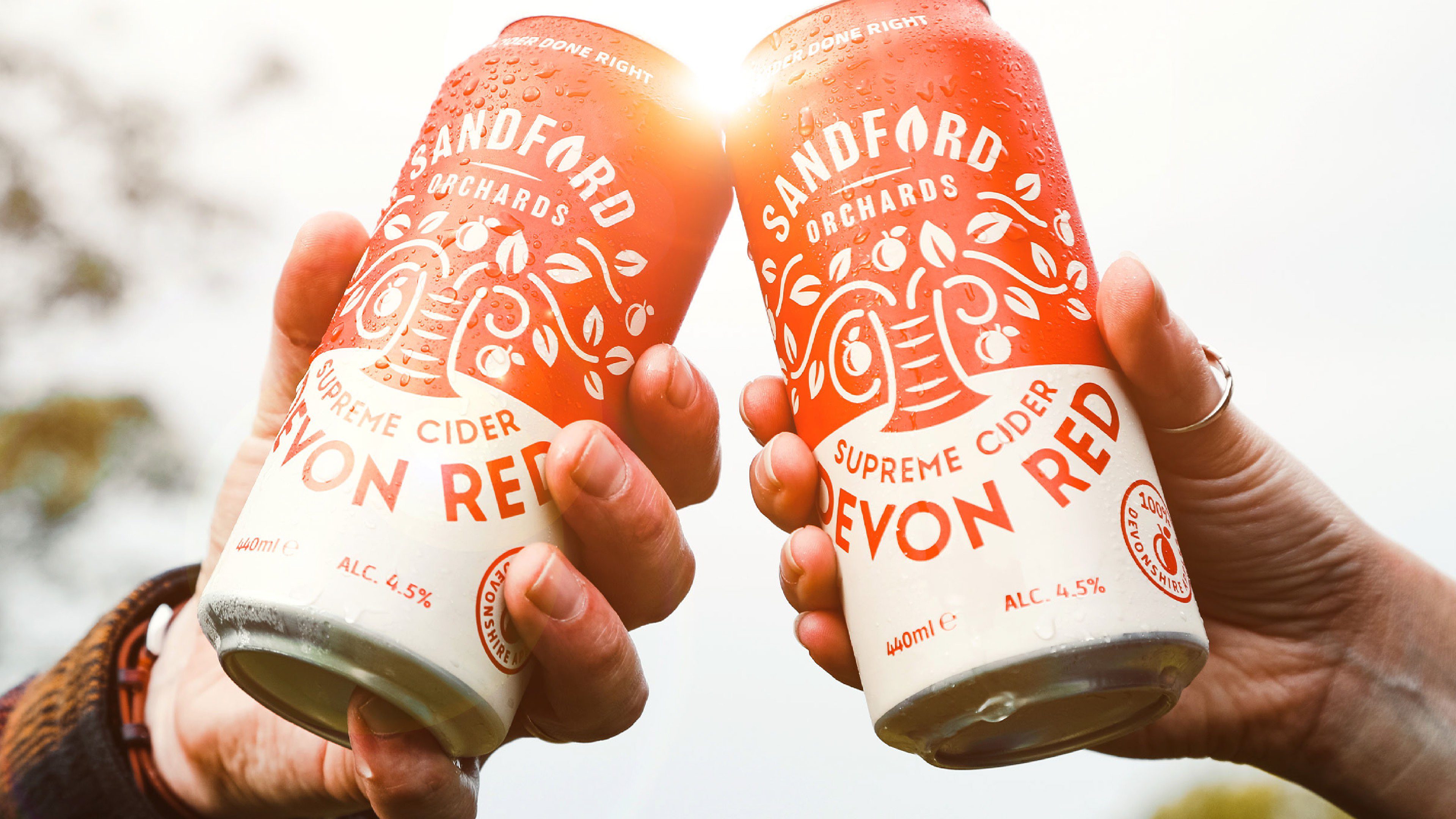
Cider done right: a fresh approach in a traditional category
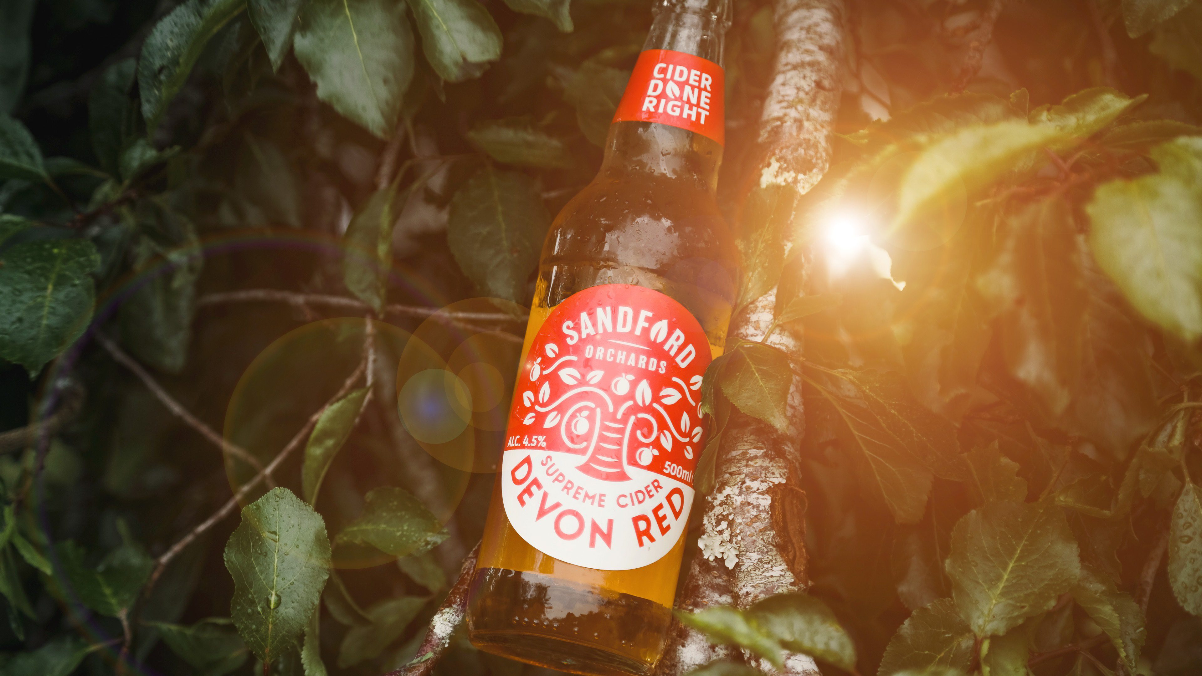
The British cider category was lacking in contemporary, middle-ground, premium cider — and Sandford Orchards came to us primed to fill this space. They’ve been making cider the proper way in the heart of Devon since 2002, producing drinks of far higher quality than the cheap, mass-produced ciders but more accessible than pricey craft options. Despite this, their brand wasn’t doing them justice, niching them in Devon and lacking appeal on the bar and shelf.
Branding | Typography | Packaging | Core Messaging | Guidelines

The Concept
To help them grow beyond their county and gear up to become a national player in the cider market, we needed to enable consumers to see Sandford Orchards as a worthwhile trade up, and justify their slightly higher price point. This meant working with them to reposition their brand as a more authentic and better tasting alternative to mainstream competitors.
The Impact
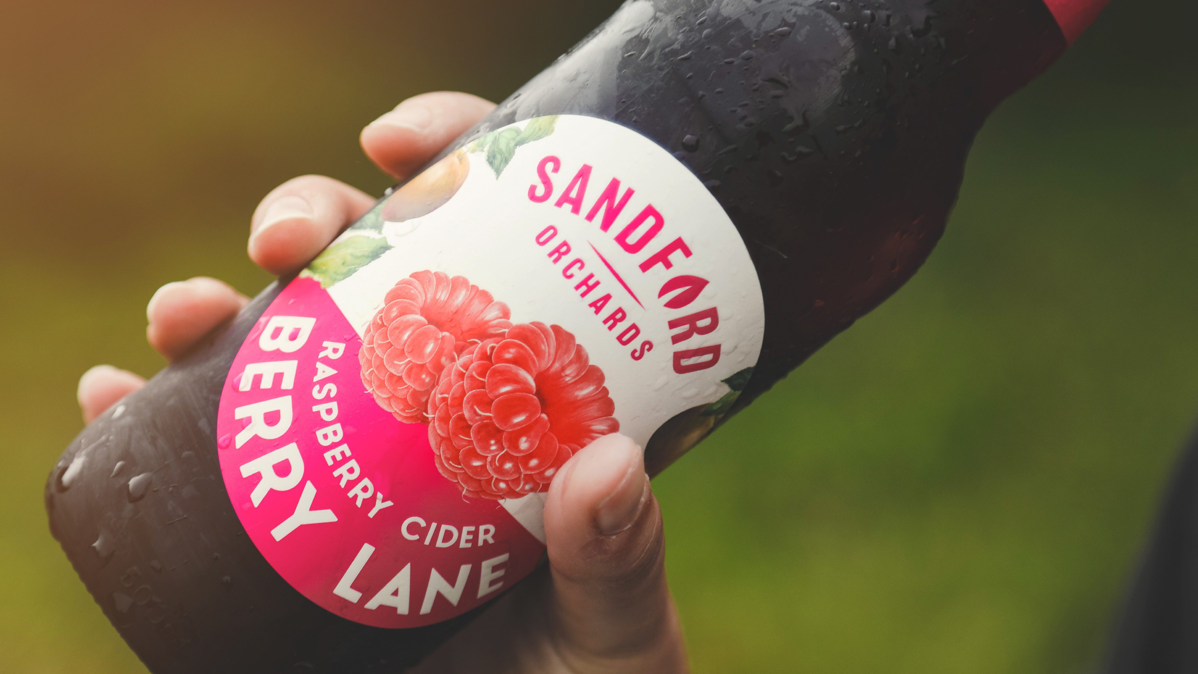
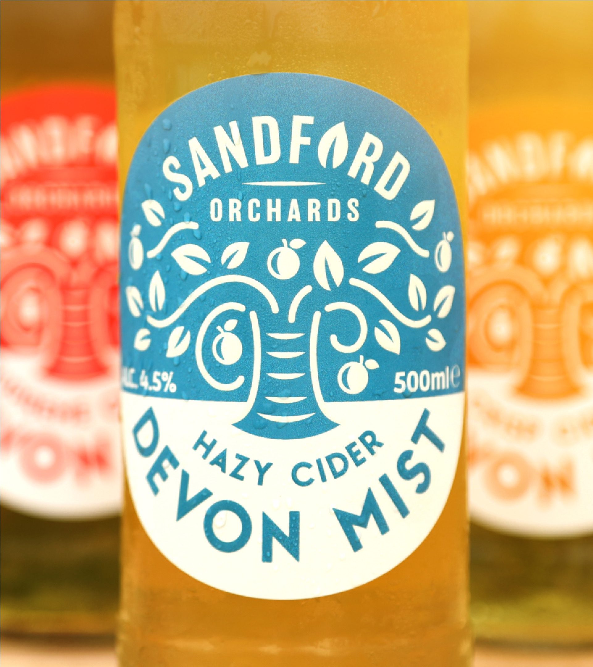
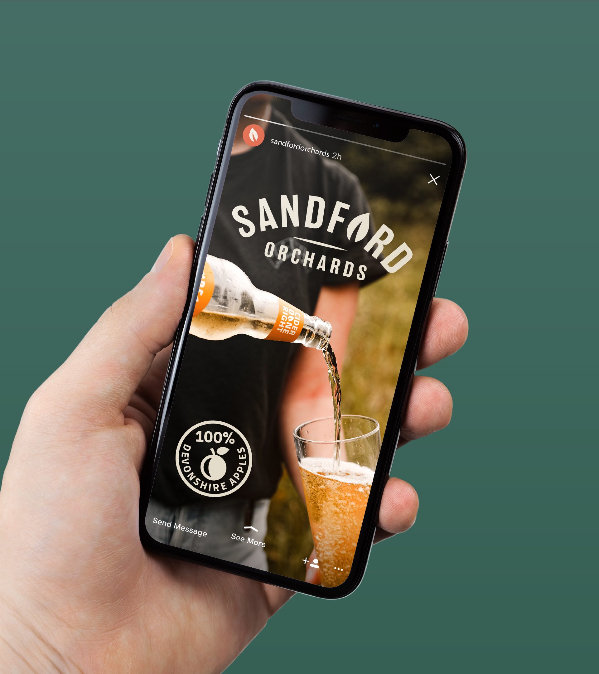
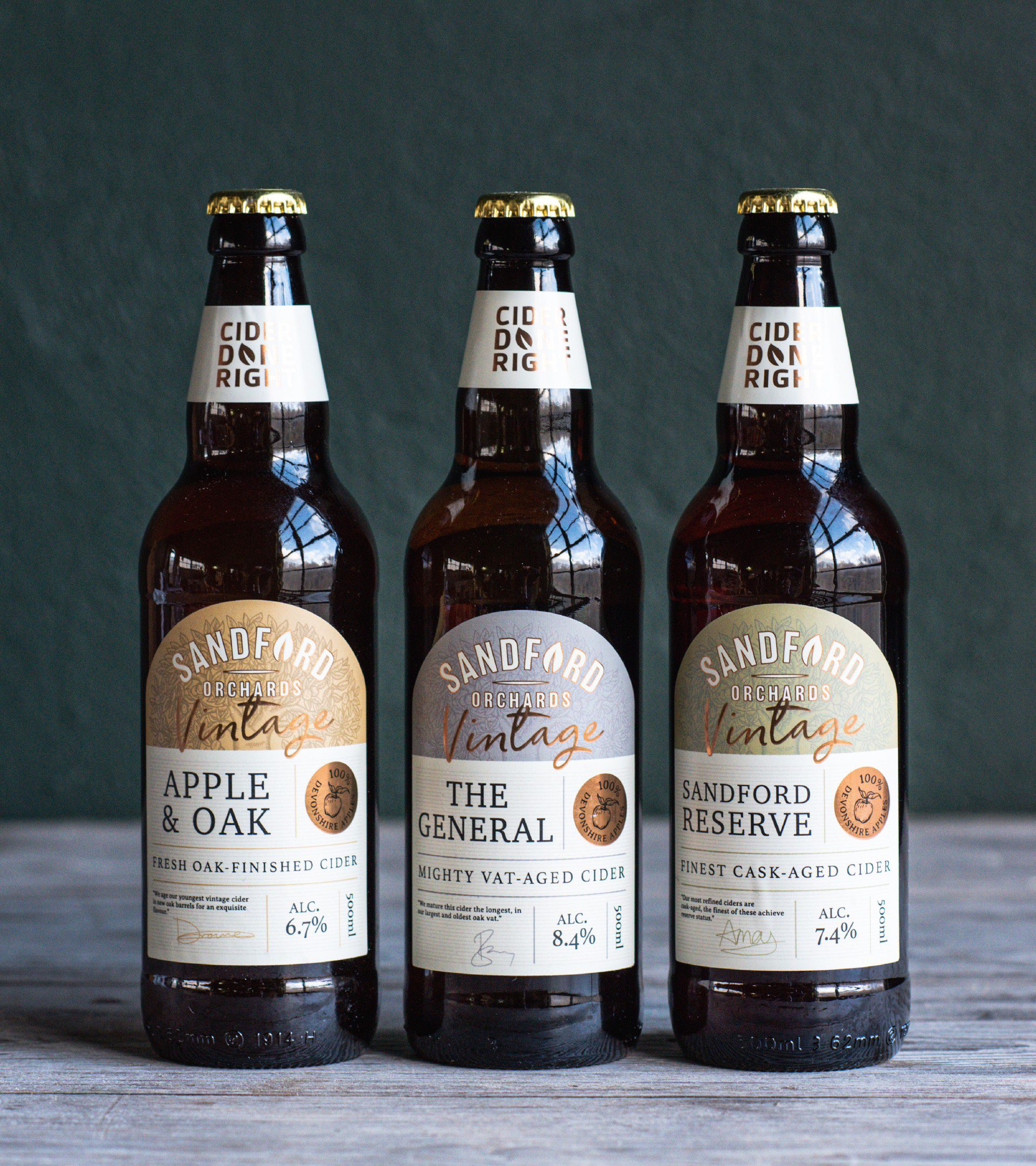
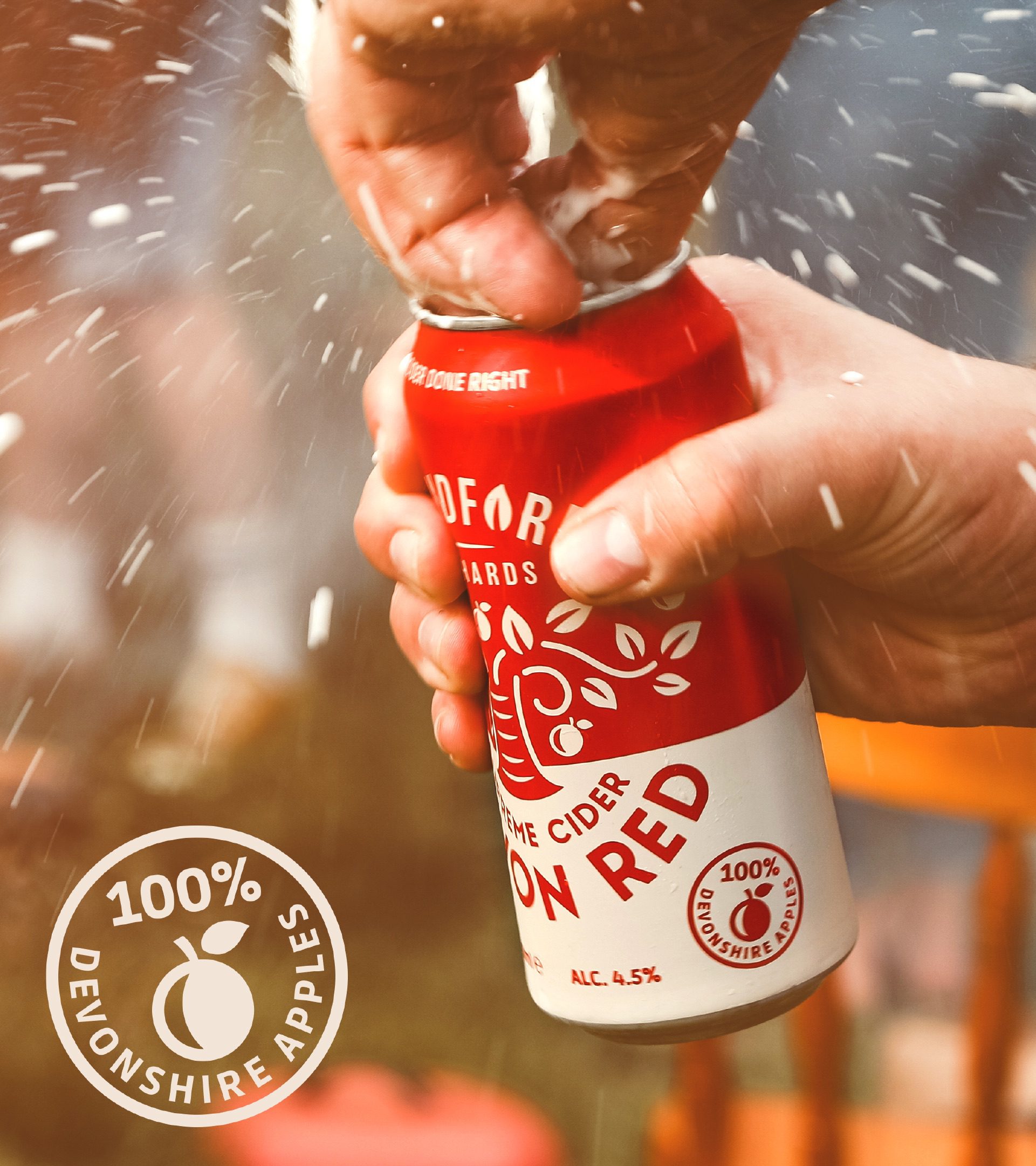
We redesigned their visual identity, pairing a modern, natural colour palette and style with clear, bold messaging to communicate quality and taste. Each of their ranges has its own unique character and offering, so we ensured the brand system was recognisable but flexible enough to appeal to different consumers.
Positive Change
“Kingdom and Sparrow are a team of highly creative, strategic, inquisitive people…
They were quick to understand what we’re about and to develop that into a simple yet compelling positioning and creative strategy. We’re extremely happy with the end result and look forward to working with them again.”
Barry Butterfield, MD of Sandford Orchards.