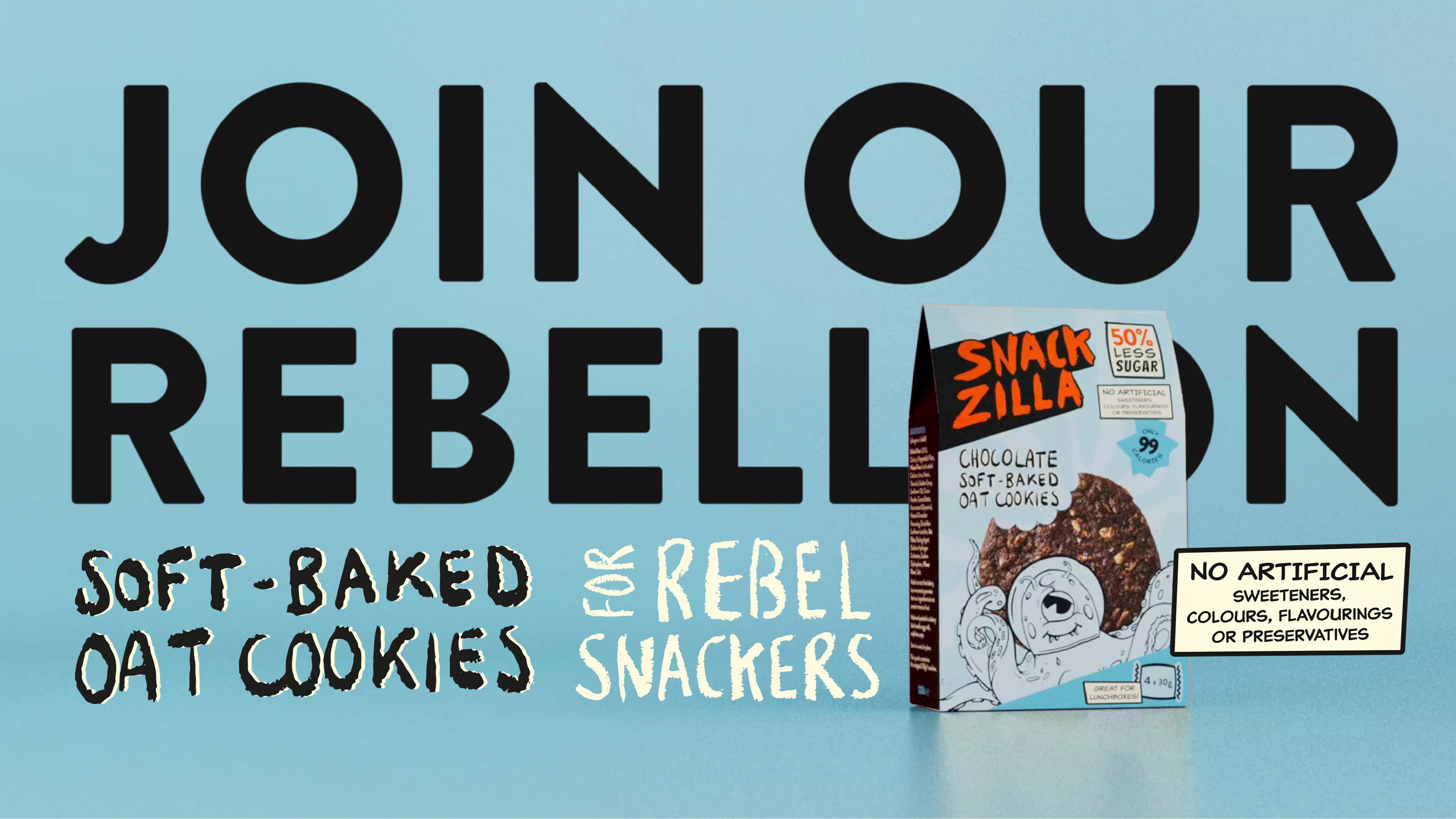
For rebel snackers: At the forefront of kid-friendly snacking.

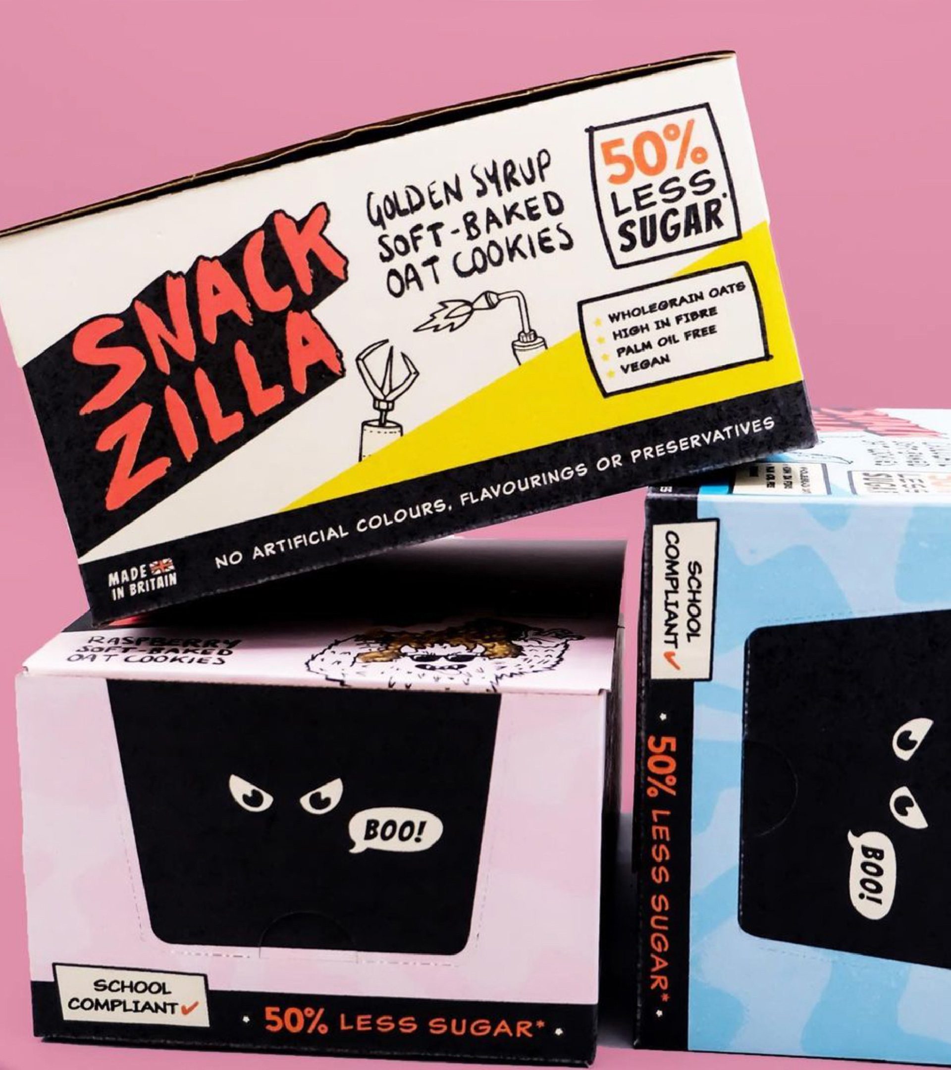
Snackzilla came to us with an exciting proposition: to own the low sugar snack space for 5-13 year olds. Their handmade oat cookies have 40% less sugar than the average sweet biscuit. They’re also dairy-free and have no artificial colours, flavours or preservatives. Our challenge was to create a brand that would attract and engage with their target audience of school-age kids – but also reassure their parents by communicating these health claims. 
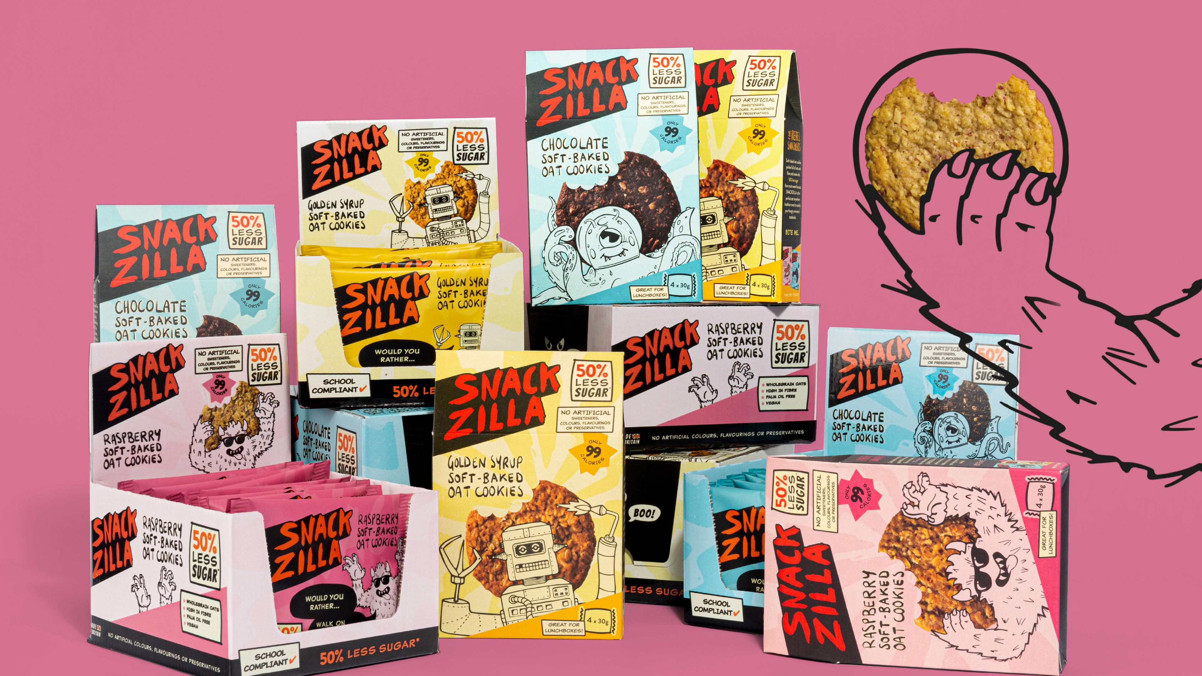
BRAND IDENTITY | POSITIONING | TYPOGRAPHY | PACKAGING | ANIMATION | MESSAGING | GUIDELINES
6 SnackZila Desktop
3 SnackZila Desktop
4 SnackZila Desktop
5 SnackZila Desktop
2 SnackZila Desktop
7 SnackZila Desktop
8 SnackZila Desktop
9 SnackZila Desktop

The Concept

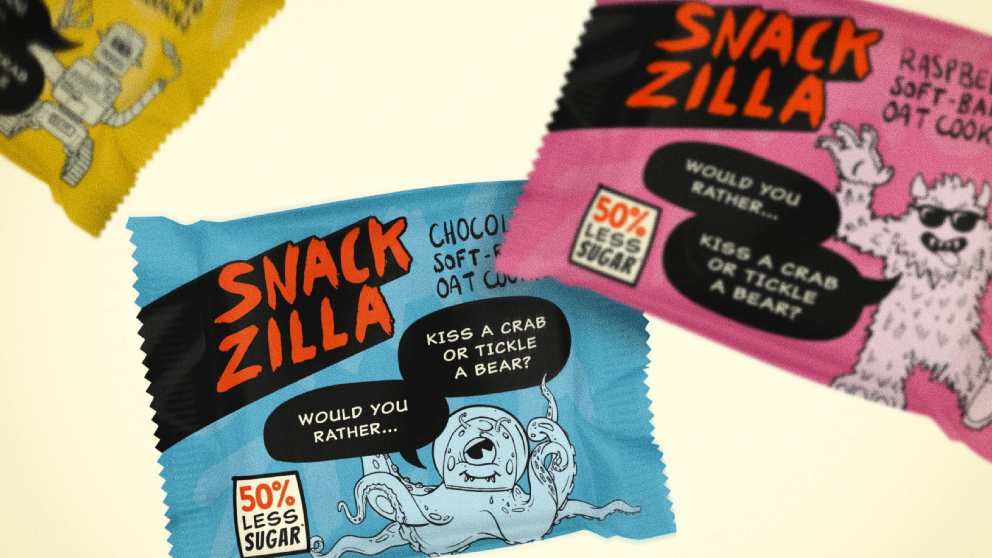
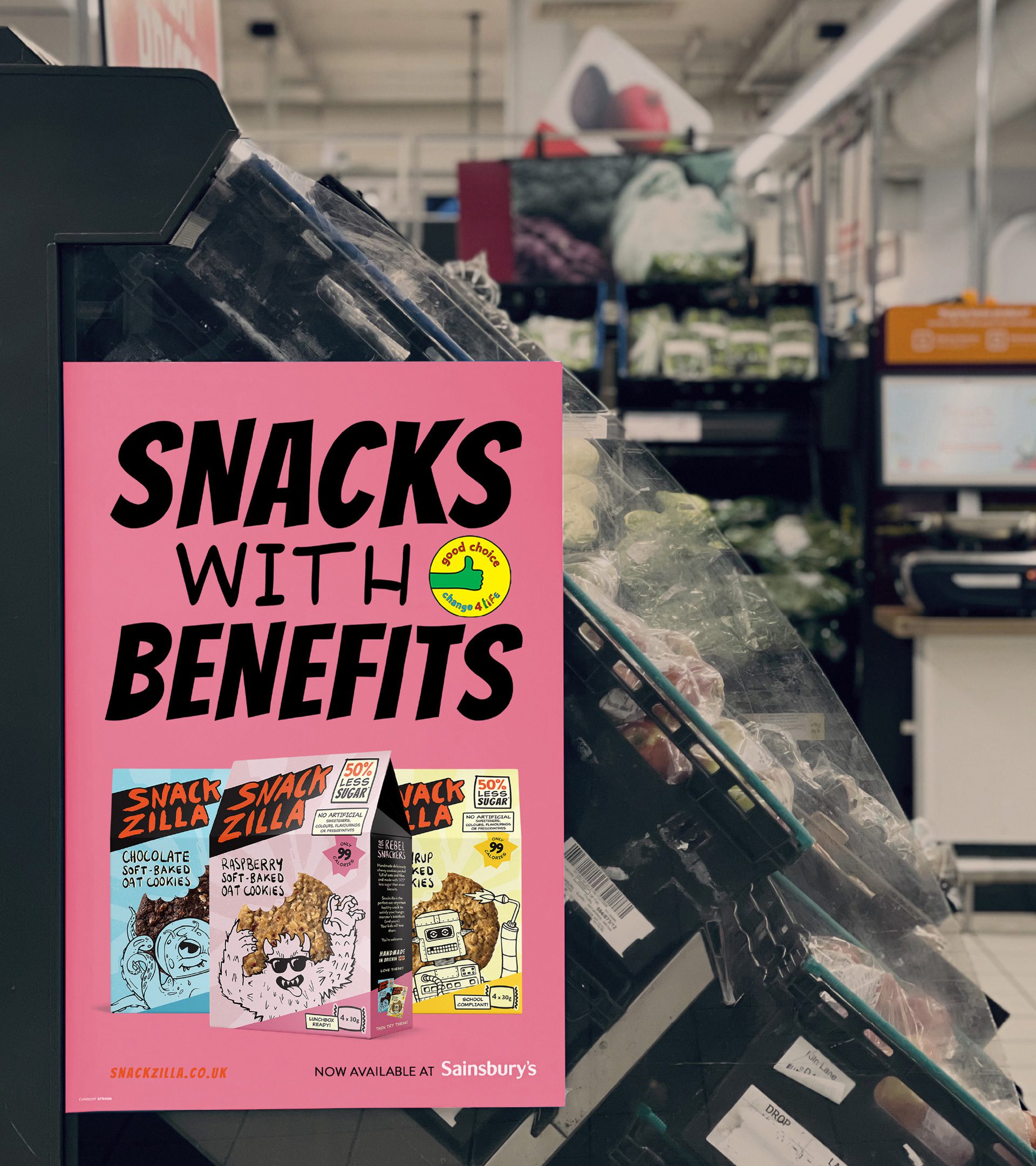
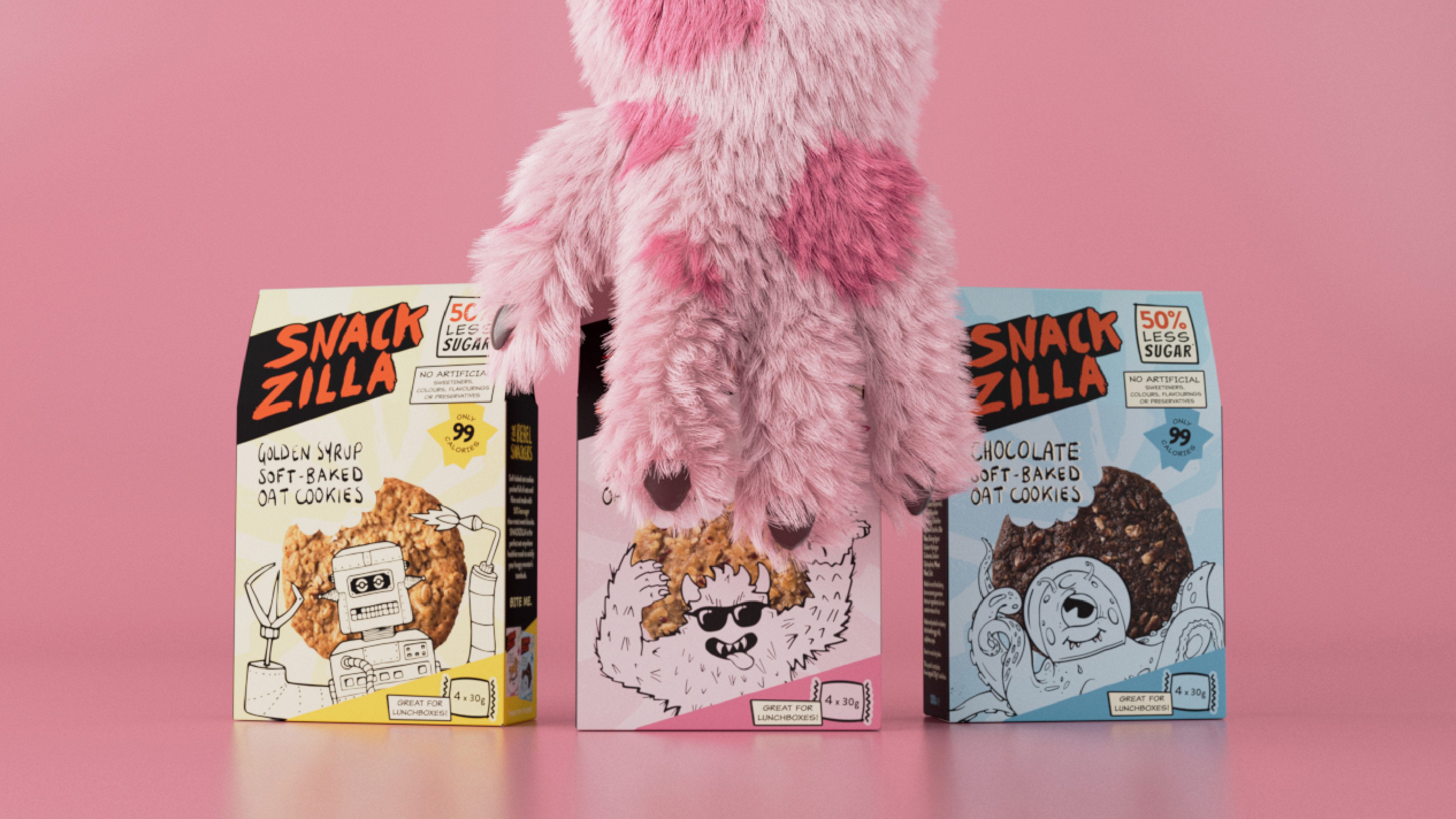
To stand out amongst competitors in the category where brand styles are often ‘cute’ or focused on nature, we used a contemporary, character-led illustration style paired with comic book design cues and a rebellious tone of voice. Clear health claims are part of the overall aesthetic and brand communication, so they don’t compromise on the fun!
 
Snackzilla’s purpose is not only to be better for kids but to be better for the planet too, so we worked with Founder Marieke to ensure that the design was effective on the sustainable flow-wrap material – a fully recyclable and compostable fibre paper.
 

Positive Change

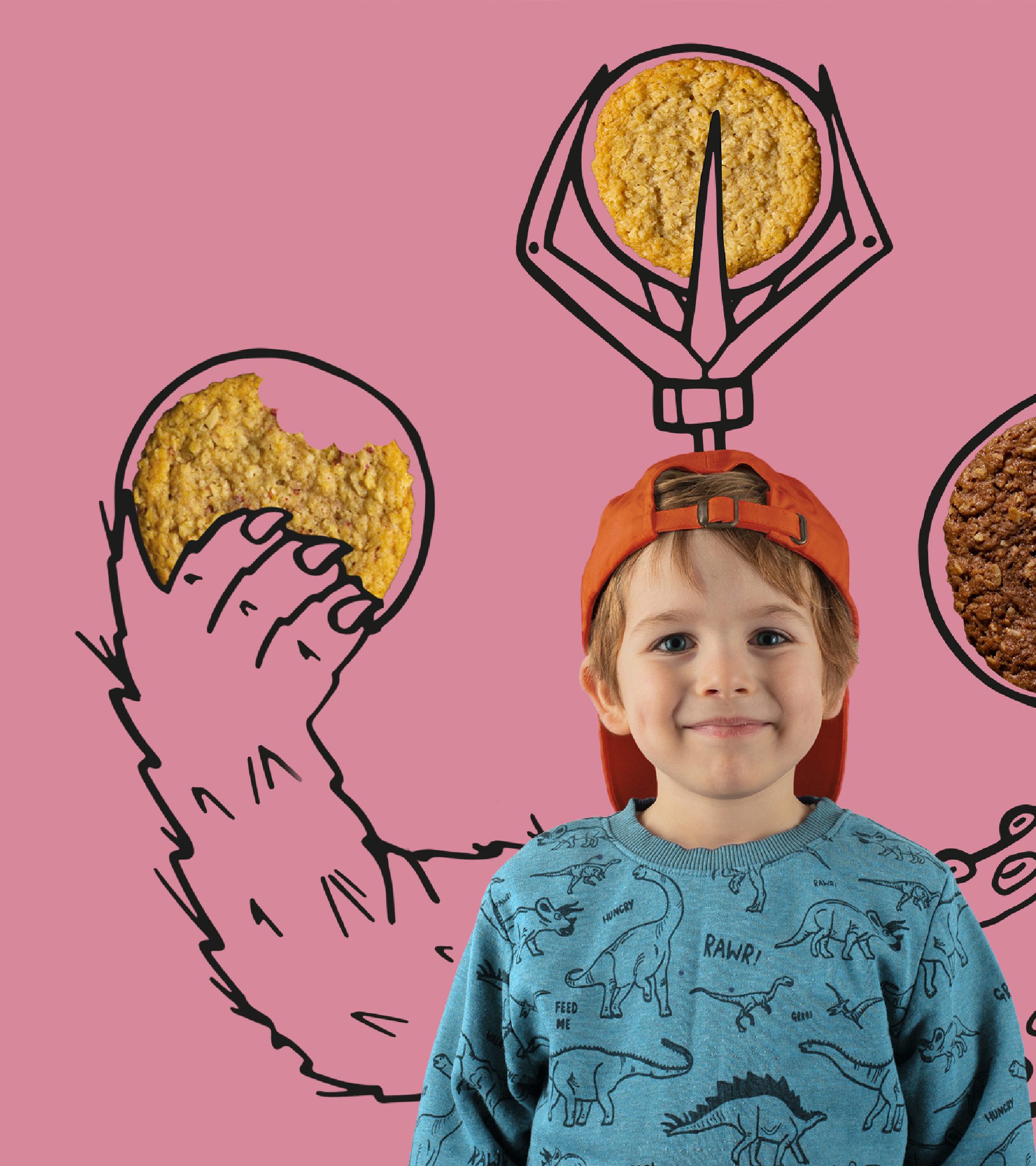
With fun and imagination at the heart of it, the result is a category-challenger brand that’s loved by parents and kids alike.

Snackzilla launched in 2019, and after a strong two years of growth, in early 2021 announced that Warburtons had taken a minority stake in the company, paving the way for more exciting things to come.

DBA

Powered by Green Hosting   ©2024 Kingdom & Sparrow Ltd.