Roost Portfolio 1 1

Creating a brand for new wine drinking occasions

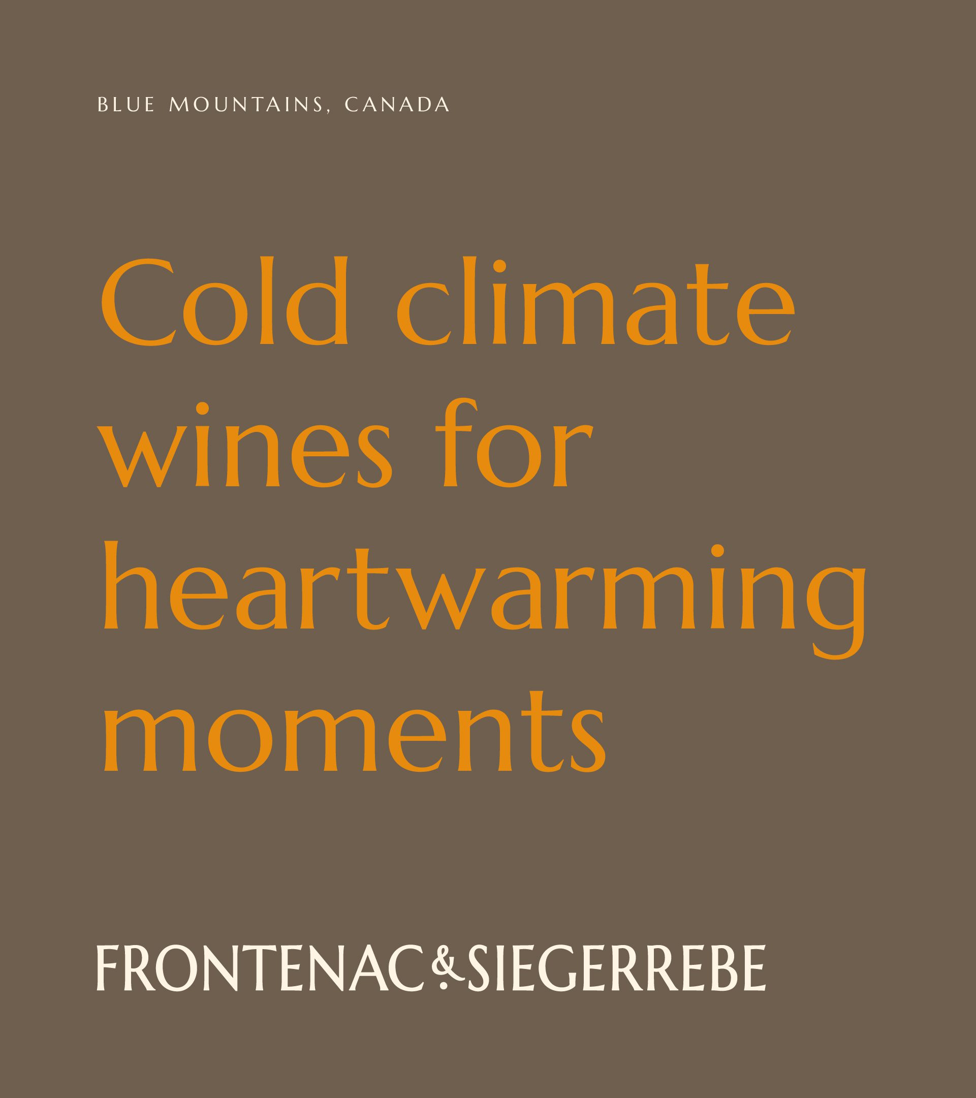
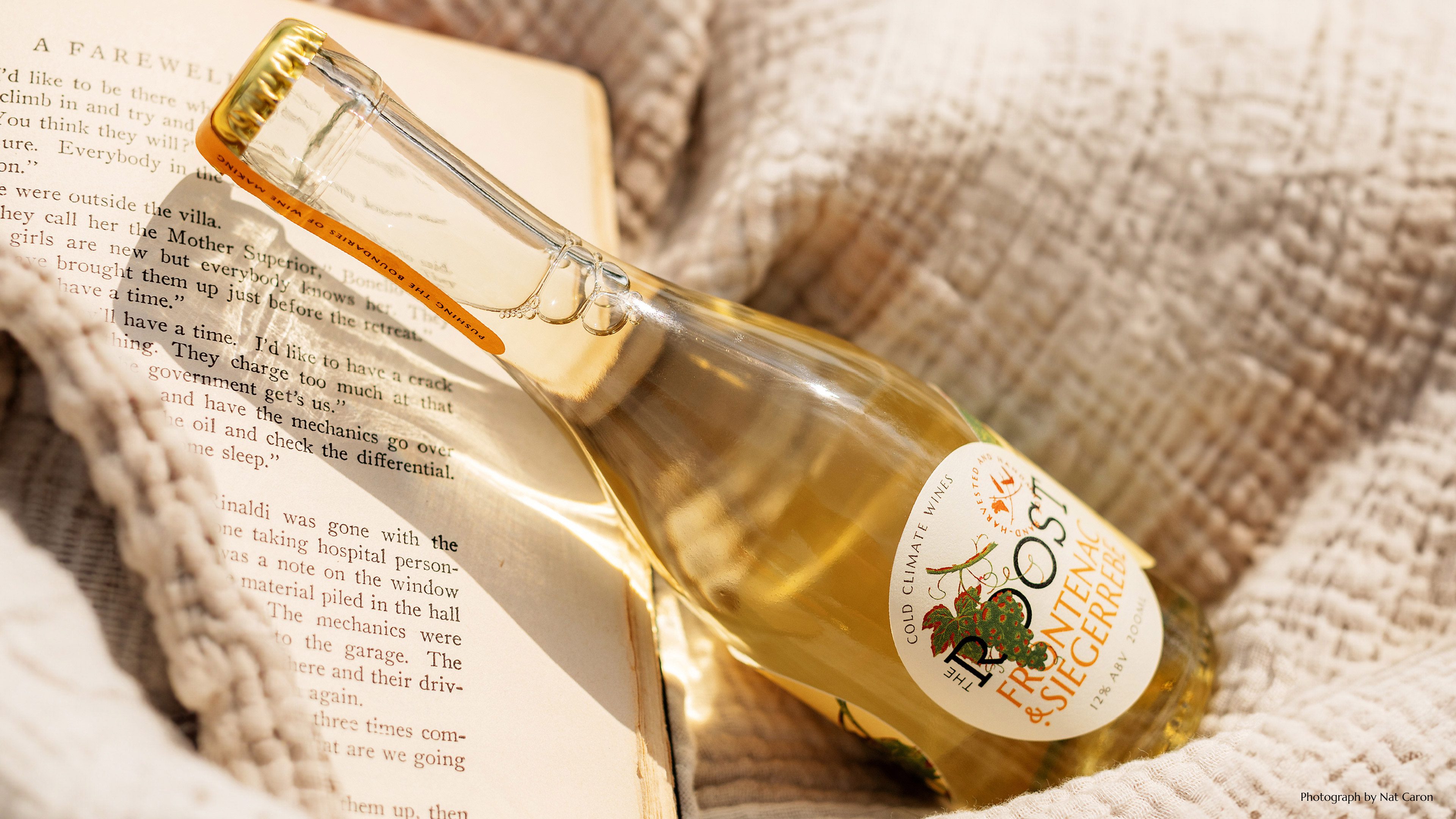
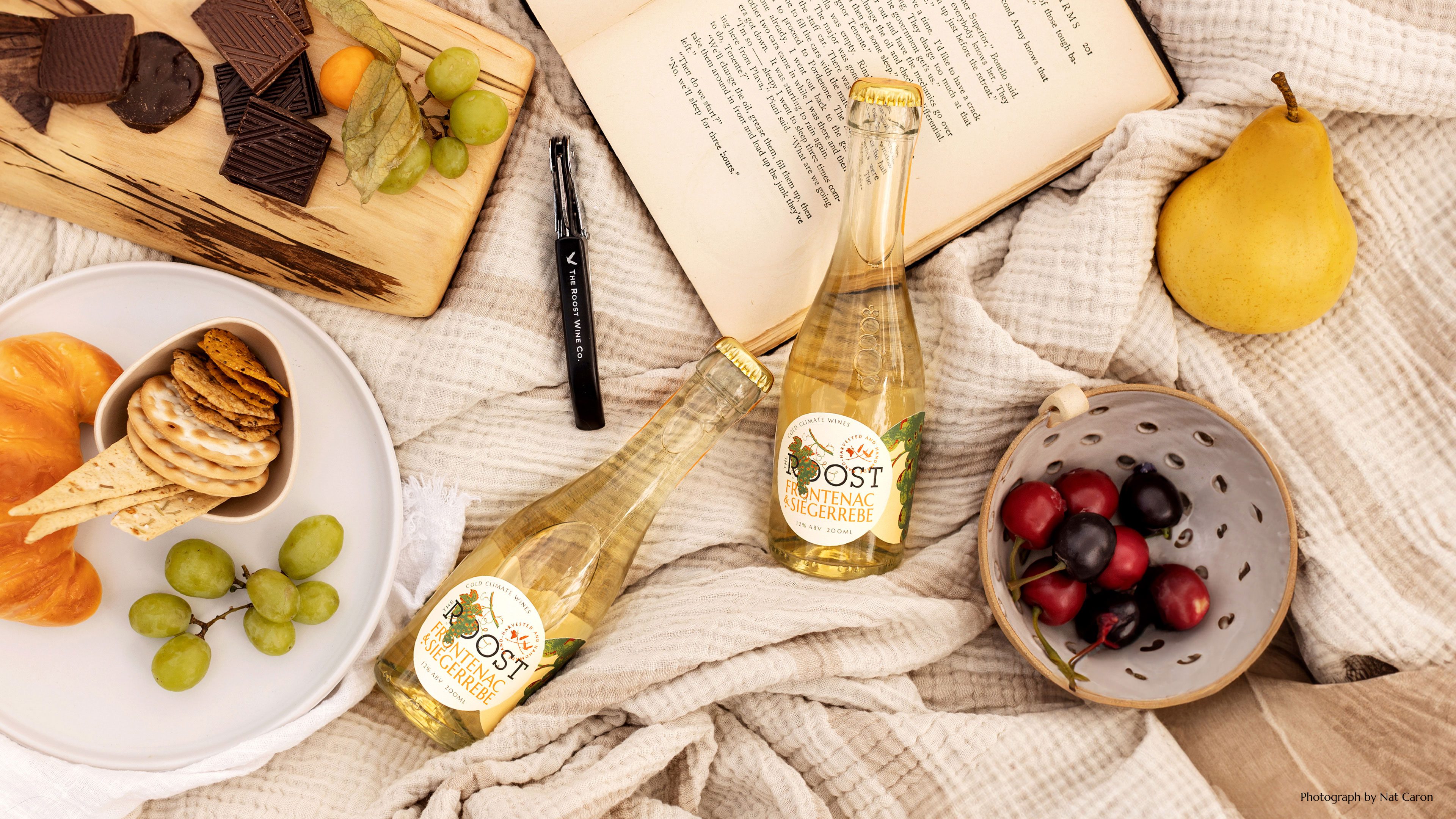
Re-imagining cold climate wines for a new audience. We developed a brand extension for a new product format to appeal to a lifestyle-driven audience and different occasions to enjoy cold climate wines.

BRAND IDENTITY | PACKAGING DESIGN | BRAND GUIDELINES | TYPOGRAPHY DEVELOPMENT | ILLUSTRATION
Roost Portfolio 2 1
Roost Portfolio 3 1
Roost Portfolio 4
Roost Portfolio 5 1
Play Video
Roost Portfolio 7 2
Roost Portfolio 8
Play Video
Roost Portfolio 10
Roost Portfolio 11
Play Video
Roost Portfolio 13
Roost Portfolio 14 1

The Concept

An identity and packaging connecting established assets with original, modern elements, connecting to the outdoor lifestyle and new drinking occasions.

The Impact

“It has been wonderful working with you and your team… It looks great! We’re very happy with how it’s all come together”
Roost Winery

Positive Change

Roost Winery is based in The Blue Mountains, Canada. A beautiful location surrounded by lakes, rivers and hiking routes. But where it can hit -50 degrees – a difficult place to have a vineyard. Roost have successfully developed their own hand grown and harvested cold climate varieties, which have proved popular across the region.

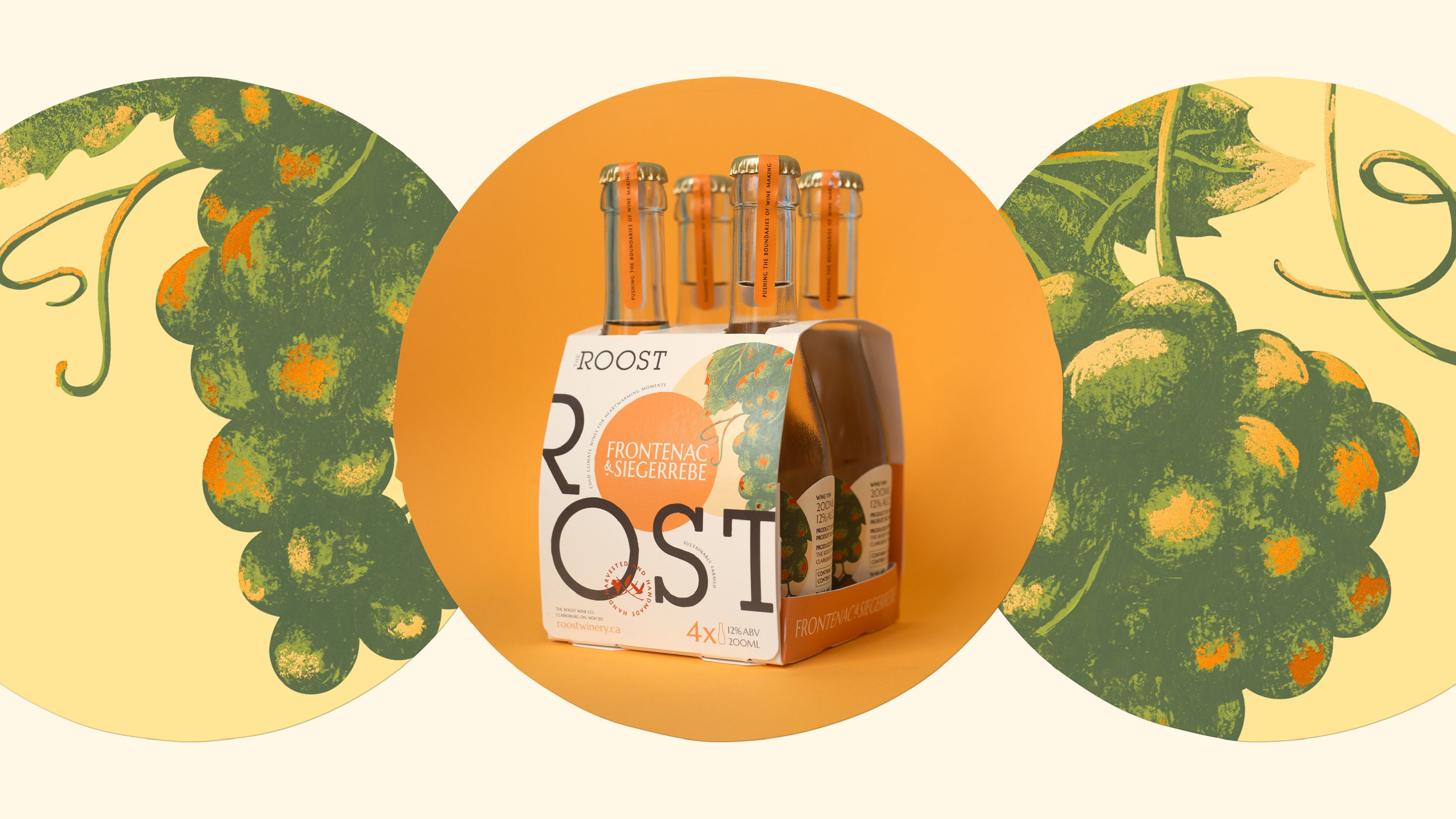
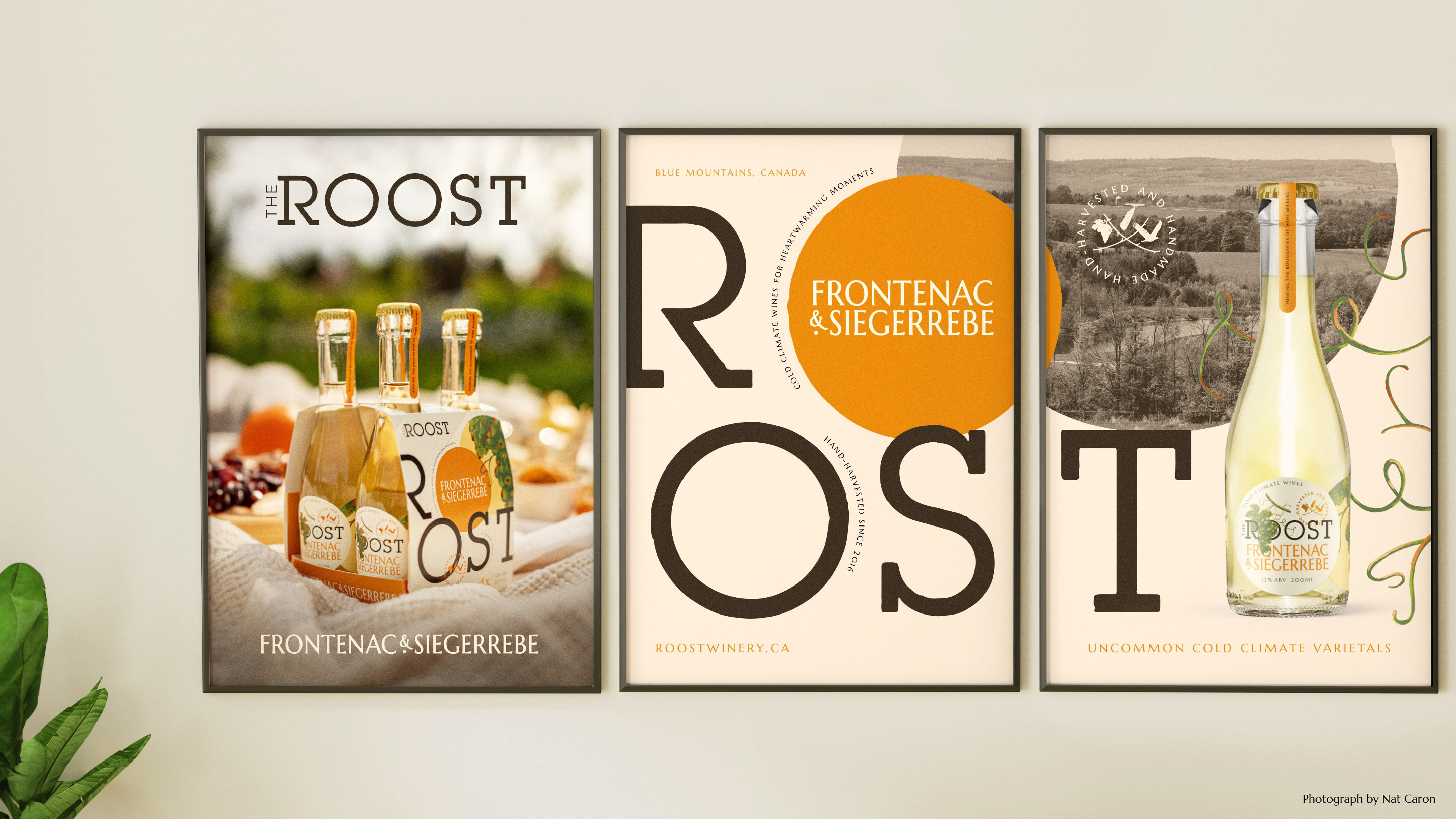
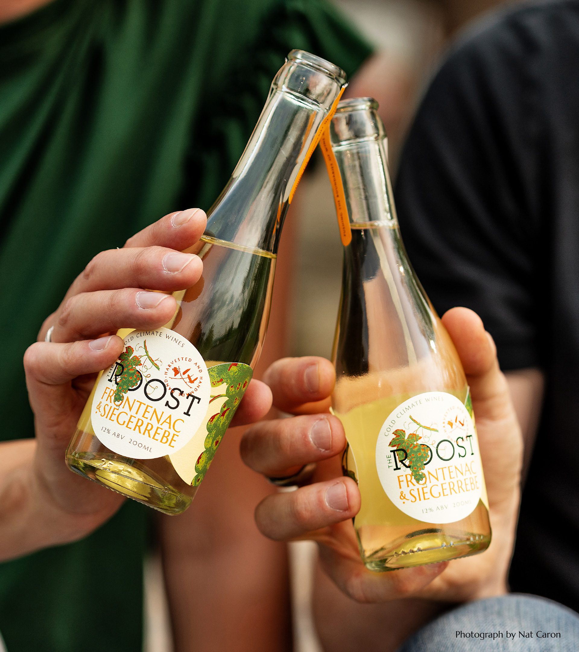
They came to us for branding for a new product; 200ml bottles ideal for a barbecue, picnic or lakeside lunch. The new brand needed to appeal to this outdoor lifestyle audience, without losing the connection to the existing brand or their natural philosophy.
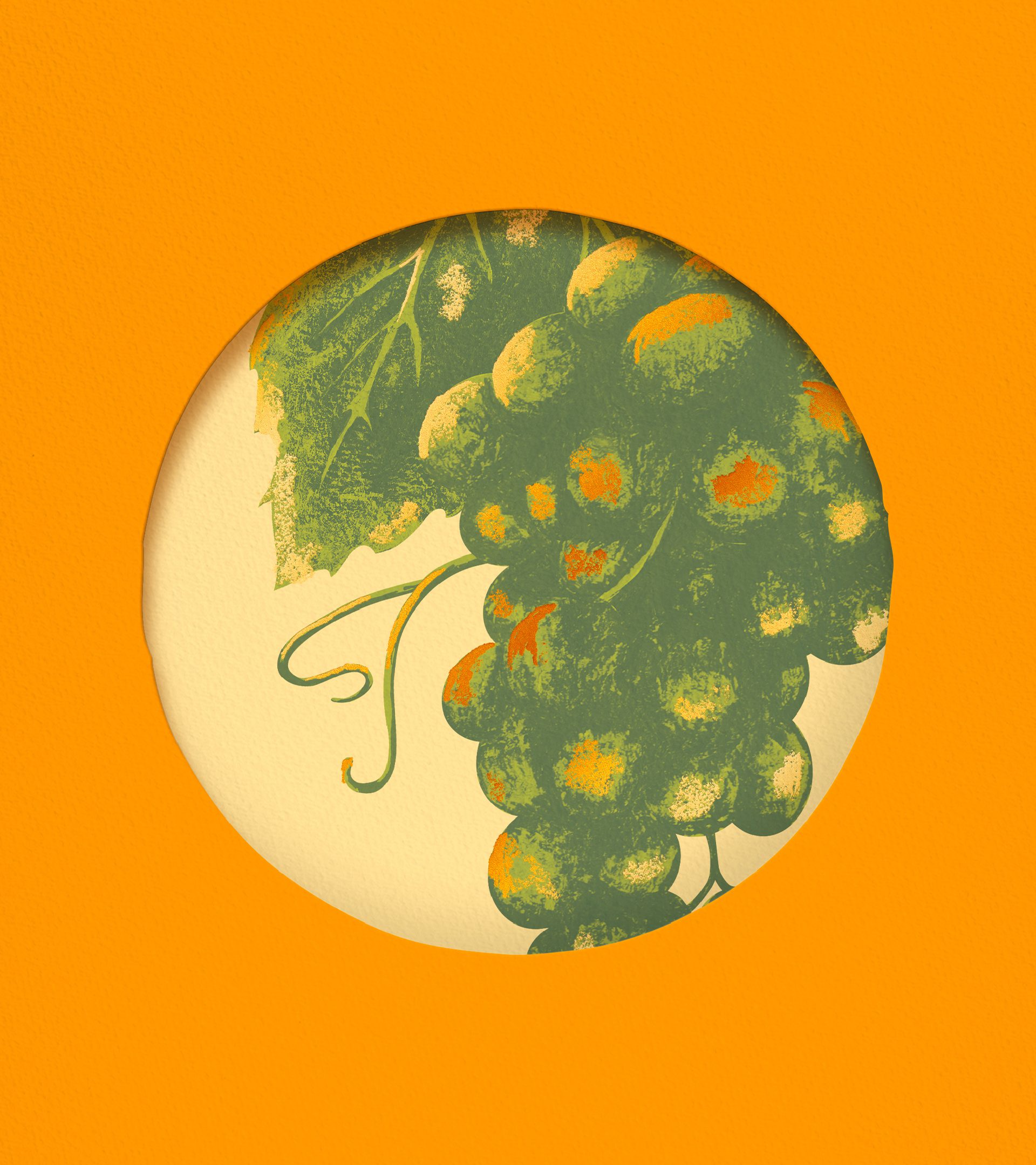
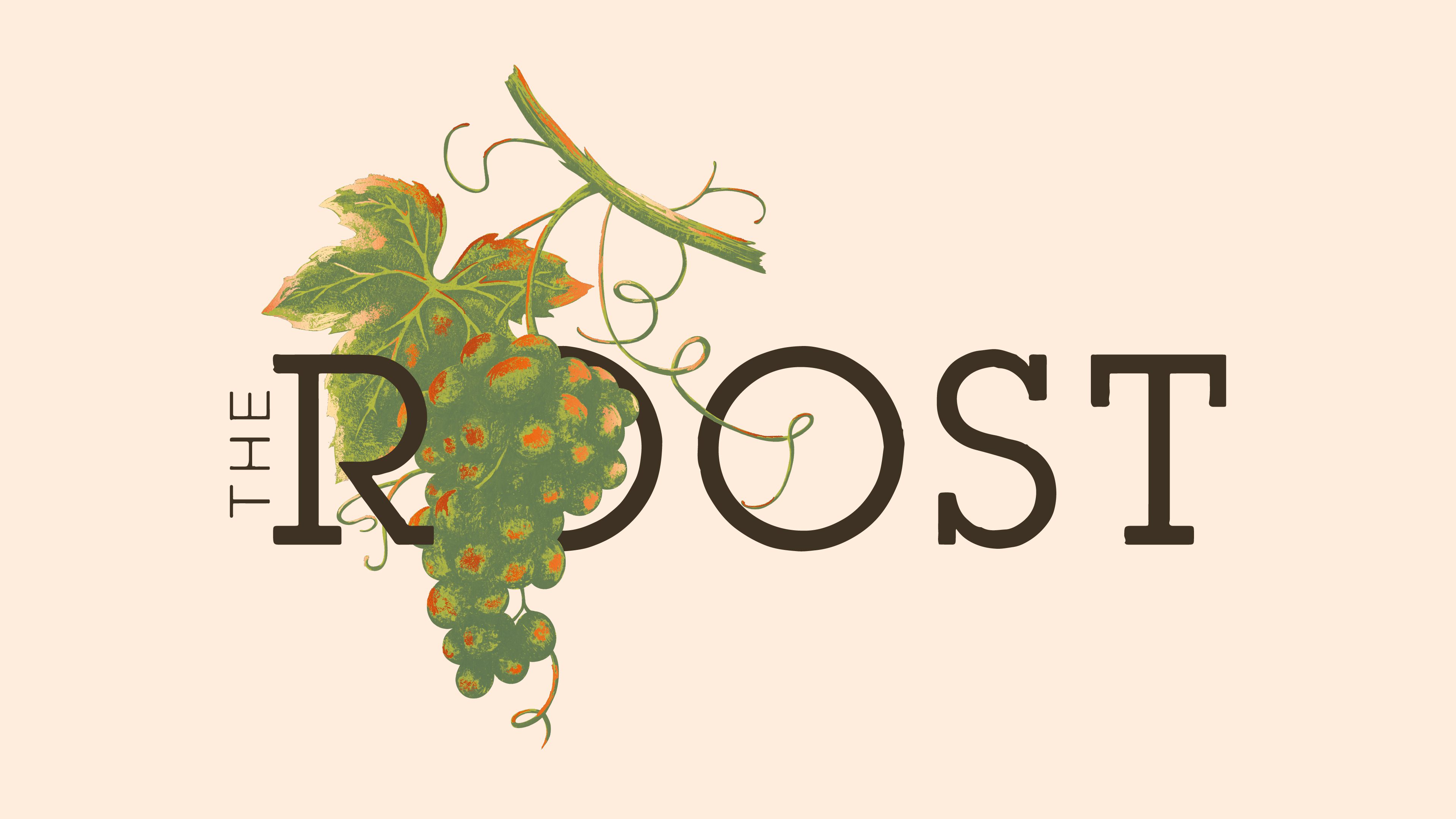
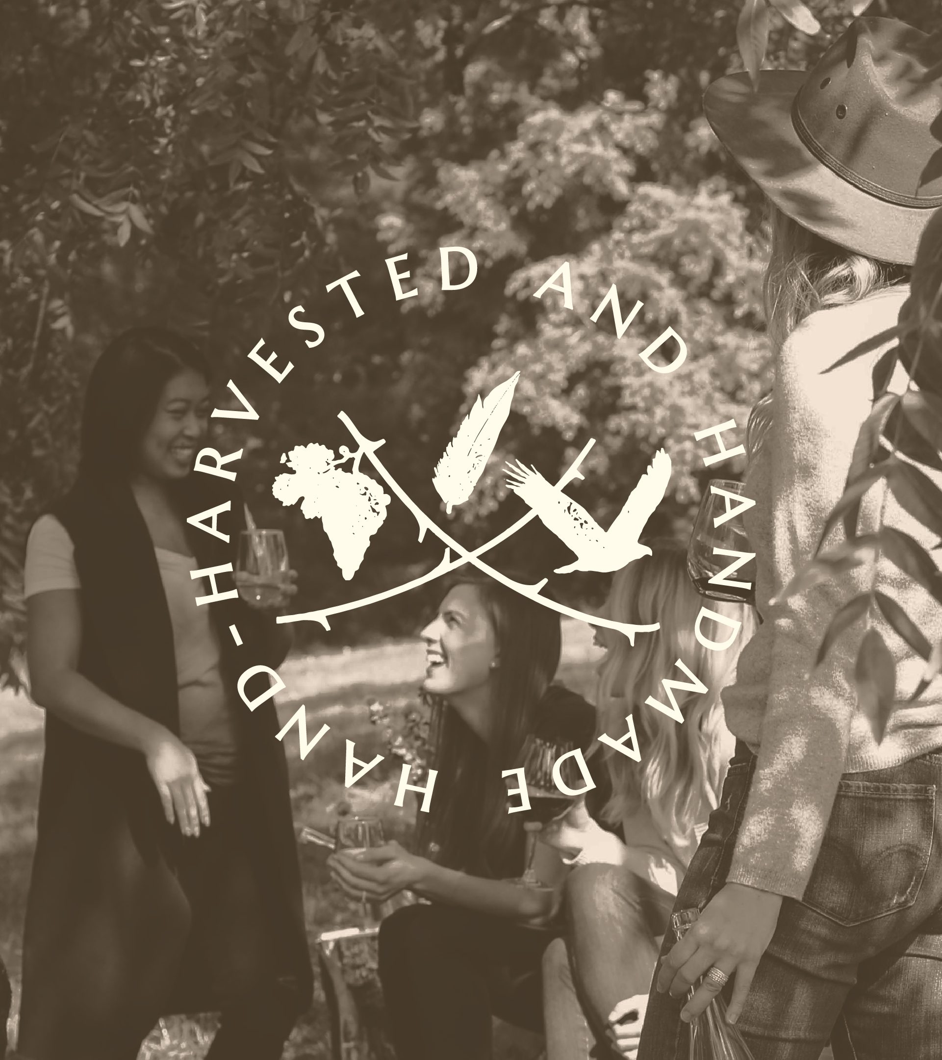
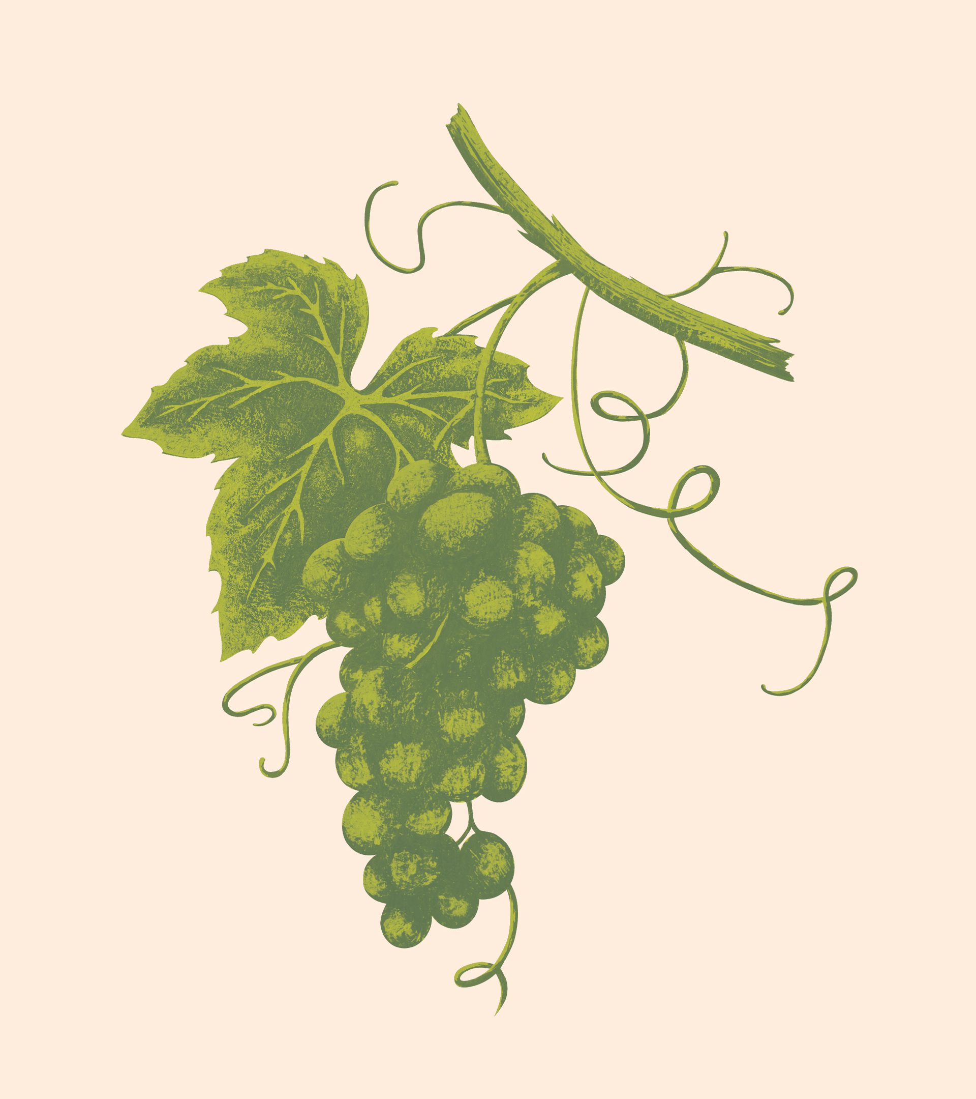
Our in-house design team created a hand-painted grape and vine image which is utilised as part of a refreshed logo, with elements used across the rest of the brand world. The updated logo wordmark connects directly to the existing brand, but is more flexible and contemporary in execution.
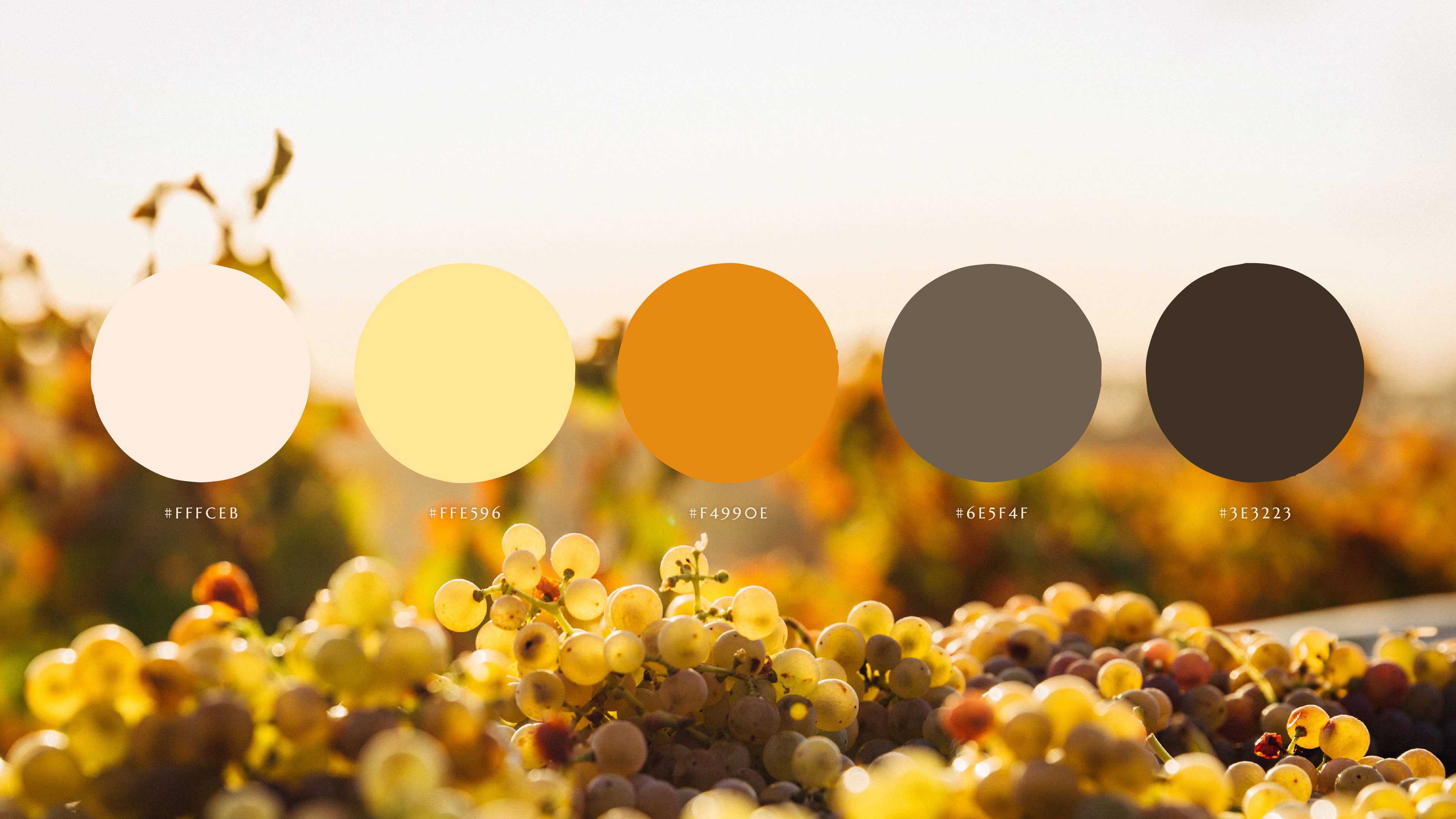
The packaging utilises the prominent ‘oo’ on ‘Roost’ to create windows for the brand identity and information. These are also used across the brand world to crop in on the illustration asset. The colour palettes were chosen to feel earthy and natural, but add a sense of warmth and approachability.
The product typeface was selected for the varietals on the bottle, reflecting both the established existing brand, but also a nod to something more modern and contemporary.

talk to our team

K&S_footer_logos_400-02
BBA_BetterBusinessAct_Logo_Light
250-Club-white-stamp-2021
K&S_footer_logos_400-04
K&S_footer_logos_400-07