Making Waves
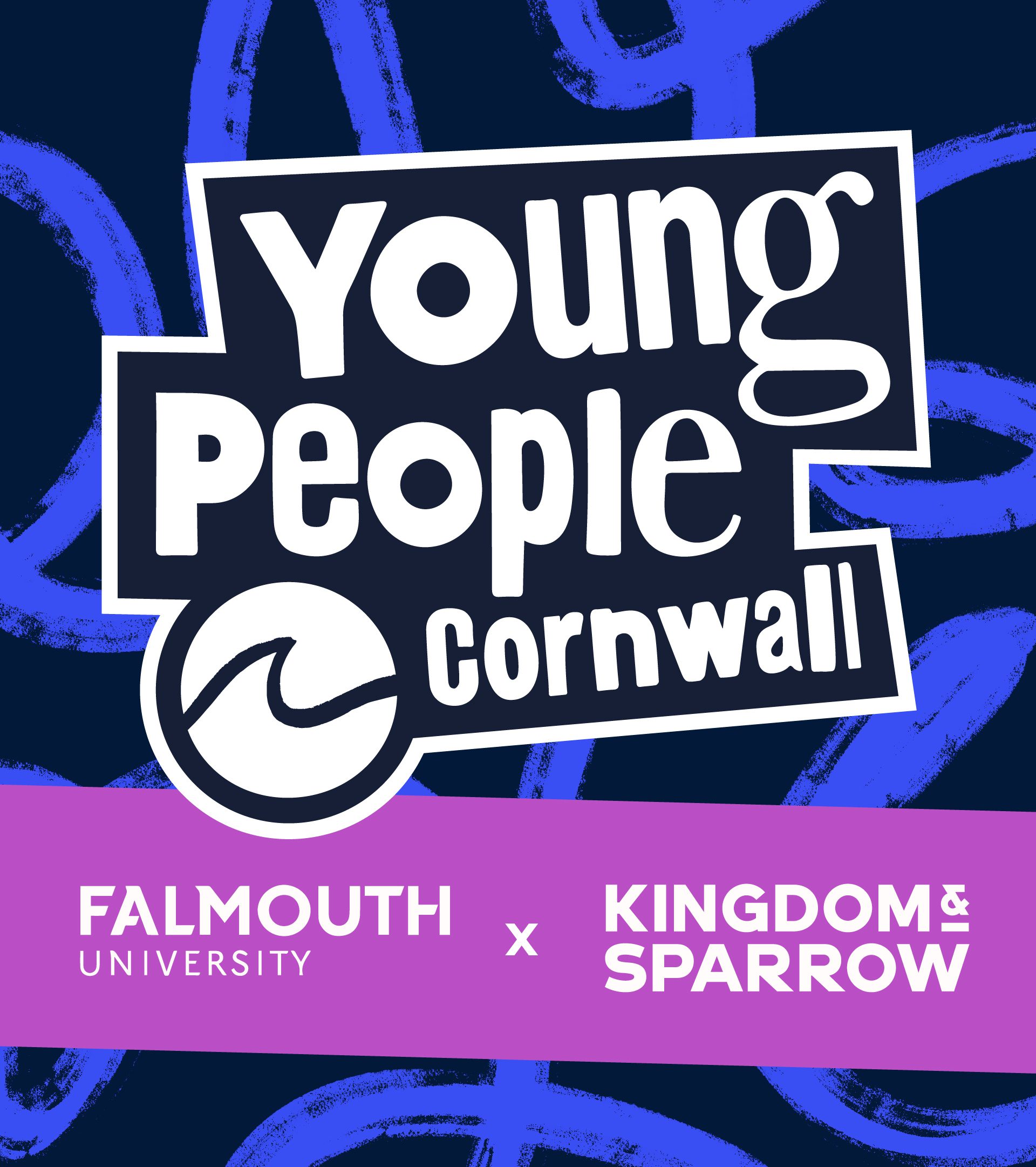
Working with young people in Cornwall to evolve the Young People Cornwall brand We worked with charity, Young People Cornwall, and Falmouth University students to evolve their positioning and identity.
PRO-BONO | BRAND IDENTITY | BRAND GUIDELINES | TYPOGRAPHY DEVELOPMENT | ILLUSTRATION
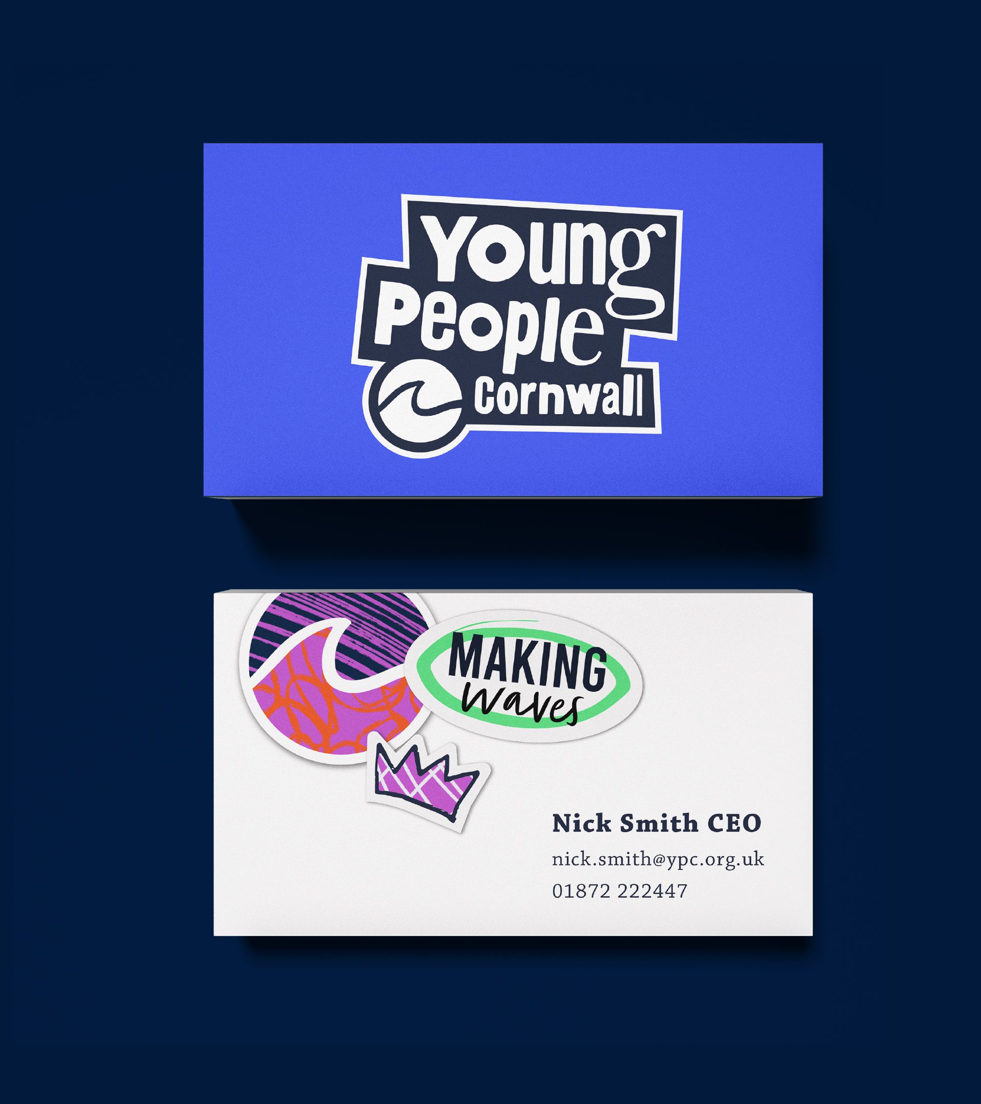
The Concept
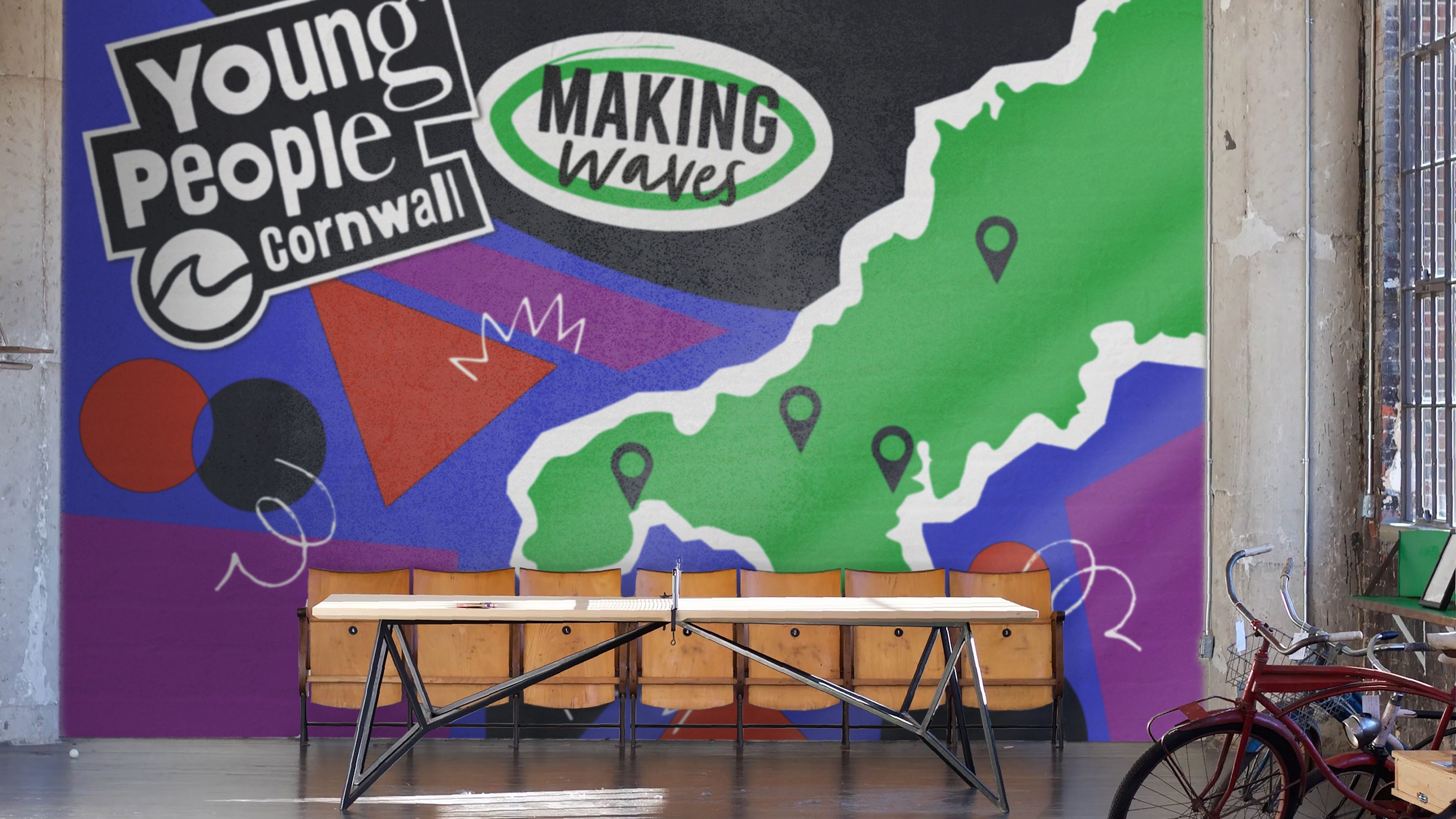
An evolved identity and brand world to reflect the energy and dynamism of the YPC tagline, Making Waves, and appeal to a new personality of young people.
The Impact
New portfolio work for a number of Falmouth University students and a final, real world project for the successful concept. A new brand identity for YPC, approved by the board and trustees, rolled out across key touchpoints.
Positive Change
Young People Cornwall first started working with local youth groups in 1974. Since then they have continued to push further and harder to support and improve young people’s lives across Cornwall.
Their work is described as edgy, dynamic and innovative – their maverick approach ensures that young people’s voices are heard. They now run four youth centres across the county as well as fourteen specific projects.
But, their brand had lost some of that dynamic edge over the years. We approached them to ask if they’d be interested to be part of Kingdom & Sparrow’s CSR work for pro-bono brand development.
When our offer was taken up, we decided that there would be nobody better to work with in developing a new brand identity to appeal to young people in Cornwall, than young people in Cornwall. We approached the talented third year students on Falmouth University’s Graphic Design.
After a brand discovery workshop with a broad range of stakeholders across the YPC team, we refined the positioning of the brand, created a new strategic framework and a creative brief. Our studio team created various territories for design exploration. We briefed the student team and were amazed at the quality and thought of the work we had back. YPC were presented with the work and had a clear direction for development.
Emily Woodall, whose concept was chosen, worked with our team to further refine, develop and present the final work to clients.
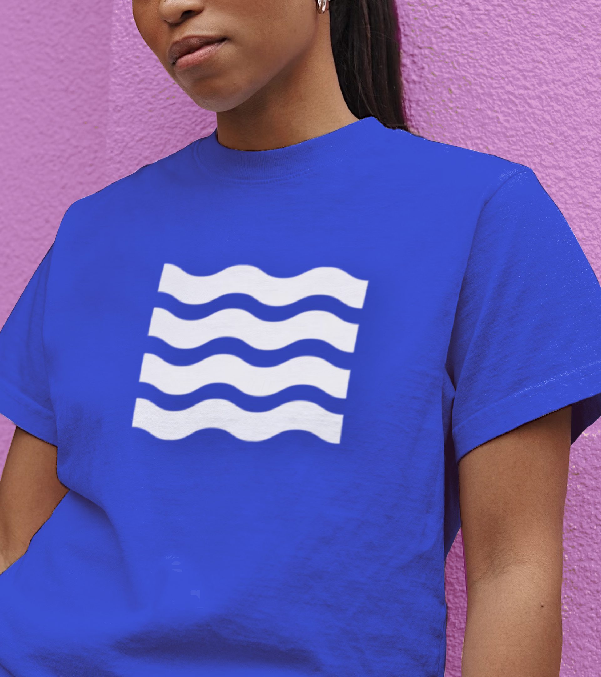
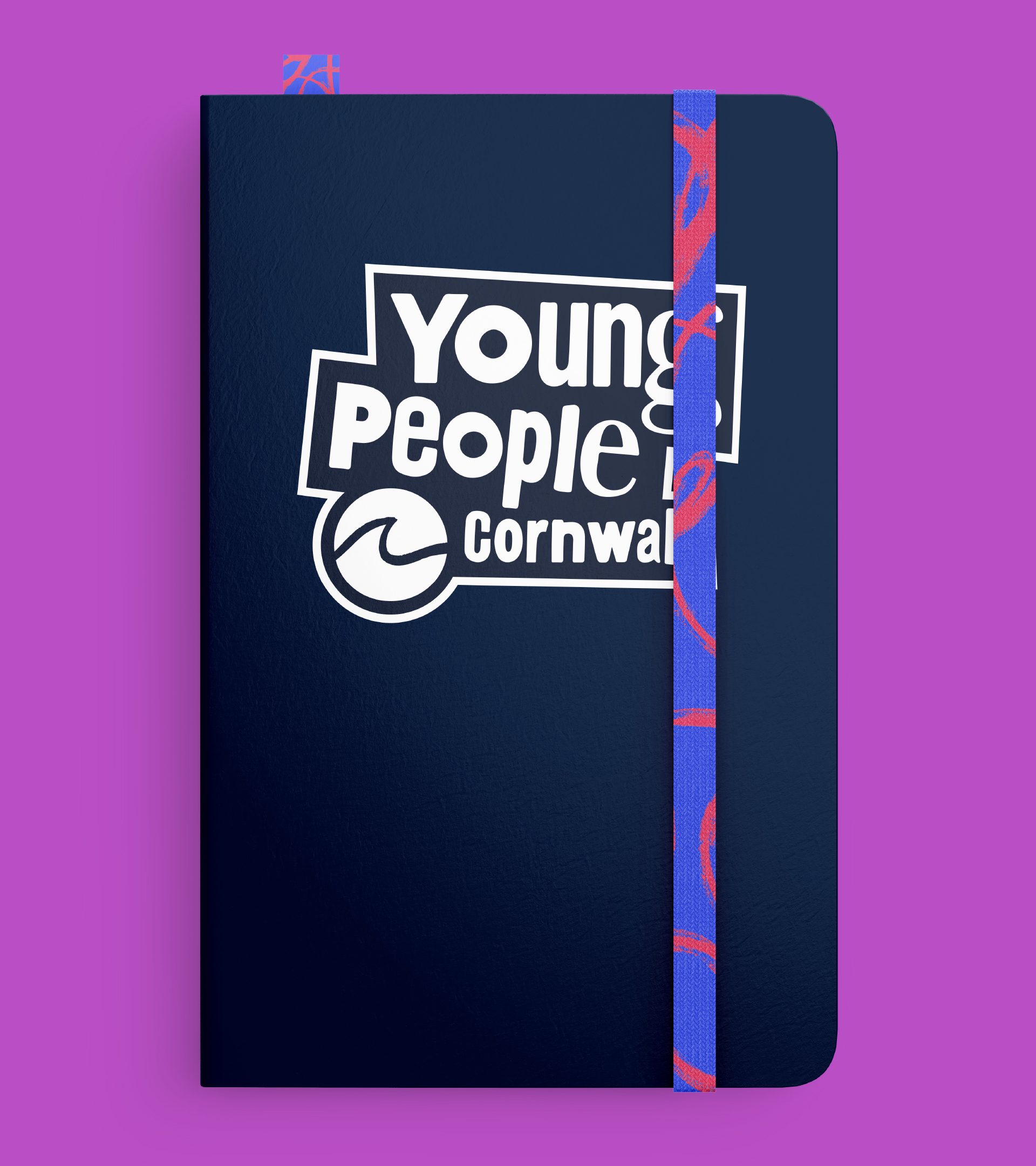
The final identity feels fresh and dynamic, retaining some of the key assets from the original logo, but moving them forward. The colour palette is bright and refreshing and allows flexibility across YPC’s multiple audiences – the young people themselves, professionals, families, and funding partners.
The creation of a range of patterns adds to the lively nature of the brand world, reflecting the creativity of YPC but also young people. They are truly ownable and distinct brand assets for the brand, for use across multiple touchpoints.