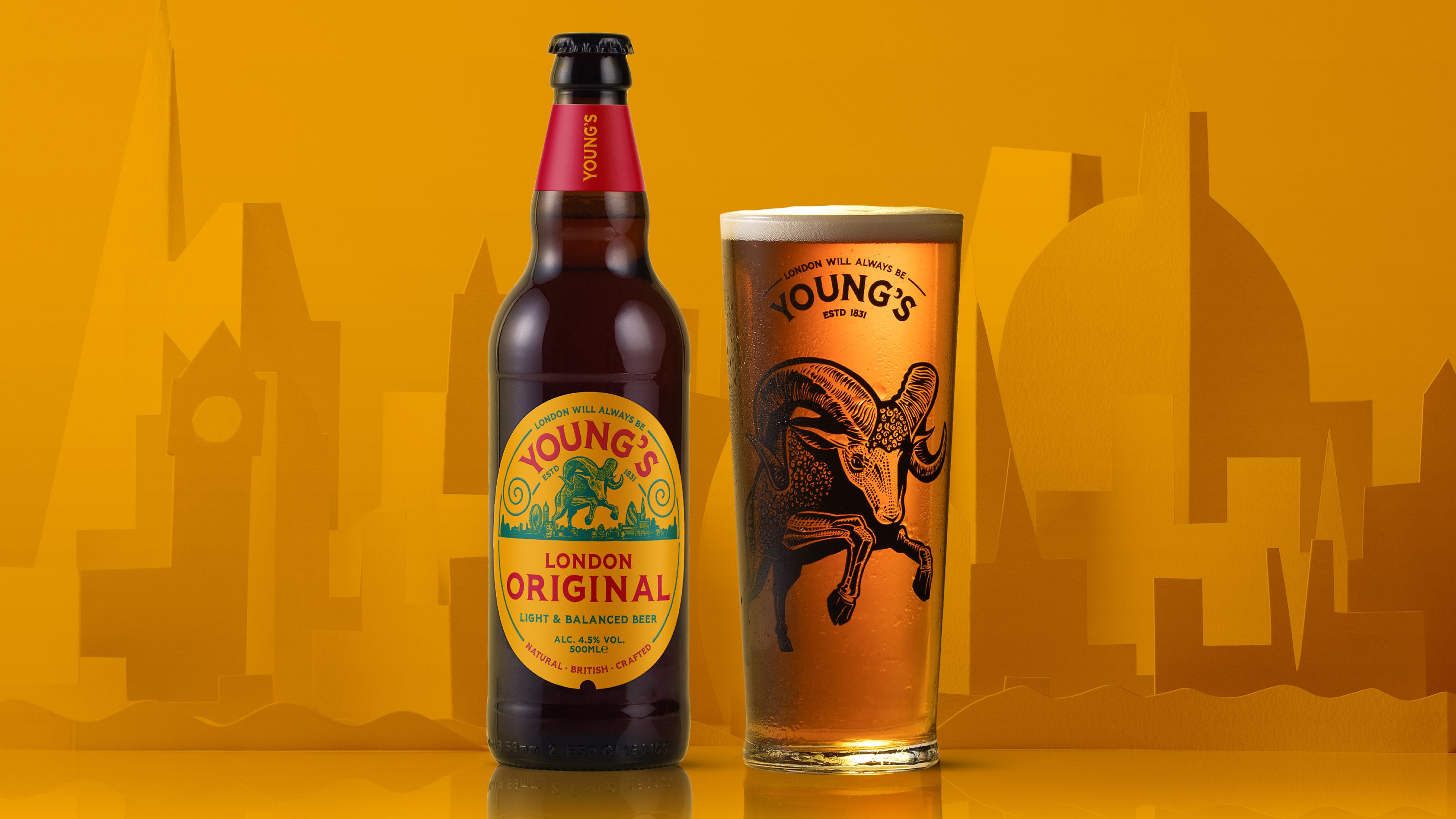
Cask ale rammed with attitude
Young’s is one of the UK’s most celebrated heritage beer brands. With a brewery dating back to 1831, they certainly have a lot of experience and tradition behind them — but they were under pressure to revitalise and refresh to appeal to the newer generation of beer drinkers.
Branding | Typography | Packaging | Core Messaging | Guidelines
The Concept
We needed to develop a contemporary voice for the brand, giving it relevance in today’s market whilst maintaining their history, provenance and credibility as brewers.
The Impact
Since the rebrand, Young’s has seen a notable uplift in sales and the design has turned some heads too, particularly with the Best Agency Work of the Year and a Gold Award from World Brand Design. We were also shortlisted for the Design Week awards alongside brand work for the likes of Cadbury and Smirnoff.
Positive Change
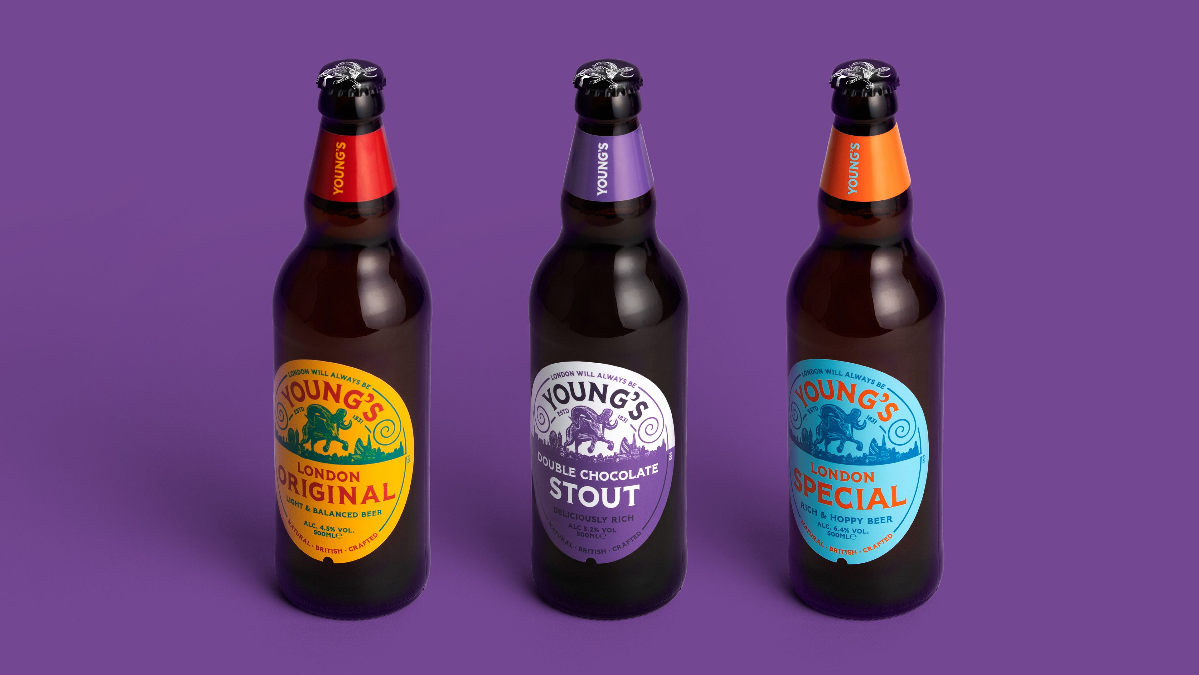
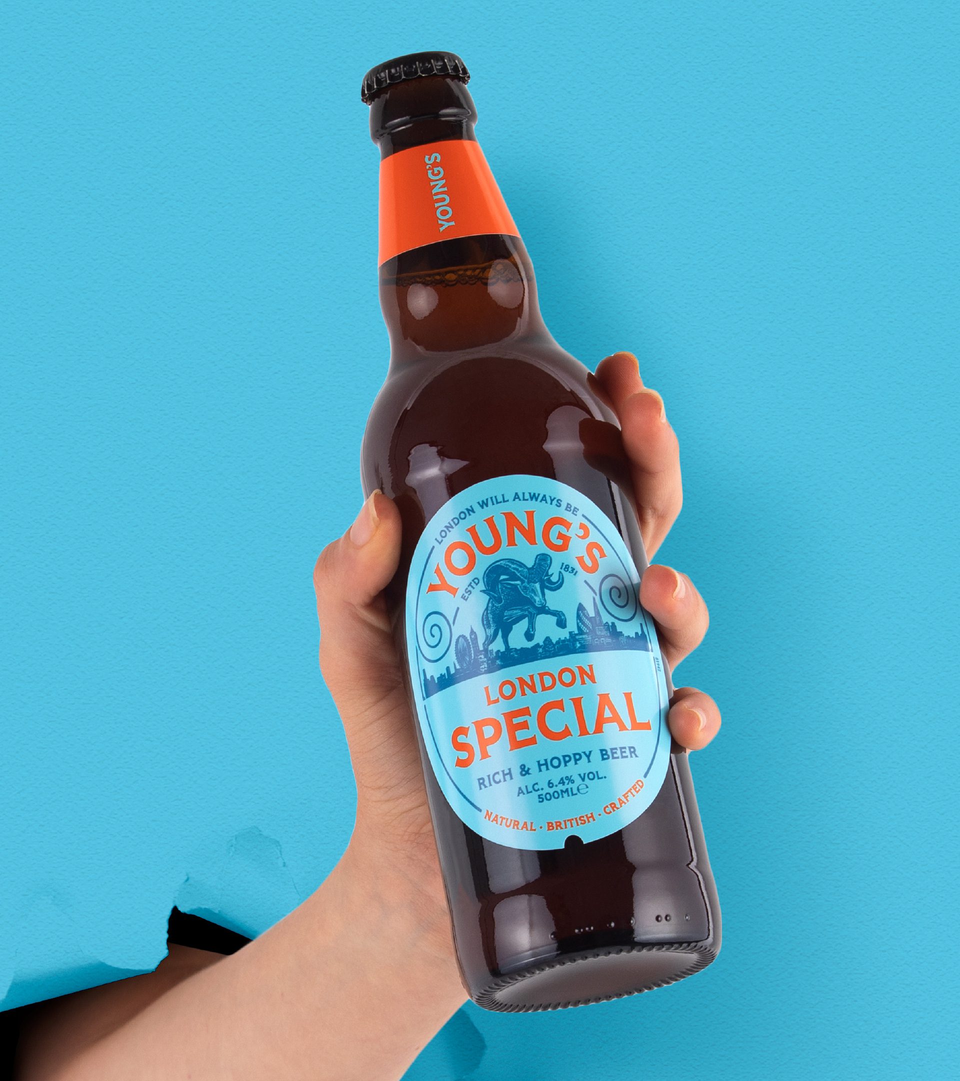
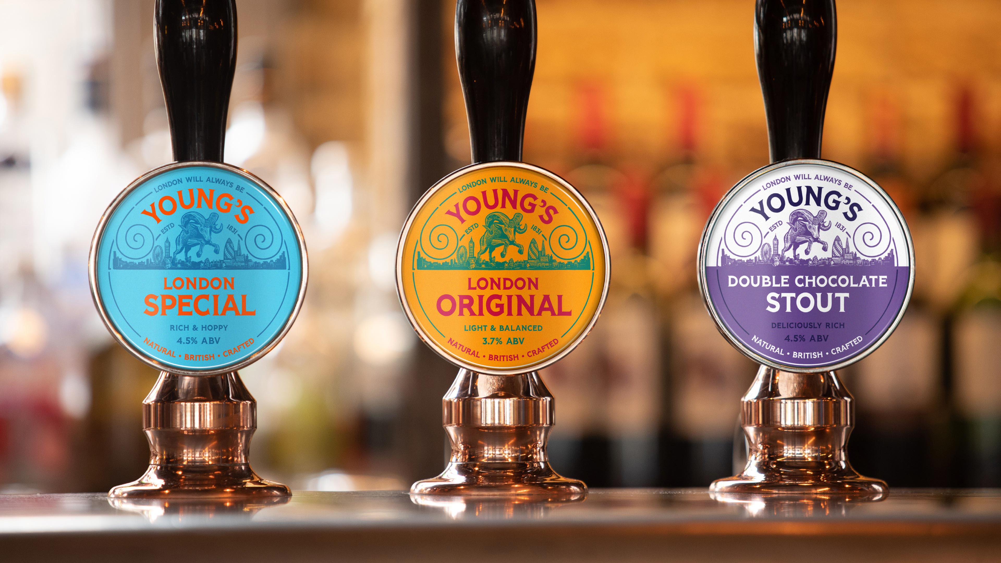
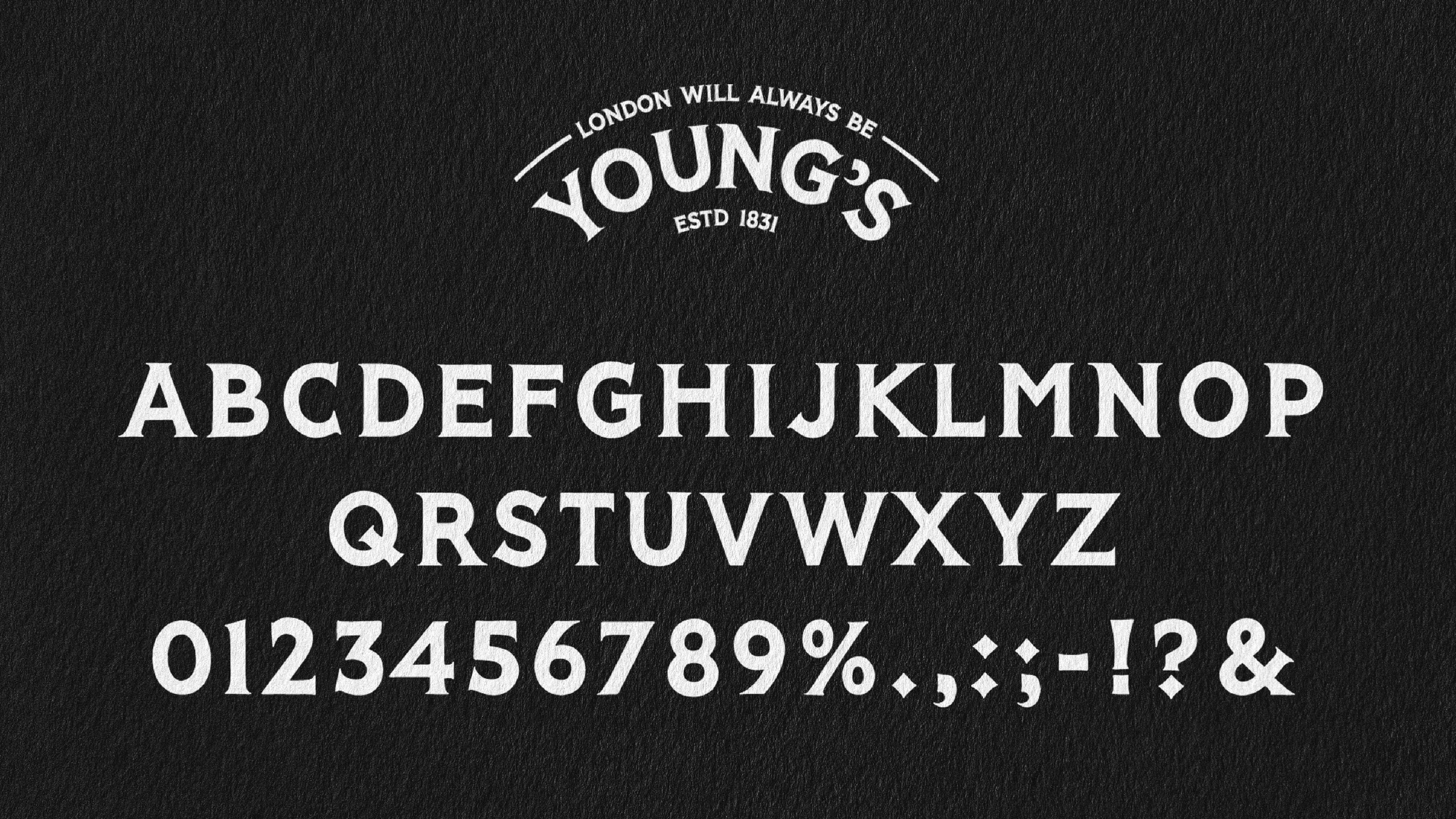
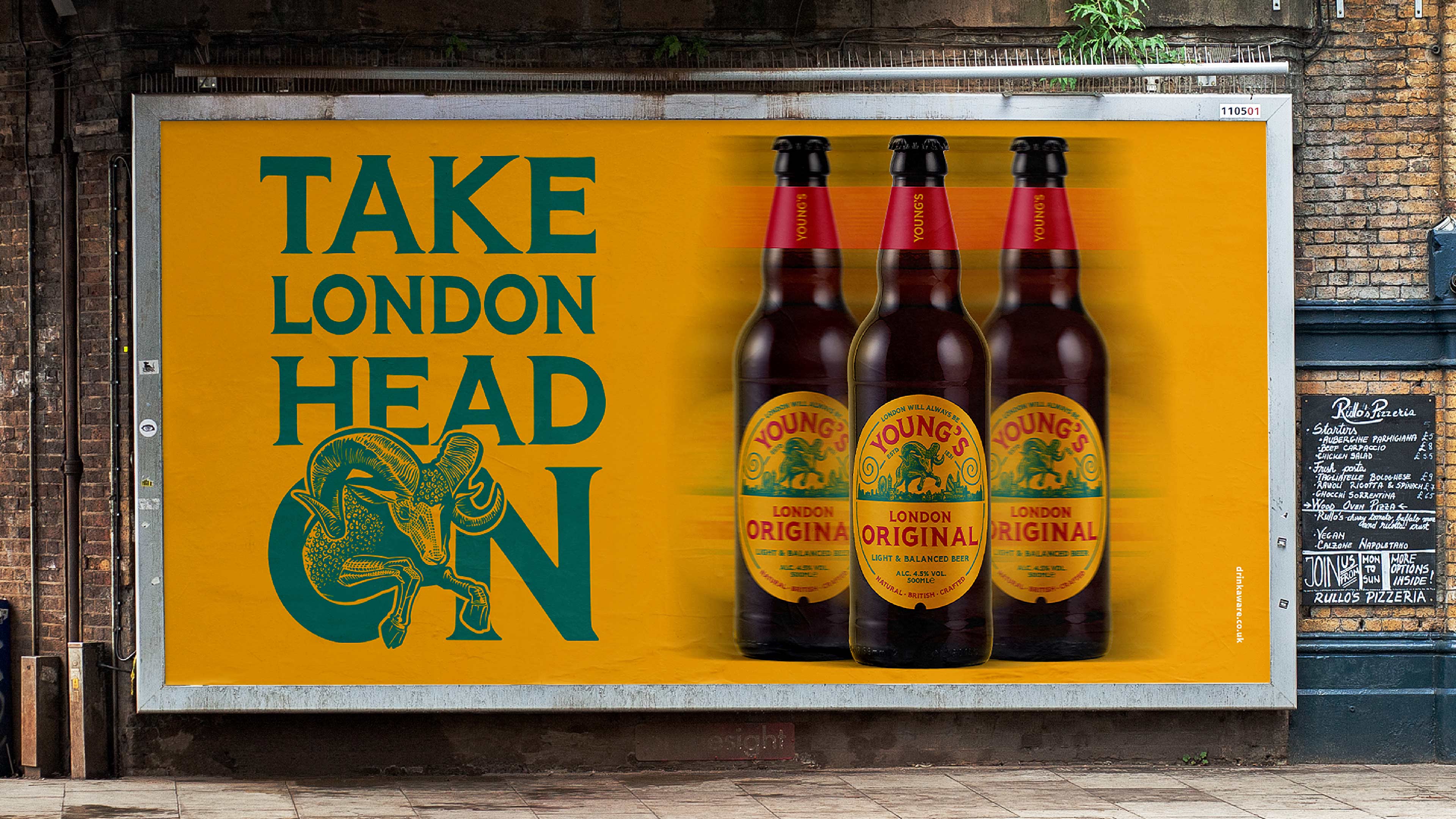
We created a series of confident and engaging brand assets to help eliminate younger consumer’s perceptions of cask ale and stand up to competitors on the bar and shelf, including a bright colour palette and a handcrafted, bespoke typeface with heritage London cues.
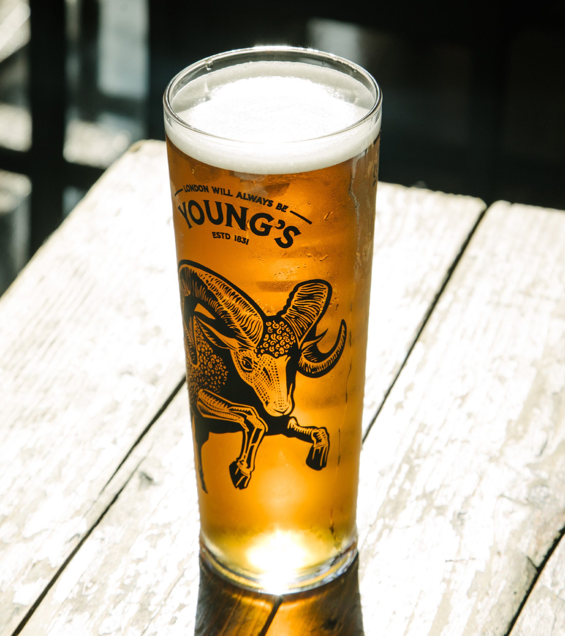
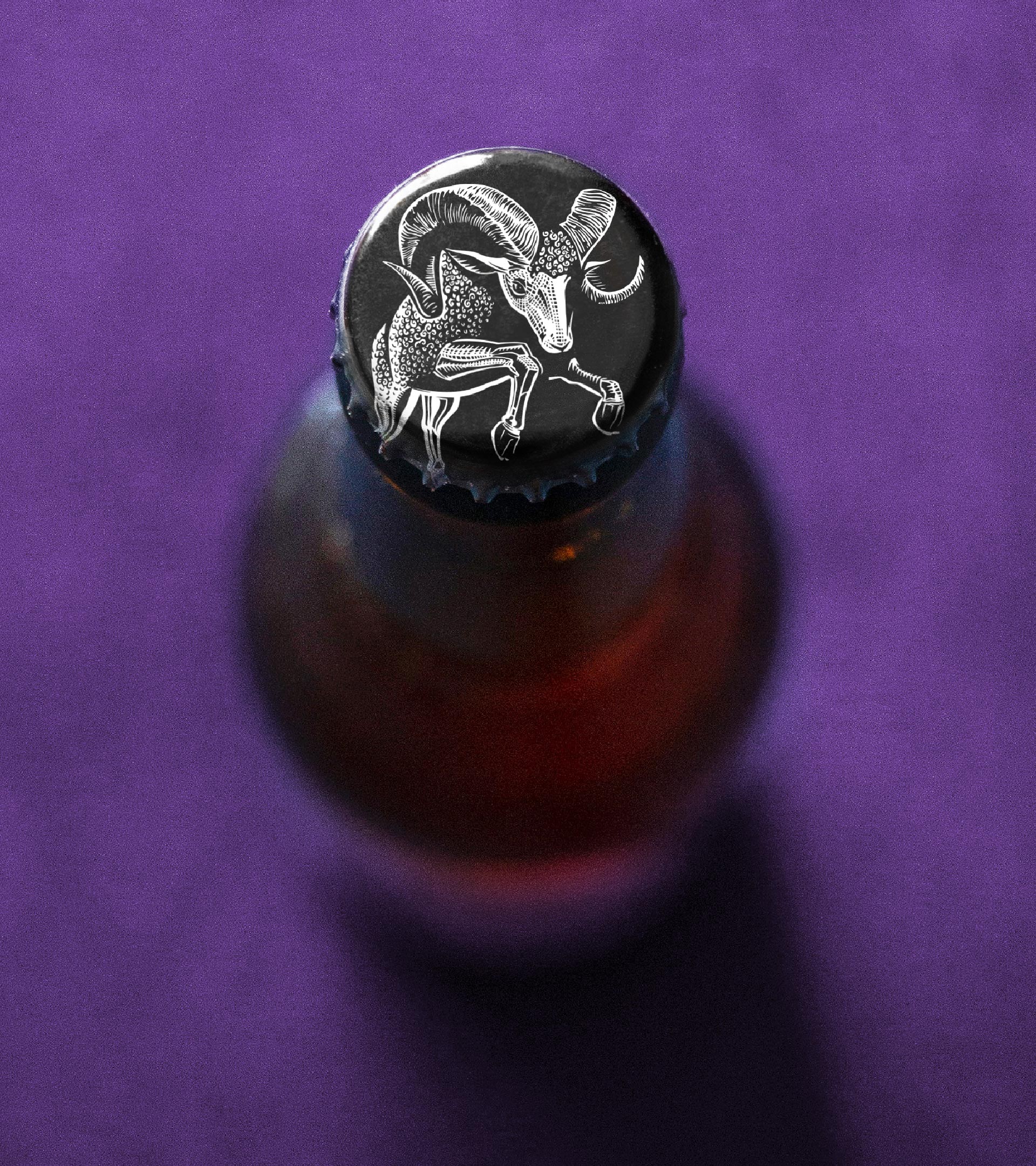
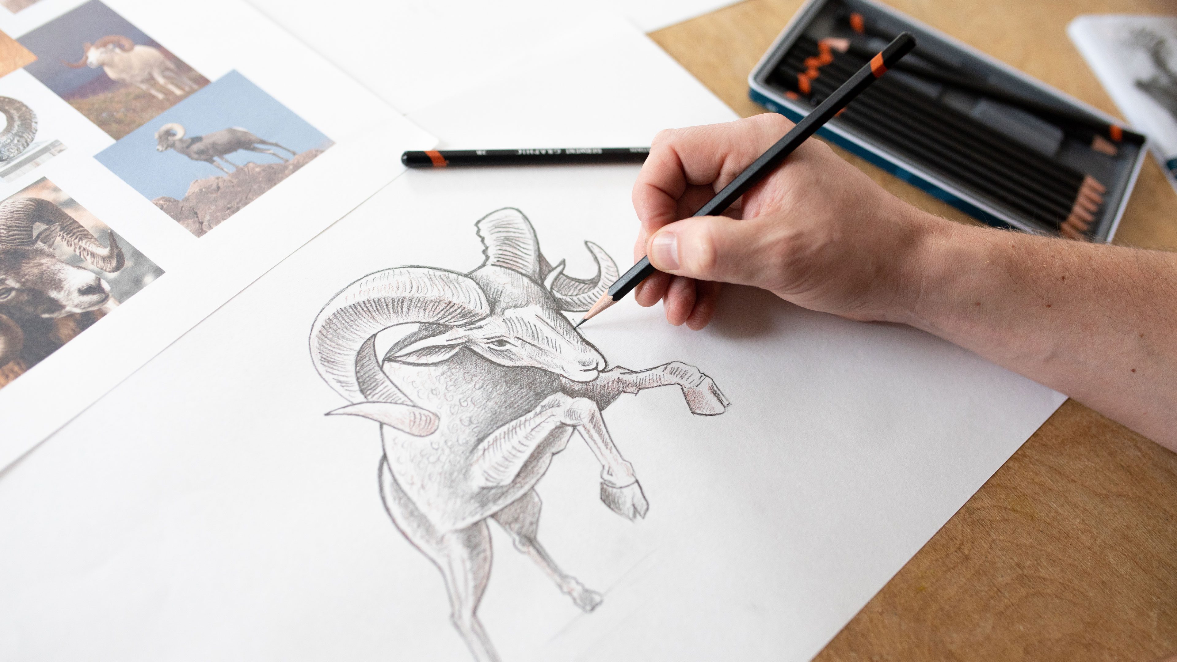
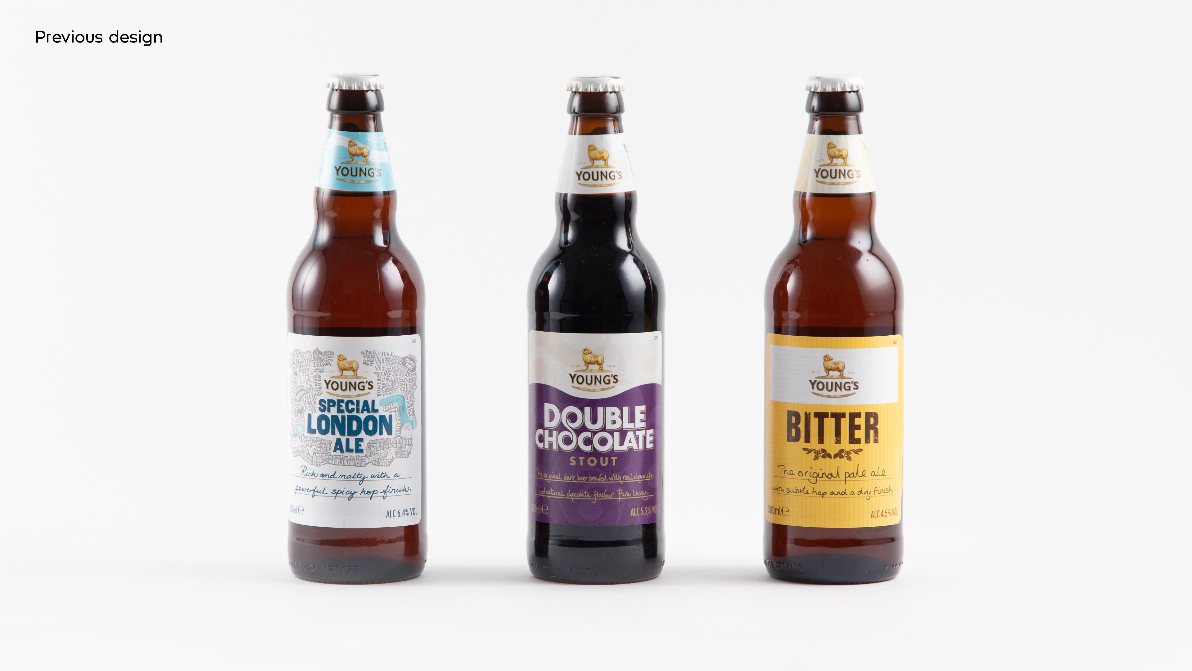
Most notably, we’ve injected some attitude into Young’s iconic ram emblem. Previously depicted as static and shy, the new hand-drawn ram leaps confidently over the London skyline.
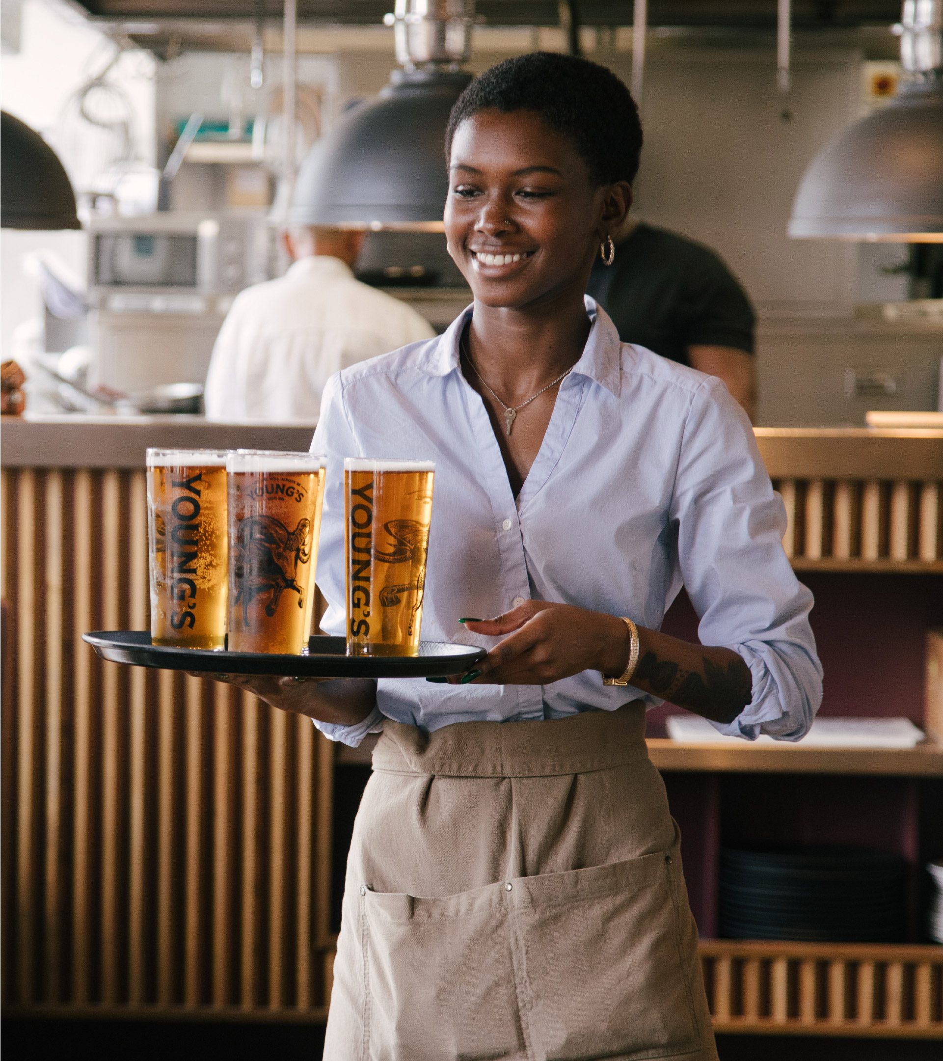
We brought all of this together to create a consistent, coherent design system that would stand up to contemporary competitors and connect with consumers across all formats and beer styles. The result was a brand that was revolutionary for the brewery but has classic bones to stand the test of time.
“Kingdom and Sparrow were on our wavelength from day one…
We really felt they understood the brief and absolutely got what we were trying to achieve”.