Embracing A New Era for Cornwall Hospice
Cornwall Hospice Care came to us seeking a brand refresh to coincide with their 45th anniversary celebration. They wanted to evolve the brand to reflect both the outstanding care they provide and to connect more meaningfully with the community they’ve grown.
With multiple and varied touchpoints across the brand, including retail, internal teams, volunteers, fundraising events and service users, the visual identity and messaging needed to engage and resonate with a diverse audience in different situations.
We worked closely with their team to elevate and consolidate Cornwall Hospice’s brand identity, ensuring that it provides them with a strong and recognisable visual identity that also has the flexibility and opportunity to become a distinctive representation of the mission and values Cornwall Hospice stands for.
We involved Key Stakeholders across the charity in the rebranding process through a ‘Brand Discovery Workshop’ with the Cornwall Hospice team leaders, drawing out key current brand challenges, exploring category analysis and gathering information on how the brand needed to work across multiple touch-points.

The challenge:
Create a clear and concise brand hierarchy for the Cornwall Hospice team to utilise across their hospices, donation centres and retail spaces.
A bold, colourful icon for the charity to build stronger recognition across the county and beyond, building emotional connection with the Cornwall Hospice brand.
Provide the team with comprehensive Brand Guidelines and a robust suite of assets to follow and use across all touch-points for the charity.
Consider the branding of their retail and donation spaces, providing the charity with opportunity to carry key messaging through to encourage further support.

The result:
- Consolidation of the brand name, dropping ‘care’ and streamlining it to Cornwall Hospice, creating clarity and enhancing brand memorability.
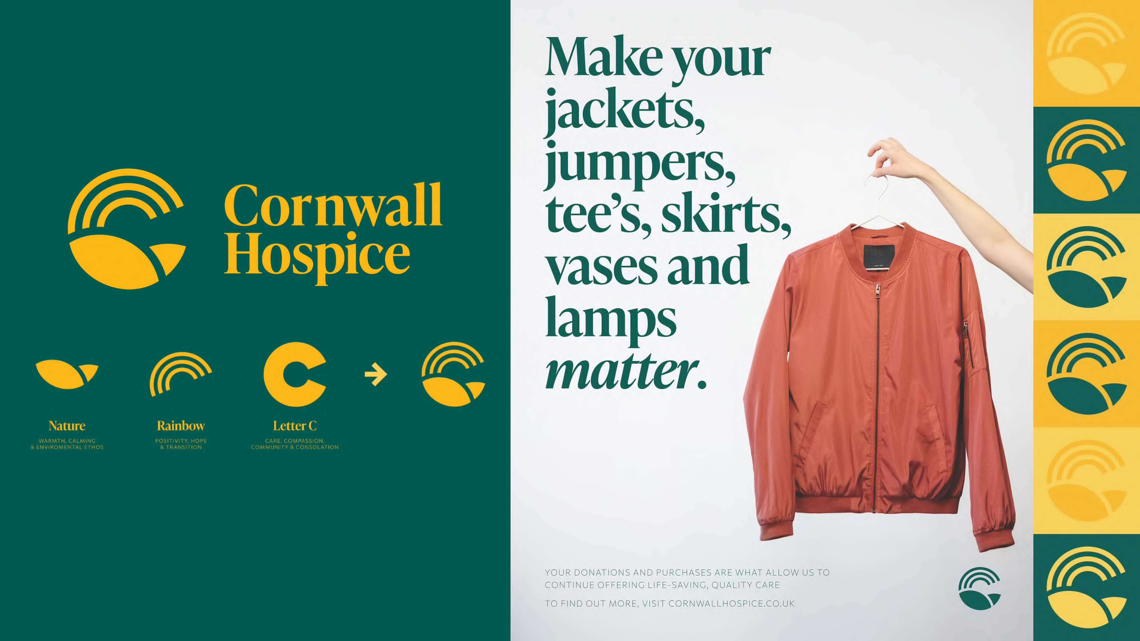
- A striking icon, combining key elements of the brand into a memorable ‘C’ mark. The ‘C’ combines the Cornish sense of place, the rolling hills representing the nature focused ethos of the brand and an overarching rainbow embodying hope, positivity and transition. The ‘C’ also stands for compassion and community, two key values of the charity.
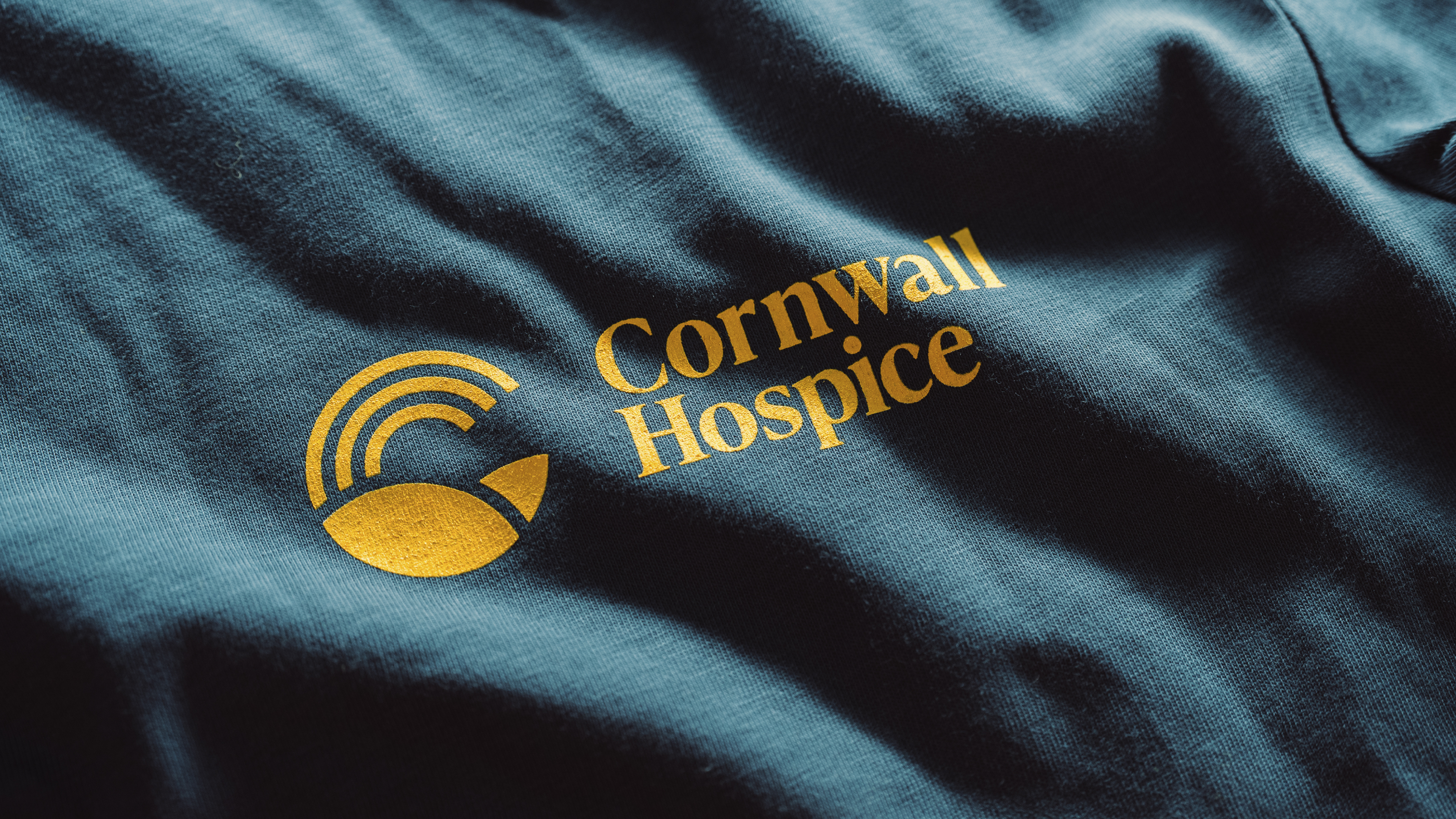
- A striking primary brand colour palette, featuring a coastal teal and a warm golden yellow, evoking a sense of Cornwall’s coastline, countryside and county colours.
- A key slogan for the brand: “Make every moment matter.” Capturing the heart of the charity and reflecting their principles in a clear, genuine way, using a warm and purposeful tone of voice.

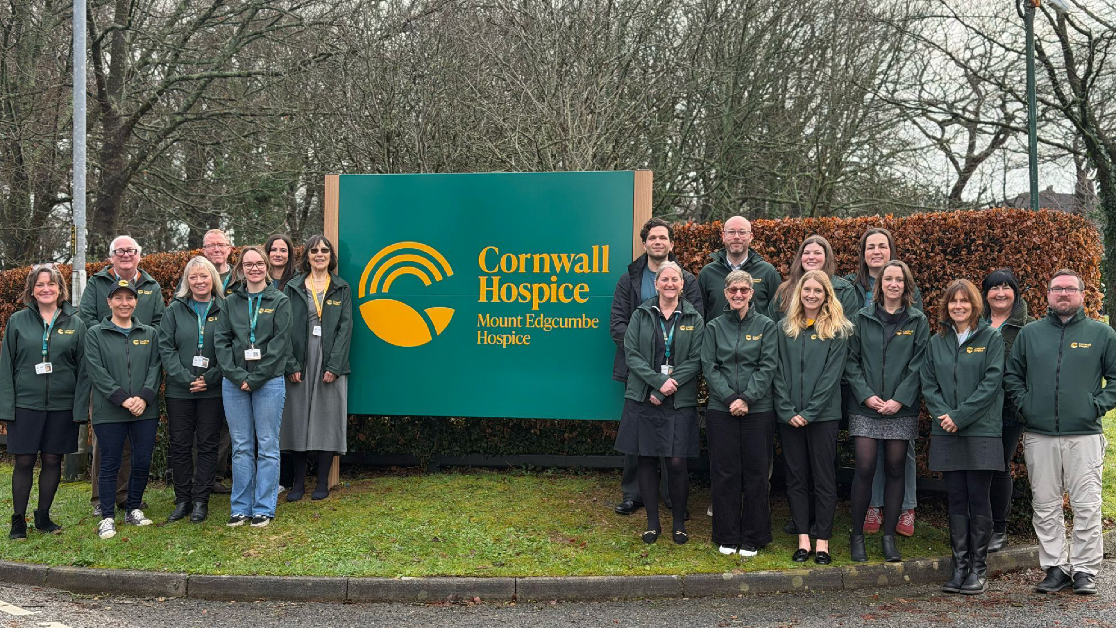
It was an incredible privilege for us to rebrand a Cornish charity so close to many of the teams’ hearts. We look forward to celebrating the roll-out of the brand throughout Cornwall as the charity continues to provide such exemplary care and support to so many throughout the county.
“Our new look was brought to life by the incredibly talented, Cornwall-based team at Kingdom & Sparrow. From the very beginning, their support and ability to bring the heart of our charity to the forefront has been exceptional. Every step of this journey was an absolute pleasure. The finished product is exactly what we wanted and more. Their eye for detail and the care they’ve given to this project have truly enabled us at Cornwall Hospice to make every moment matter.”
Ben Statham Wilkins, Head of Brand and Marketing, Cornwall Hospice
Photos: Oaty Media
