When is it time to refresh your brand?
It could be sooner than you think
The average food or drink brand updates their identity and packaging every three to five years, but in an industry that’s forever evolving, it’s so important to stay fresh, current and exciting to your consumer base. And we believe that the fast-moving digital world means even three years might be too long.
Meeting the needs of today’s consumers
Platforms like Instagram give consumers a huge range of options so brand loyalty is becoming less prevalent. With all this choice consumer expectations are high too – and changing all the time. In 2018 sustainability has been the hot topic of conversation and, indeed, a key factor for many in making purchasing decisions. ‘72 % of millennials in the UK are willing to pay more for products from companies committed to positive social and environmental impact’ (Provenance). If you don’t have environmentally-friendly values and sustainability at the forefront you at least need to acknowledge that you are working towards this and communicate your intentions with consumers, or you risk losing to your competition. Visual shelf presence is important but is no longer enough on its own. How your brand operates off pack is just as important. Does your brand have substance and a purpose? And do you communicate that in all touch-points with your audience?
Standing out from the competition
16,000 new food and drink products launch every year in the UK (London Stock Exchange Group) so to ensure consumers are continuing to choose you over them, not only do you have to meet their expectations, you need to stand out in your category. You should challenge your brand, continually assessing how you could do better and how your brand and packaging communicates to your target market against your competitors. Look at what other people are doing and learn from it – why is it working for them? Or not working for them?
A new look
We’ve observed that food brands no longer have to play up to the trend of ‘country cottage’ or naive illustration styles to reinforce the organic nature of products or sustainable messages. We’re seeing brands of all sizes launching or refreshing with slicker, simpler, bolder looks. A refined, distilled style can help clearly communicate what you’re about to consumers and can also give a more commercial ‘big brand’ feel – which can attract more consumers and buyers.
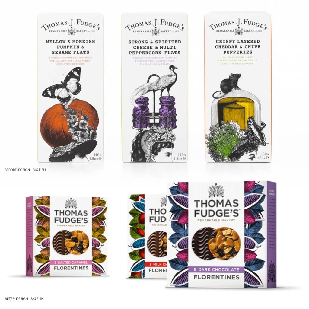
There are plenty of examples of refreshes that have done wonders for food brands that already had what might be considered as beautiful branding and packaging. Big Fish’s second refresh of Thomas Fudge’s has given the brand a huge lift. They’ve kept the quirky personality but have stripped back the Victoriana detail to make it brighter, cleaner and more current.

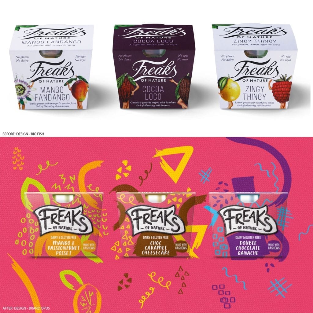
Brand Opus’s relaunch of ‘Freaks of Nature’ is completely the opposite to what you might expect on the free-from aisle and has amazing stand-out. It challenges the category in a big bold way with a unique visual language that screams liberation!

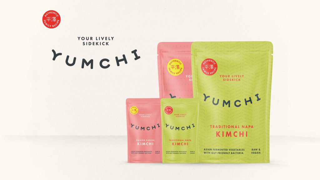
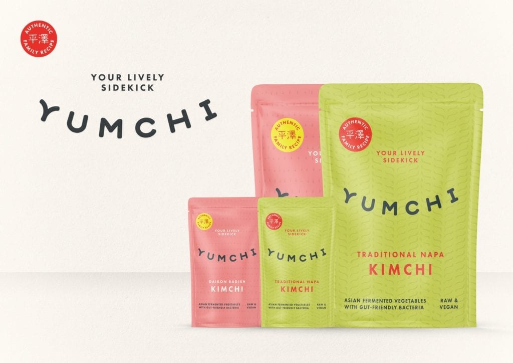
When kimchi brand Food85 came to us last year, we adopted a less is more approach. We took inspiration from the product’s authenticity and Asian routes but brought it up to date with modern, simplistic, brightly coloured packaging and a new name, Yumchi. We also used subtle cues to communicate the organic nature of the product and its health benefits, including a smile-shaped logo and a pattern inspired by the good bacteria and ingredients. The concept is subtle but the design isn’t. It wasn’t long after launch that Yumchi was snapped up by Planet Organic, making waves in the emerging kimchi category.

You might be getting great feedback on your brand and packaging but that doesn’t mean it’s doing as well as it could for you. A refresh could take you to the next level of success.